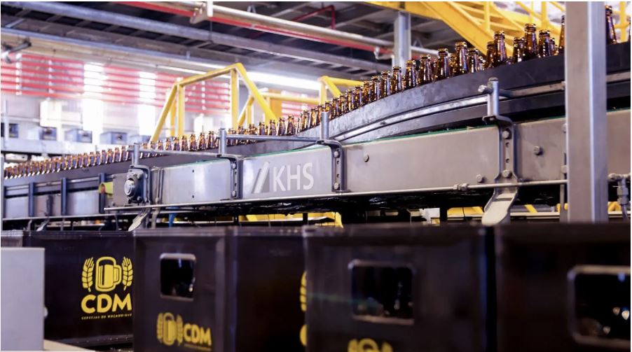
Using high-tech from KHS, AB InBev subsidiary Cervejas de Moçambique has now built the most modern brewery in Africa. The heart of the system is what the customer claims to be the fastest returnable glass line on the continent.
In large swathes of Africa beer has long been made from local crop cassava. Home-brewed, it takes on a variety of forms, usually cloudy, without any foam to speak of and with a chunky consistency – almost like liquid muesli and by no means to everyone’s taste.
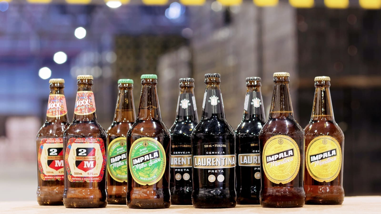
The first brewery to have risen to the challenge of making a drinkable beer from the plant also known as manioc or yuca is Cervejas de Moçambique or CDM. In 2011 the company launched one of the first commercial cassava beers in Africa to market under the brand name of Impala.
70% of the starch used comes from the root vegetable instead of from wheat or barley malt. A long development phase ultimately produces a beverage that is yellow and fruity and slightly cloudy in the glass. With its white head of foam it looks like a normal lager and has a surprisingly refreshing taste.
Impala has proved a roaring success for CDM in a number of respects: by procuring local ingredients, the brewery secures the livelihood of small farmers in the region and creates lots of jobs in agriculture.
The state honors this commitment – as it does the fact that the beer produced is a professional substitute for the harmful own brews concocted by its citizens. Thanks to a lower tax rate, the new beer can be sold for about 30% less than the usual price.
With more than a million bottles sold per annum, this has helped to make Impala a huge success – one that has long been emulated in a number of other African countries and by various breweries.
In addition to showing innovative spirit, CDM also sets great store by tradition. Privatized in 2005 during the restructure of the market economy in a country previously under socialist rule, the company now unites all of Mozambique’s established beer brands in its portfolio.
This primarily includes 2M brewed since 1950, the name of which is reminiscent of French president Patrice de MacMahon. In 1875 he acted as mediator in the conflict between Portugal and England over what is now the capital Maputo and is accordingly admired in this Southwest African country.
Laurentina, the first beer ever brewed in Mozambique in 1932 – and still a regular award-winner – is another running favorite.
With a turnover of around €300 million (in 2021), the brewery now largely owned by the AB InBev Group is by far the largest local beer producer and market leader.
New site with potential
This status has been earned by CDM’s consistent strategy of growth and continuous increase in capacity.
Not so long ago in 2010 a third factory was opened in Nampula in the north of the country in addition to the existing facilities in the capital Maputo and Beira further north up the coast.
Just eight years later the foundations were laid for a further greenfield project in Marracuene a few kilometers outside Maputo. Here, production started up with a capacity of 1.6 million hectoliters a year.
In view of the fast-growing population and increasing demand for high-quality beer, this rapid development has not yet come to an end, however; the production site has been designed in such a way that it can be easily expanded over the coming years to cope with a capacity of six million hectoliters.
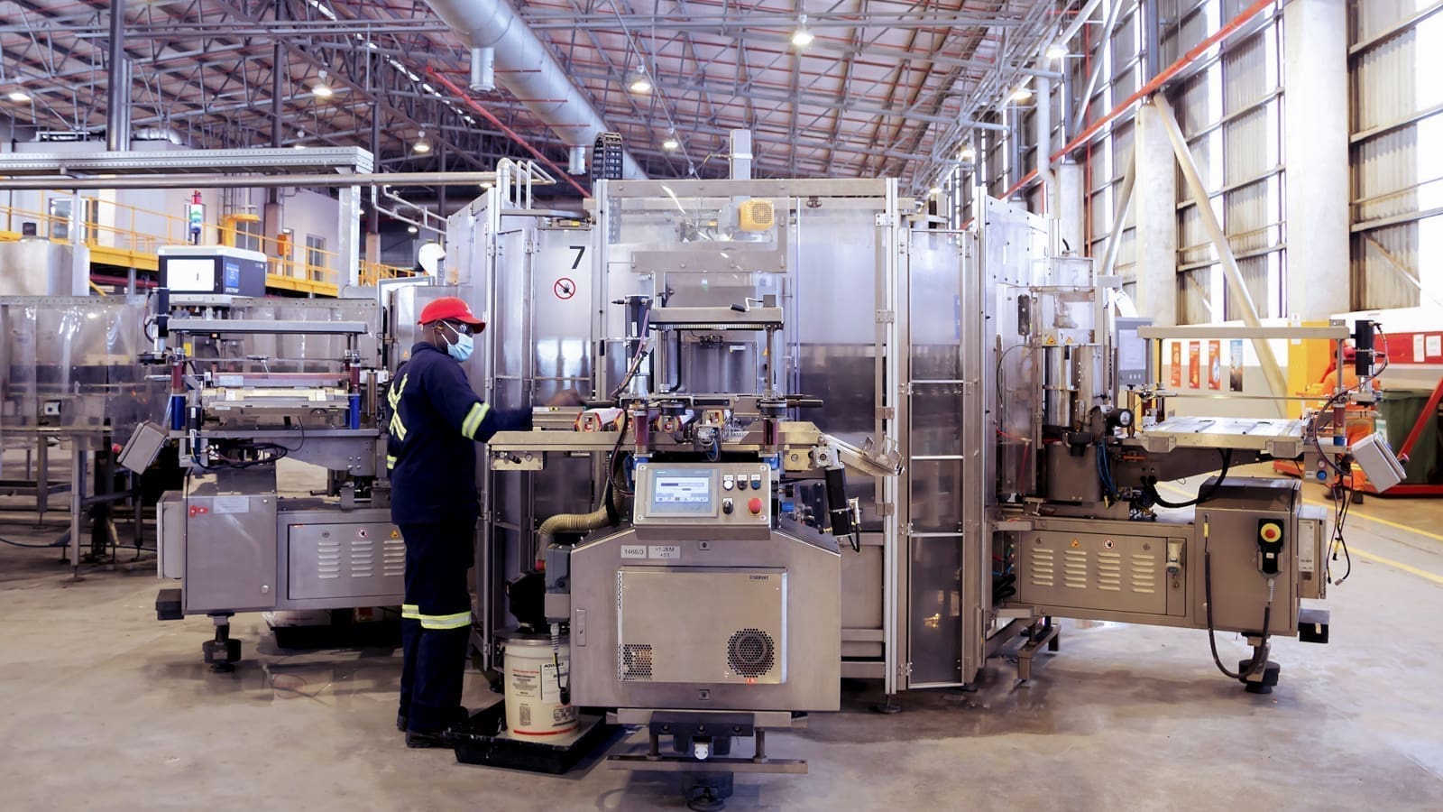
The heart of the new location is a returnable glass line from KHS, on which up to 80,000 550-milliliter bottles per hour can be filled – the format that accounts for about 95% of total sales.
This line capacity is extremely high for the African continent, explains Tobias Zeimentz, who as key account manager at KHS is responsible for customer AB InBev the world over. “In this region it’s rare to find more than 40,000 bottles per hour being processed.”
International KHS network
CDM was in a hurry to get its new plant finished. In order to meet the ambitious schedule and supply the various components as quickly as possible, KHS called on its international network.
The conveyors thus came from Mexico and the sedimentation tanks from South Africa. The line was to be installed by engineers from Ukraine, Turkey, Mexico and Germany.
KHS colleagues from Brazil were then to train personnel on the new machinery as they can communicate with the Mozambicans in their mother tongue Portuguese without any loss of communication.
Already at the offer stage the teamwork was excellent: the necessary internal and external coordination processes were triggered in good time and everyone was confident that the formidable timeline could be kept to.
Things did not quite turn out as expected, however.
In March 2019 the country was hit by Intense Tropical Cyclone Idai that inflicted heavy damage; over 1,000 people died and almost a million were made homeless.
According to estimates by the World Bank, the devastation in Mozambique and the less severely affected neighboring countries of Zimbabwe and Malawi totaled about €1.7 billion in cost.
The region close to the capital was also impacted by this natural catastrophe, resulting in delays to the CDM schedule. The production shop could not be finished on time to accommodate the machines ready for installation.
KHS reacted spontaneously and flexibly by making partial deliveries wherever possible. Installation then started in October 2019, although much of the production shop was still little more than a shell.
From this point forward, however, all of the deadlines could be met and all those involved were happy. Everybody ultimately had every reason to celebrate when in February 2020 the first bottle was filled on the line.
Impact of corona lockdown
This happy state of affairs did not last long, however.
Within just a few weeks, Covid-19 mushroomed into a global pandemic. Those countries affected went into lockdown, flights were canceled and travel became practically impossible.
Within the space of a day, Mozambique announced it was closing its borders and there were suddenly no more flights to the airport in Maputo. “Our team literally had no other choice but to flee the country,” Zeimentz remembers.
“So that they didn’t end up being stranded for an indefinite period, our colleagues immediately embarked on their in some cases difficult homeward journey while nevertheless observing their duty of care. At this point, line optimization was only three-quarters finished and we still had two months’ work ahead of us.” Despite this, the decision was the right one to make in the interests of personnel: half a year passed before travel was again possible.
The project needed to continue on site, however, as Frank Schepping, technical director at CDM, emphasizes. “Our local team in Marracuene now faced the challenge of commissioning this 80,000-bph line through online meetings, phone and video calls and KHS’ remote maintenance service ReDiS without there having been any advance training,” he says.
“This of course initially turned our ramp-up plan on its head. With lots of hard work, overtime and a few sleepless nights, however, we finally managed to ramp our most important format, the 550-milliliter bottle, up to capacity so that we were able to supply local consumers with our beer.”
At the end of the day, everyone is really happy to have kept the system up and running. “A shutdown lasting several months would naturally have been a disaster,” Zeimentz confirms.
This shortfall in production was compounded on the marketing side of things by the government limiting the sale of alcohol to certain business hours and imposing curfews in the spring of 2020 – with a noticeable effect on beer consumption and CDM’s business.
Despite this, the brewery did not allow itself to become disheartened by the temporary slump and instead launched the 2M Flow product during this period. It was an immediate hit and has continued to enjoy great popularity ever since.
Finally fit for acceptance
It was not until September 2020 that most KHS colleagues were able to return under sometimes still difficult conditions to complete their work.
A full audit was first held before the system was successively readied for acceptance with overhauls, maintenance and cleaning – all taking the demands of ongoing production into account. The pandemic also was not over, evident in the number of infections that sporadically broke out on all sides despite the strictest safety precautions being taken, these in turn causing further delays.
Finally, in summer 2021 the plant officially went into operation after a five-day performance test that was successfully passed with a line efficiency of over 95%.
Besides the two modular KHS labelers – incidentally a first for AB InBev – the two Innofill Glass DPG ECO fillers proved especially convincing: with extremely low TPO1 pickup values of 19 micrograms per liter and a low CO2 consumption of just 150 grams per hectoliter, they underline KHS’ status as the first choice for filling technology.
Following an investment of about €150 million the “biggest and most modern brewery in Mozambique and the whole of Africa”, as CDM CEO Tomaz Salomao puts it, could finally be ceremoniously opened.
Judging by the great pleasure expressed in the smooth operation of the new filling line, the unforeseeable hurdles that had to be overcome before this goal could be reached now seem to (almost) have been forgotten.
Versatile and flexible: modular labeler
At CDM in Mozambique AB InBev has had two modular KHS labelers installed for the first time the world over. The machines can be equipped with various stations that are changed over within a very short time indeed as they are easily docked and undocked using a lifting truck.
This flexibility gives CDM greater future security, enabling it to react quickly and easily to new trends and dynamic market developments.
Impressive performance figures of just 0.054% faulty labels and an efficiency of over 99% prove doubly convincing when it comes to the high quality of KHS labeling technology.
Source: