Categories
News & Updates

ames Cropper reveals garment tags made from recycled coffee cups

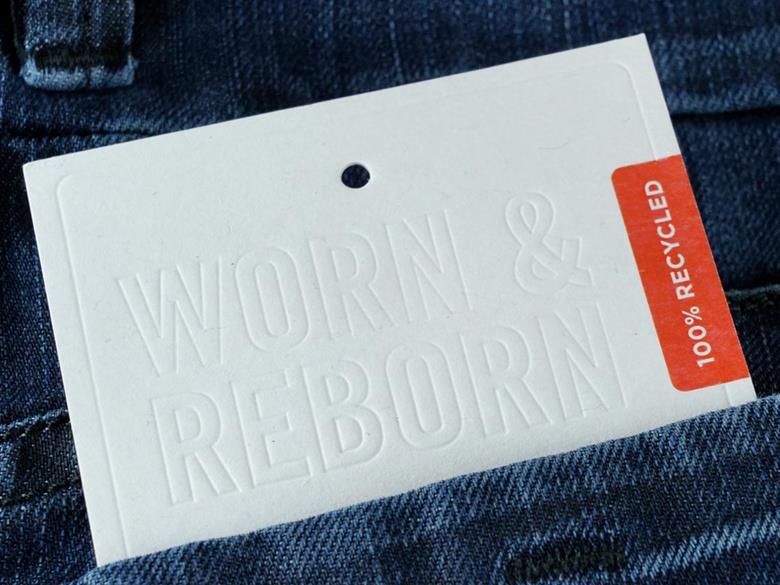
In a significant step towards sustainable fashion, James Cropper has unveiled its premium garment tags made from recycled coffee cups, designed for the New Zealand lifestyle brand Untouched World. This initiative addresses the pressing issue of textile waste, particularly within the denim industry, which sees the production of approximately eight billion pairs of jeans each year. Alarmingly, the World Economic Forum reports that 73% of discarded clothing ends up incinerated or in landfills, with only a mere 12% being recycled into insulation or mattresses, and less than 1% repurposed into new products.

The innovative tags from James Cropper are composed of 100% recycled materials, featuring 20% post-consumer denim fiber and 80% recycled fiber sourced from coffee cups. This cellulose-based product is not only recyclable globally but also embodies the principles of a circular economy, allowing the fibers to have multiple lives.

Untouched World has selected Rydal Apparel to replace traditional swing tags on its new range of recycled denim tote bags, coinciding with the launch of their new store in Auckland, New Zealand, this November.

Kate Gilpin, Product Manager for Luxury Packaging at James Cropper, emphasized the importance of such innovations in fostering a circular economy within the fashion industry. She remarked, “Brands like Untouched World are highlighting what’s possible and how a simple shift, like replacing paper or plastic tags with recycled fiber tags, can make a world of difference to our planet.”

Lucinda LeHeron, Creative Director at Untouched World, echoed this sentiment, stating, “We use time-honoured practices and luxurious natural materials to break away from the fast fashion model. Every detail of our garments’ life cycle and each step in our supply chain is carefully considered.” She further noted the significance of selecting sustainable materials, highlighting the collaboration with James Cropper as a testament to their commitment to circularity and waste reduction.

This partnership marks a pivotal moment in the movement towards sustainable fashion, showcasing how thoughtful innovation can lead to meaningful environmental impact.

Source:

https://packagingeurope.com/news/james-cropper-reveals-garment-tags-made-from-recycled-coffee-cups

Categories
News & Updates

Albertsons Releases Buzz-Worthy rPET Wine Bottles

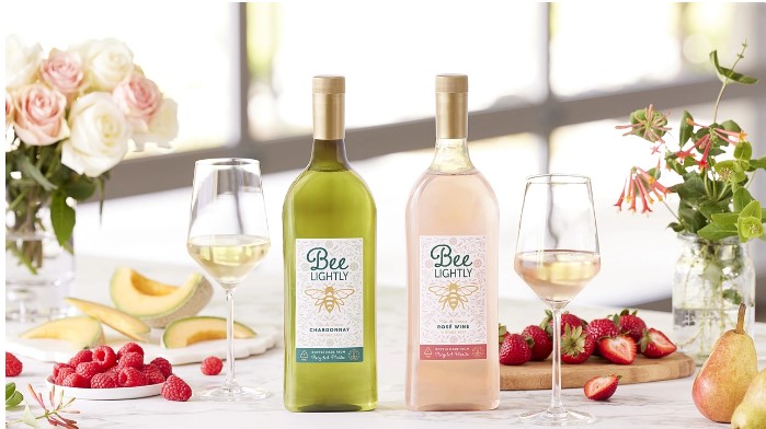
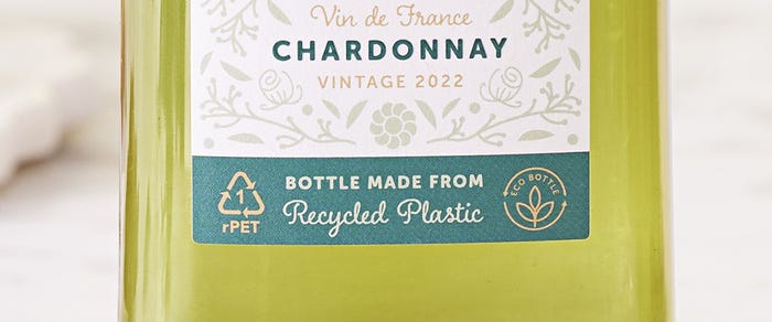
In a significant leap toward sustainable packaging, Albertsons Companies, Inc. has unveiled its Bee Lightly wine line, packaged in 100% recycled PET (rPET) bottles. This initiative marks a pioneering moment in the U.S. beverage industry, showcasing a commitment to eco-friendly practices while introducing innovative packaging solutions.

The Bee Lightly collection features two distinct varietals: the 2022 Bee Lightly Chardonnay and the 2023 Bee Lightly Rosé, both of which represent a harmony of quality and sustainability. The introduction of flat rPET bottles not only minimizes the carbon footprint associated with wine distribution but also reduces pallet usage by an impressive 44%, thereby enhancing shipping efficiency.

“It is our ongoing mission at Albertsons Cos. to distinguish ourselves in the wine sector and expand our quality offerings,” asserts Curtis Mann, master of wines. “With the launch of our Bee Lightly selection, we provide customers with affordable wines from France while setting new standards in wine packaging.”

Bee-Lightly-Wines-Label-Close-1200x550.jpg

This innovative project is the result of a collaborative effort between Albertsons’ Own Brands team, WX Brands, and Packamama, a climate tech packaging firm recognized for its distinctive flat-bottle design. Together, they have established a sustainable model that prioritizes environmental responsibility without compromising consumer choice.

Bee Lightly wines are available at select Albertsons, Safeway, Vons, Jewel-Osco, and ACME stores, with plans for delivery through Vine & Cellar in California. Sourced from the Hérault and Limoux regions, these wines elevate the standards for both taste and sustainability.

As the grocery chain moves forward, the Bee Lightly initiative serves as both a reminder and an inspiration for innovative practices in the beverage industry, promoting a greener future through thoughtful packaging solutions.

The Advantages of Recyclable rPET Bottles in Wine Packaging

In the quest for sustainable packaging solutions, the introduction of recyclable rPET bottles marks a significant advancement in the wine industry. These innovative bottles are 87% lighter than traditional glass bottles of the same volume, presenting a compelling case for eco-conscious producers and consumers alike.

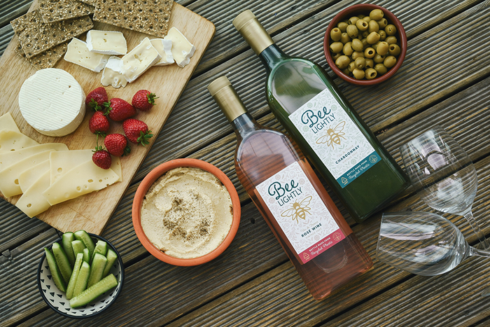
One of the most notable benefits of rPET bottles is their flat packaging design, which significantly reduces the carbon footprint associated with transportation. This design not only enhances logistical efficiency but also allows for nearly double the number of products to be shipped on a single pallet. For instance, Albertsons’ Bee Lightly application utilizes this flat-back bottle design, resulting in a remarkable 44% reduction in pallet usage when shipping the same volume of wine compared to standard glass bottles.

Bee-Lightly-Wines-Laydown-1000x667.png

Brandon Brown, Senior Vice President of Own Brands at Albertsons Companies, emphasizes the importance of this innovation: “The introduction of Bee Lightly into our Own Brands portfolio marks an innovative partnership and venture into wine packaging, highlighting our dedication to product quality and environmental stewardship.” He further notes that today’s consumers appreciate the quality and value offered by private label products, making the Bee Lightly premium wine varietals an attractive option for those seeking both affordability and excellence in flavor.

In summary, the adoption of recyclable rPET bottles not only supports sustainability efforts but also enhances operational efficiency in the wine industry, paving the way for a more environmentally responsible future.

Source:

https://www.packagingdigest.com/beer-wine-spirits/albertsons-releases-buzz-worthy-rpet-wine-bottles

Categories
News & Updates

Tomintoul Expands Contemporary Cask Finish Collection

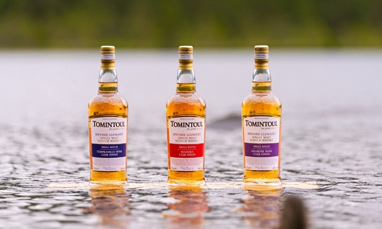
Tomintoul Single Malt Scotch Whisky has announced the release of three new expressions in its ‘non-age statement’ cask finish collection, marking an exciting expansion for whisky enthusiasts. Handcrafted within the picturesque Cairngorms National Park, this addition features the Tomintoul Amarone Wine Cask Finish, Tomintoul Madeira Cask Finish, and Tomintoul Tempranillo Wine Cask Finish.

The new offerings showcase a simple yet elegant design, characterized by clear bottles that allow the rich amber whisky to be prominently visible. Each bottle is adorned with a straightforward, business-like label, prominently displaying the brand’s logo and essential information. This contemporary aesthetic reflects Tomintoul’s commitment to both quality and style, appealing to a modern audience.

As Tomintoul continues to innovate, these latest expressions promise to delight whisky connoisseurs and casual drinkers alike, offering a unique exploration of flavors influenced by distinct cask finishes.

Source:

https://www.packagingnews.co.uk/design/new-packs/tomintoul-launches-new-lines-in-contemporary-cask-finish-collection

Categories
News & Updates

Axe’s Limited Edition Collaborations: A Fusion of Fragrance and Hip Hop Culture

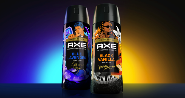
In an innovative marketing strategy, Axe has unveiled two exclusive limited-edition cans designed in collaboration with prominent figures in the hip hop industry: music producer Metro Boomin and rap artist Coi Leray. These special editions, created in partnership with the independent design agency Sunhouse and The Martin Agency, exemplify Axe’s commitment to cultural relevance, particularly among the influential Gen Z demographic.

The collaboration marks a significant evolution in Axe’s branding approach, seeking to resonate more deeply with contemporary audiences through artistic partnerships. James Giles, executive creative director at Sunhouse, noted the excitement of involving both artists in the design process, allowing their distinctive styles to inform the final products. Metro Boomin’s can features dynamic elements such as swirling keyboard keys and comic book motifs, reflecting his musical essence, while Coi Leray’s design incorporates Koi fish and butterflies, resonating with her signature visual identity.

Both designs draw inspiration from the artists’ shared passion for anime and comics, creating a cohesive narrative that appeals to their fan bases while celebrating the essence of Axe’s fine fragrance offerings. The inclusion of vanilla flowers and lavender stalks further enhances the fragrance credentials, crucial for the product’s success in a competitive market.

The collaboration is underscored by the artists’ signatures, symbolizing authenticity in an era where genuine connections with brands are paramount. As Stephanie Bau, Axe global brand manager, articulated, the exceptional capabilities of the Sunhouse team have resulted in collectible pieces that not only deliver in terms of aesthetics but also set a new benchmark for future collaborations.

Thus, Axe’s partnership with Metro Boomin and Coi Leray, bolstered by the creative prowess of Sunhouse, encapsulates a forward-thinking approach that merges fragrance with contemporary culture, appealing to the aspirations and preferences of the modern consumer. This initiative not only reinforces Axe’s position in the fragrance market but also solidifies its relevance within the dynamic landscape of youth culture.

source:

https://www.packagingnews.co.uk/design/new-packs/axe-limited-edition-collaborations-with-rap-stars-designed-by-sunhouse

Categories
News & Updates

The Label Makers works on second release of Haçienda Gin

The Label Makers has recently worked with The Spirit of Manchester Distillery on the second release of Haçienda Gin.

The collaboration between The Label Makers and The Spirit of Manchester Distillery marks a significant milestone in spirit branding with the second release of Haçienda Gin. This partnership not only exemplifies the importance of innovative design in product presentation but also reflects a commitment to enhancing the consumer experience through aesthetic creativity.

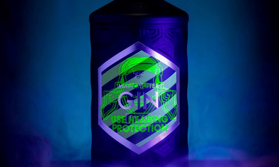
In a notable departure from conventional packaging norms, the Haçienda Gin underwent a transformative redesign. The typical clear glass bottle, commonly found within the gin market, was replaced by a striking matte black spray finish. This bold choice not only distinguishes the product but also reinforces its unique identity within a saturated marketplace.

The label design drew inspiration from the iconic Haçienda hazard stripes, transitioning them from the peripheral aspect of the label to a prominent central placement. This strategic repositioning not only captures the essence of the brand’s heritage but also appeals to a modern audience. Furthermore, the application of hidden UV print adds an element of surprise and interactivity. The inclusion of the ‘Use Hearing Protection’ symbol—an art piece on the front of the bottle—as well as complementary artwork on the reverse side, creates layers of engagement for consumers.

Zoe Rigby, marketing manager of The Spirit of Manchester Distillery, highlighted the collaborative spirit between the two entities, noting that The Label Makers provided essential support throughout the design process. Their expertise in label materials and printing options was invaluable in realizing the vision for the final product. The outcome, as Rigby stated, is a testament to quality, with vibrant color choices that enhance the overall appeal of the packaging.

In conclusion, the second release of Haçienda Gin serves as an exemplary case of how innovative design can elevate a product’s market presence. The partnership between The Label Makers and The Spirit of Manchester Distillery not only resulted in a visually striking label but also set a benchmark for creativity and collaboration in spirit branding. This approach underscores the significance of thoughtful design in capturing consumer attention and fostering brand loyalty.

Source:

https://www.packagingnews.co.uk/design/new-packs/the-label-makers-works-on-second-release-of-hacienda-gin

Categories
News & Updates

PROPER Snacks and Netflix Unveil Pillow-Sized Popcorn Pack Exclusively at Tesco

In an innovative collaboration, PROPER Snacks has partnered with Netflix to launch a unique ‘pillow-sized’ pack of Sweet and Salty popcorn, designed to enhance the experience of a cozy night in. This exclusive offering, available only at Tesco stores, aims to redefine snacking for movie enthusiasts.

The playful and striking design of the pillow pack is complemented by an engaging marketing campaign, which includes a fleet of PROPER x Barbie buses traversing London, as well as a creative jewellery collaboration with KFC. Each 280g bag contains 10 servings, making it ideal for sharing or indulging during a binge-watching session.

Cassandra Stavrou, founder of PROPER Snacks, expressed her enthusiasm for the partnership, stating, “Netflix is the No.1 streaming platform in the world and has transformed the way we spend time at home. This collaboration reflects our shared commitment to creating connection and re-imagining everyday moments. Our game-changing PROPER x Netflix pillow pack is a true celebration of the night-in.”

As PROPER Snacks continues to innovate, this launch marks a significant step in promoting a culture of enjoyable, shared experiences through snacking.

Source:

https://www.packagingnews.co.uk/design/new-packs/proper-snacks-launches-pillow-sized-pack-in-partnership-with-netflix-in-tesco

Categories
News & Updates Sustainability

Cabot Cheeses Go Green with Sustainable Packaging

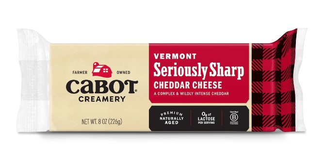
The cheese company’s new sustainable packaging strikes the perfect balance of product protection and environmental responsibility.

In a recent interview with Packaging Digest, Jed Davis, Cabot’s Vice President of Strategic Engagement and Sustainability, emphasized the environmental advantages of the company’s new packaging initiatives. This innovative approach is set to yield substantial reductions in resource consumption and greenhouse gas emissions. Specifically, the new packaging is projected to achieve a 23% decrease in fossil fuel emissions per bar, alongside a 19% reduction in water usage during the production of Cabot’s 8oz bar line. To put this in perspective, the water savings amount to three cups per 8oz bar produced.

Additionally, Cabot’s packaging strategy will offset 100,000 pounds of single-use resin by incorporating recycled materials, reinforcing the company’s commitment to sustainable practices. Davis stated, “This initiative not only benefits our operations but also has a broader significance for the industry.”

To further enhance its impact, Cabot has committed to sharing the findings of its grant-funded research with the dairy industry. This collaborative approach aims to extend the positive effects of these sustainability measures across the sector. As companies increasingly recognize the importance of environmental stewardship, Cabot’s efforts set a commendable benchmark for others to follow.

source:

https://www.packagingdigest.com/sustainability/cabot-cheeses-go-green-with-sustainable-packaging

Categories
News & Updates Sustainability

McDonald’s Ditches Plastic McFlurry Lids for a New All-Paperboard Design

Mickey D’s US rollout of the lid-free paperboard cups reduces plastic waste and supports sustainability goals. Watch a video of a machine producing an international variant, and read reviews from social media “experts.”

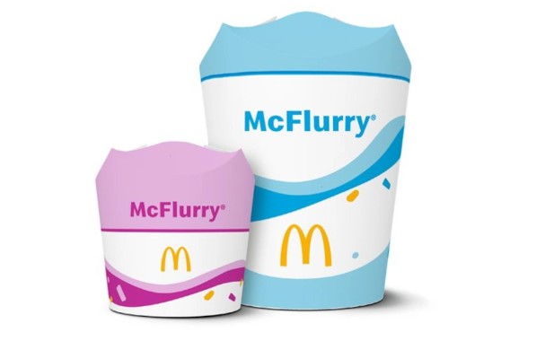
In a significant step towards sustainability, McDonald’s has introduced a novel soft-serve packaging design aimed at reducing plastic use in the United States. The fast-food giant has replaced its traditional McFlurry packaging, which featured a plastic dome lid, with an innovative lid-free cup made of paperboard.

The new design incorporates four perforated flaps that elegantly fold over the filled cup, offering both functionality and a more environmentally friendly alternative. This initiative aligns with McDonald’s broader commitment to minimizing its environmental footprint and promoting sustainable practices.

The rollout of the four-flap cups commenced on September 10, 2024, across all U.S. locations. Alongside this packaging innovation, McDonald’s introduced the Mini McFlurry, which is served in a smaller version of the same eco-conscious cup. Both the standard and mini McFlurry options will now utilize the four-flap packaging, further reinforcing the company’s dedication to reducing plastic waste.

By embracing innovative packaging solutions, McDonald’s is setting a precedent for sustainable practices within the fast-food industry, showcasing how consumer convenience can align with environmental responsibility.

Embracing Sustainability: McDonald’s Updated Cup Design

In a commendable effort to bolster its commitment to sustainability, McDonald’s has introduced an updated cup design for the US market. This initiative not only aims to reduce plastic packaging and mitigate single-use plastic waste but also aligns with the company’s broader environmental objectives.

As part of its pledge to source 100% of its primary guest packaging from renewable, recycled, or certified materials by the end of 2025, this new cup design marks a significant step forward. By prioritizing sustainable materials, McDonald’s is demonstrating a proactive approach toward minimizing its ecological footprint and fostering a circular economy.

This move serves as an exemplary model for corporations striving to blend operational efficiency with environmental responsibility. In a time when consumer awareness of environmental issues is at an all-time high, McDonald’s updated cup design exemplifies how innovation can facilitate a more sustainable future. As we look ahead, it is imperative that other organizations recognize the value in similar endeavors, thereby contributing collectively to a healthier planet.

Categories
News & Updates

Fearne & Rosie reveals new packaging design & listing with Tesco

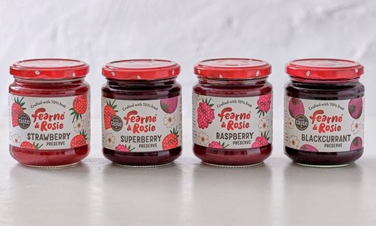
Bun Studio has worked with British jam brand Fearne & Rosie on a packaging design refresh for its range of reduced sugar spreads.

The evolution of brand identity is a critical aspect of business strategy, particularly in the competitive food sector. The recent collaboration between Bun Studio and Fearne & Rosie exemplifies a successful endeavor to enhance product appeal while preserving core brand values. The brief for this project was to cultivate a more mature and premium aesthetic without losing the playful spirit that initially defined the brand.

Under the guidance of Victoria Hemphill, Bun Studio implemented a design strategy characterized by striking visuals and vibrant graphics. By introducing bright red berry lids and employing a refined logo, the packaging achieves greater shelf visibility, an essential factor for consumer engagement. Hemphill emphasized the use of soft textures, hand-drawn illustrations, and a simplified color palette, all of which contribute to a clean and modern appearance. This design approach not only enhances the product’s aesthetic appeal but also evokes a sense of home and comfort, which is critical for establishing emotional connections with consumers.

From the perspective of Rachel Kettlewell, founder of Fearne & Rosie, the rebranding was imperative for broadening the market appeal of their jams. By positioning the product as an accessible yet premium alternative, Kettlewell aims to establish Fearne & Rosie as a prominent brand within the UK marketplace. The synergy between fear of being niche and the ambition to become a mainstream favorite reflects a strategic vision for market leadership.

Moreover, this refreshed branding coincides with a key opportunity: the brand’s inclusion in Tesco’s 2024 Accelerator Programme. This strategic placement has the potential to amplify visibility and accessibility, further propelling Fearne & Rosie towards its goal of becoming the most trusted family brand in the UK.

In conclusion, the redesign initiated by Bun Studio serves as an exemplary model of how thoughtful design can harmonize with strategic business objectives. By melding a mature, premium look with elements of playfulness, Fearne & Rosie is poised to capture a broader audience while maintaining the essence that originally endeared them to customers.

Source:

https://www.packagingnews.co.uk/design/new-packs/fearne-rosie-reveals-new-packaging-design-listing-with-tesco

Categories
News & Updates

Douglas Laing launches limited-edition Big Peat pack

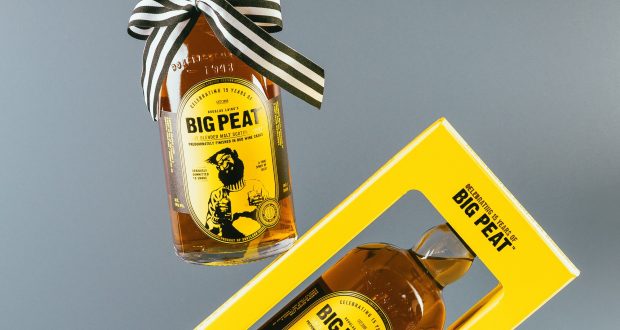
Douglas Laing has launched its Islay blended malt scotch whisky Big Peat in new bottling in celebration of its 15 year anniversary.

The recent release of the special edition of Big Peat encapsulates the rich heritage of Islay whisky in a uniquely crafted, giftable carton. This limited edition not only showcases the charm of Big Peat but also invites consumers to discover 15 notable points about the whisky, the Isle of Islay, and the iconic spirit itself. The design of the carton transcends mere presentation; it serves as an educational tool, enhancing the consumer’s appreciation for the complexities of Islay’s whisky-making traditions.

In addition to its engaging packaging, the special edition includes a scannable QR code, paving the way for enthusiasts to join Big Peat’s Club. This initiative promises to deliver further exciting developments in 2025, fostering a sense of community among whisky aficionados. The integration of technology into the whisky experience exemplifies Big Peat’s commitment to evolving alongside consumer expectations.

Chloe Wood, the brand manager of Big Peat, emphasizes the innovation behind this release. She notes that the hand-selected Red Wine Casks impart a distinctive flavour profile, harmoniously blending the renowned peat smoke with a delectable complexity of fruit-driven, chocolatey nuttiness. This careful maturation process culminates in a dram that is best appreciated slowly, highlighting the rich, multifaceted character of the whisky.

In conclusion, the special edition of Big Peat not only exemplifies the esteemed qualities of Islay whisky but also represents a thoughtful approach to consumer engagement. With its exquisite flavour and educational packaging, this release invites both seasoned connoisseurs and newcomers to immerse themselves in the enchanting world of Big Peat.

Source:

https://www.packagingnews.co.uk/design/douglas-laing-launches-limited-edition-big-peat-pack