Categories
News & Updates

Riedel opts for SIG on-the-go Combismile packs

Dutch juice drinks brand Riedel is switching to SIG’s on-the-go Combismile carton packs.

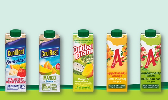
Riedel’s Appelsientje, CoolBest and DubbelDrank juice brands will benefit from the SIG’s Signature full barrier packaging material, where the small amount of polymers used are linked to certified forest-based renewable materials via a mass-balance system.

Riedel has extensive expertise in carton packaging, naturally evolving over time in close partnership with SIG.

The new 330ml on-the-go Combismile carton pack is a logical development, unifying Riedel’s carton packaging portfolio to offer the most convenient and sustainable choice for consumers.

SIG’s CFA 1824 filling machine for CombismileBig is providing Riedel with the capacity to fill 24,000 carton packs per hour and the ability to fill five different volumes: 200ml, 250ml, 300ml, 330ml and 350ml.

Julie van Bergen, marketeer at Riedel: “Being the first to offer Dutch consumers such a great convenient and sustainable packaging solution for our on-the-go juices is an important step forward for Riedel. We conducted an independent LCA and the positive results show SIG’s combismile pack has 75% less CO2 emissions than our previous PET bottles. On one hand we are following our carton pack roots, while on the other bringing true innovation with combismile and Signature Full Barrier, as our busy consumers gravitate towards more sustainable and convenient packaging options.”

Sonia Voicu, marketing manager BeNeLux & France at SIG: “Our combismile carton pack is the perfect match for Riedel’s famous Appelsientje, CoolBest and DubbelDrank juice brands, standing out on shelf and offering unparalleled on-the-go convenience and sustainability to consumers.”

Source:

https://www.packagingnews.co.uk/design/new-packs/riedel-opts-for-sig-on-the-go-combismile-packs

Categories
News & Updates

Cobra launches new street food-inspired cans

Cobra Beer has recently unveiled a new can design to celebrate street food from around the globe.

The 330ml cans feature motifs inspired by pan-Asian cultures and cuisines – ranging from Indian and Chinese to Thai and Japanese – to engage a new generation of adventurous foodies looking to explore different world dishes.

The design plays into Cobra’s long-standing association with Asian food as the go-to accompaniment to spicy flavours.

The cans are available in four-can multipacks, and are encased in a recyclable cardboard sleeve which also features a food-inspired design.

Lord Bilimoria CBE DL, founder and chairman of Cobra Beer, said: “When we created Cobra we wanted to achieve a smooth and refreshing taste to compliment a host of different delicacies. Our new can designs recognise the whole breadth of dishes that it can be paired with and are a great nod to our heritage. They will no doubt help our customers to build on the brand’s popularity to generate more sales.”

Kevin Fawell, off-trade sales director at Molson Coors Beverage Company, added: “Cobra is already recognised as the perfect partner to Asian food and the new cans will make an ideal accompaniment to social occasions and mealtimes at home. The artistic design will undoubtedly stand out on the shelf and help retailers create excitement in their food and drink displays, and lend themselves perfectly to pairings and meal deals.”

Source:

https://www.packagingnews.co.uk/design/new-packs/cobra-launches-new-street-food-inspired-cans

Categories
News & Updates

Who Dares Design behind branding and pack design for GLUG!

Who Dares Design have created the branding and packaging design range for GLUG!.

The fruit drinks brand turned to Who Dares Design, with the North-West establishing the name, visual identity and packaging range for the brand.

The packaging designs use product illustrations to articulate the fruit flavours of each drink, with vibrant colours highlighting the tropical flavours and their unique health credentials.

Ashok Meyyappan, owner of GLUG!, said “I couldn’t be more happy with our new branding and designs. I wanted a brand that was quirky but most of all sets itself apart from the competition, and I firmly believe the GLUG! brand does just that. Feedback from customers has been extremely positive.”

Source:

https://www.packagingnews.co.uk/design/who-dares-design-behind-branding-and-pack-design-for-glug

Categories
News & Updates

Baggi works on new branding for Honestly Tasty

Baggi has created the brand strategy, identity and packaging for Honestly Tasty.

The packaging is said to reflect the artisanal quality of the plant-based cheese and features dairy cues. Baggi added that while “the brand world combines a vibrant colour palette, playful tone of voice and mouth-watering imagery to create 100% plant-based deliciousness that really packs a punch”.

Baggi founder Mark Baxter said: “We were inspired by the unique process and attention to detail that goes into crafting each cheese. From the very start we wanted to design a brand that finds the right balance between being an artisan, premium cheese combined with the playful personality of the company and its customers. One that feels like a young, good quality, plant-based cheese brand.”

Honestly Tasty founder Mike Moore added: “I think the only way to change people’s attitudes and help the environment is by creating great products because I don’t think the majority of people are going to change behaviour without having the impetus of something which is just as good and accessible.”

Source:

https://www.packagingnews.co.uk/design/baggi-works-on-new-branding-for-honestly-tasty

Categories
News & Updates

StormBrands behind refreshed design for Morrisons’ organic range

StormBrands has partnered with Morrisons to redesign the supermarket giant’s organic range of products.

The brief for Storm was to rejuvenate Morrisons organic offering across the entire range of SKUs in line with a refreshed brand positioning and changing consumer behaviour around consumption of organically produced products.  The agency was also asked to help educate consumers on what organic stood for by defining a distinctive and disruptive identity.

The resulting design showcases a new organic illustration, using natural earthy colours linked to the landscape. In addition, the “flexible label layout has an artisanal ‘batch’ feel, while each variant has its own colourway to aid navigation and differentiation, comprising three tones: a light top layer, an earthy core and a rich base”.

Zoe Phillipson, StormBrands creative director, said: “Having defined wider sources of inspiration driving both shopper and consumer awareness and consideration, we’ve now elevated the Morrisons organic range from following legacy category codes at a value for money price to setting new standards that respond to increasing consumer experimentation and aspiration around food, diet and supply chain. The resulting design system is fresh and contemporary with a beautifully crafted logo that encapsulates the Morrisons organic brand story.”

StormBrands worked with Morrisons on the redesign of its Counted range of calorie-controlled products.

Source:

https://www.packagingnews.co.uk/design/stormbrands-behind-refreshed-design-for-morrisons-organic-range

Categories
News & Updates

United Caps and Mimica partner to produce ‘intelligent’ cap

United Caps has worked with start-up Mimica to produce a unique closure displaying freshness indicators for food.

Mimica was able to calibrate a gel that never comes into contact with the product yet enables a specialised label to change from smooth to bumpy based on storage conditions and food profile.

The United Caps and Mimica teams were able to develop a fully recyclable cap that does not affect bottle recyclability yet offers a fast, easy way for a consumer to ensure food quality is still good.

The closure consists of a base cap and over cap, a bumps tray and the top foil label that becomes bumpy as food deteriorates.

The Mimica cap arrives at the filling line in two parts: The base cap, which has been tested by key filling line manufacturers and requires only minimal changes to the filling line; and the over cap which is applied after the filling process with a dedicated machine integrated into the production flow like other modules such as labelling or film wrapping. The top cap, where the bumps will appear is dormant until it is activated by the consumer which happens automatically when the cap is twisted open for the first time.

The cap is currently undergoing a pilot project in the UK with an orange juice brand.

United Caps claims in the UK alone thee is up to 121 million kilograms of total annual waste of juice, and the new Mimica Touchcap has a waste reduction potential of 44%, equating to 53 million kilograms annually of juice.

Benoit Henckes, chief executive of United Caps, said: “We look at solutions like this in a holistic fashion,” Henckes added. “Is it innovative? Is it sustainable? What is the ROI for a brand who adopts it? Are there changes that need to be made on filling lines? What happens to the cap at end of life? The Mimica TOUCHCAP ticked all those boxes. If just two days of shelf life could be added to food products, retail waste could be cut by 50%, and home waste of perishable products could be cut by 63%. Brands who adopt this technology could increase sales by at least 10%, including the willingness of consumers to purchase larger containers of products, such as orange juice, without worrying as much about spoilage prior to full consumption.”

Source:

https://www.packagingnews.co.uk/news/markets/food/united-caps-and-mimica-partner-to-produce-intelligent-cap