Categories
News & Updates Sustainability

Greiner helps Tesco add ‘snap’ back to PP yoghurt tubs

Over the past two years, following requests from retailers, Greiner Packaging has replaced yoghurt multi-packs made from polystyrene (PS) with polypropylene (PP), and ‘Project Snap’ has now successfully recreated the ‘snap’ which consumers love.

Yoghurt multi-packs have traditionally been made from polystyrene (PS), but there is currently no PS recycling stream in some territories, leading supermarkets to focus on removing all PS products.

Seeking to deliver a sustainable alternative, in February 2018 Greiner Packaging’s factory in Dungannon, Northern Ireland, began trials using polypropylene (PP), and says it was the first in the UK to recreate a functional multi-pack in PP.

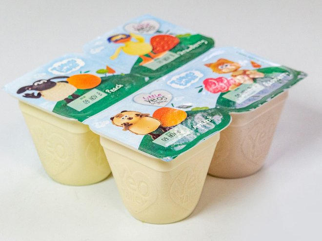
One of the advantages of PS was its ability to deliver an effective ‘break’ which was initially difficult to achieve with PP. Leading UK retailer Tesco was one of the first customers to move from PS multi-packs to PP multi-packs, but consumers were disappointed that packs made from the new material did not ‘snap’ in the same way as the previous PS packs.

In July 2020, Greiner Packaging began ‘Project Snap’ to develop and improve PP multi-pack breakability. By October 2020, the first successful filling trials of the latest PP 4-pack had begun, and the new improved yoghurt 100g 4-packs are now on-shelf.

Multi-pack development from PS to PP has reportedly taken considerable investment, but has been achieved faster than originally expected, with ‘Project Snap’ delivering the final part of the story.

“Over the past two and a half years, Greiner Packaging Dungannon has invested heavily in delivering these multi-packs made from PP and then further engineering to give the same satisfying ‘snap’ as their predecessors,” says Greiner Packaging UK & Ireland CEO Philip Woolsey

“The next step, for PP yoghurt multi-packs will be to manufacture them using recycled PP,” Woolsey concludes. “Mechanically recycled PP can currently only be used for non-food packaging, however food approval is now in preparation. Chemically recycled PP is suitable for food contact, but not readily available as there are no large-scale recycling streams for PP.

“Greiner Packaging is currently involved in a project that aims to obtain food approval for r-PP from mechanical recycling. Ultimately, we will have succeeded in helping retailers move to using a material that genuinely delivers on our circular economy commitments, while still keep the fun element in place for consumers.”

Source

https://packagingeurope.com/greiner-helps-tesco-add-snap-back-to-pp-yoghurt-tubs/

Categories
News & Updates

New secondary packaging based on barley surplus unveiled by Corona

Corona has revealed a new project that harnesses surplus barley straw to create a new paper secondary packaging solution.

Corona is the first global brand to leverage the technology and processes that have been developed over the last three years by AB InBev’s Global Innovation and Technology Centre (GITEC). This technology reimagines the use of barley, giving the essential beer ingredient new life as a packaging solution.

Barley straw, a leftover from farmers’ harvests, will now be used through a unique pulping process built to handle its relative fragility. Combined with 100% recycled wood fibres, this process creates a paper board to produce new packaging that is reportedly as strong and durable as a regular six-pack.

According to the company, turning barley straw into paper fibre uses 90% less water in its production than the traditional virgin wood process, along with less energy and fewer harsh chemicals.

Corona also says that using leftover barley straw is more productive than the equivalent area of woodland, and the company sees this as one path forward to eliminate the need for virgin trees and raw material from their supply chain in the future.

Upon completion of the pilot, AB InBev, Corona’s parent company, will review rolling out the technology to its other brands, which include Budweiser and Stella Artois.

Keenan Thompson, director of packaging innovation at AB InBev, said: “We’re excited to finally launch this new packaging innovation we’ve been developing over the past three years. At AB InBev we are continually pushing boundaries by developing scalable solutions. Today is a proud moment for us, not only are we providing an opportunity for farmers but we’re also delivering a more mindful solution to the consumer.”

The new packaging will launch today with an initial 10,000 six-packs rolling out as a pilot in Colombia in March, followed by Argentina later in 2021 as Corona looks to scale the new solution globally.

Source

https://packagingeurope.com/new-secondary-packaging-based-on-barley-surplus-unveiled-by-corona/

Categories
News & Updates

Evian launches its first ever sparkling drinks in cans

Evian has unveiled Evian+ flavoured sparkling drinks packaged in recyclable aluminium cans – a first for the brand. 

The water giant said the move ‘demonstrates ongoing innovation’ as the brand expands its product portfolio into two new product categories with the launch of functional sparkling and flavoured.

Shweta Harit, VP of marketing at Evian, said: “Encouraging our consumers to be healthy and perform at their highest level is at the heart of all that we do at Evian, so we’re excited to be able to action this in a new and appetizing way. The introduction of a sparkling flavoured functional water reflects the importance of adapting to consumer habits. We are delivering the pure taste of evian natural mineral water in a new and fun way, as we continue to act and support a generation who seek to become the best version of their true selves.”

Source:

https://www.packagingnews.co.uk/design/new-packs/evian%e2%80%aflaunches-first-ever-sparkling-drinks-cans

Categories
News & Updates

Vetroplas supplies metal packs for George Northwood

Vetroplas has supplied aluminium packaging for hairdresser George Northwood’s home haircare products range UNDONE.

Working in partnership with Envases, Vetroplas created the packaging using 250ml and 500ml aluminium bottles with a clean and contemporary ‘premium’ look.

Multi-coloured offset direct printing onto the bottle, over a white base coat covered with soft touch varnish, allows clear communication of straightforward propositions which cut through a crowded and confusing market.

Fiona Wilson, chief executive of George Northwood, said: “We are delighted with the finish of

our packaging from Vetroplas. We are one of the first brands to launch a full range of haircare

into the mass market using aluminium. The print execution supports our commitment to

sustainability in a unique and eye-catching way.”

Source

https://www.packagingnews.co.uk/design/new-packs/vetroplas-supplies-metal-packs-george-northwood

Categories
News & Updates

The Famous Grouse launches limited-edition rugby bottles

The Famous Grouse whisky brand has launched a limited-edition label to celebrate the brand’s role as the official sponsor of The British & Irish Lions.

The one-off design sees the iconic label of The Famous Grouse transformed to read ‘The Famous British & Irish Lions’.

Sold exclusively at Tesco from today, the bottle will be available in three variations (35cl, 70cl and 1L) before being distributed to additional retailers and the on-trade from April.

It also forms part of The Famous Grouse The Spirit of Rugby campaign, following the announcement that The Famous Grouse will also be the Official Partner of Premiership Rugby, SA Rugby, and Glasgow Warriors.

Chris Anderson, Head of Edrington Brands, said: “The Famous Grouse has been investing in the sport of rugby for 30 years, and we are very proud to reaffirm our commitment to this great game with the launch of this limited-edition bottle. On sale throughout the British and Irish Lions tour the bottle will enable us to celebrate the pride and camaraderie we see on the rugby pitch every matchday.”

Source

https://www.packagingnews.co.uk/design/new-packs/famous-grouse-limited-edition-rugby-bottles

Categories
News & Updates

Kit Kat prototypes recycled soft plastic wrapper

A coalition of companies with a shared vision to close the loop on soft plastics have produced the country’s first ever soft plastic food wrapper made with recycled content for the Kit Kat brand of chocolate bars.

Food grade recycled soft plastic packaging is a key missing link in Australia’s bid to improve waste management and build a circular economy, and the prototype Kit Kat wrapper represents Australia’s opportunity to close the loop on recycling soft plastics.

The coalition of companies consists of Nestle, CurbCycle, iQ Renew, Licella, Viva Energy Australia, LyondellBasell, REDcycle, Taghleef Industries and Amcor – all of whom brought their individual expertise to the table for the prototype’s creation.

Turning soft plastic back into oil is currently the only path plastic waste can take if it is to be transformed into a food safe wrapper. Unfortunately, this is technology that Australia does not have yet at scale.

“Between us, we have shown that there’s a pathway to solve the soft plastics problem,” said Sandra Martinez, CEO of Nestle Australia.

“To build this at scale, across all states and territories, across hundreds of councils, is going to take a huge effort from government at all levels, from industry and from consumers.

“Manufacturers like Nestle will have a key role in driving demand for food grade recycled soft plastic packaging, and creating market conditions that will ensure all stakeholders throughout the value chain view soft plastics as a resource and not waste.”

The initiative emerged from a trial underway on the NSW Central Coast, where Australian Recycler iQ Renew and Nestle are working together on a trial of kerbside collection of soft plastics.

These collected plastics, together with plastics collected via REDcycle supermarket soft plastic collection, formed the starting point for the project.

To date, soft plastics collected in Australia have been made into products like outdoor furniture, added to road base or used in waste to energy.

“To improve the recycling rate of soft plastics, kerbside collection is an important point of convenience,” explains Danial Gallagher, CEO of iQ Renew.

“In the trial, soft plastics are collected from kerbside recycling bins in a dedicated bright yellow bag, then sorted from the recycling stream at our MRF.

“To create the Kit Kat wrapper with 30 per cent recycled content, the soft plastics were processed, then sent to Licella for conversion back into the oil from which they originally came. This oil was then used to produce new food grade soft plastics.”

According to Tanya Barden, CEO of the Australian Food and Grocery Council (AFGC), learnings from the Central Coast trial will be informative as the AFGC works to develop an extended producer responsibility scheme for hard to recycle plastics, funded by a National Product Stewardship Investment Fund grant.

“Among other things, we’ll be looking at how this model can be scaled up, ensuring there is healthy demand for packaging with recycled content and helping bring to life local industries that can unlock billions of dollars of value that’s currently lost to landfill,” Barden continues.

On 19 March, Nestle will host leaders from across the plastic packaging value chain for a roundtable event, The Wrap on Soft Plastics, exploring the opportunities and hurdles for soft plastics recycling.

Source

https://www.packagingnews.com.au/latest/kit-kat-prototypes-recycled-soft-plastic-wrapper

Categories
News & Updates

The inside story of McDonald’s packaging rebrand

McDonald’s recently teamed up with Pearlfisher to rethink its packaging design, with a focus on aesthetic minimalism. We talked with Matt Sia, creative director at Pearlfisher, to get the inside story on the rethink and assess its importance to McDonald’s’ wider brand.

Could you introduce the rebrand to us and unpack some of its key features?

Our focus in partnering with McDonald’s was on redesigning their global system of packaging. What we created is a system led by thoughtful, colourful illustrations of every menu item. Transitioning from a design system with prominent on-pack messaging, the graphic representations of menu items help make each of the structures more connected and evocative of McDonald’s’ playful point-of-view.

No matter the combination of each unique order, from the cool, blue waves on the Filet-O-Fish clamshell or the golden, melting cheese on the Quarter Pounder with Cheese clamshell, the packaging makes for an expressive, visual system.

From McDonald’s’ perspective, what was the reasoning behind the rebrand?

The packaging redesign is part of a broader brand evolution. With so much fresh and new at McDonald’s – from smart kiosks to menu innovations – it made sense for the global packaging to change in step with the direction the brand is taking.

We took into consideration how we could support the renewed brand identity to foster a feel-good experience that works around the world. No matter the region or language, we wanted the packaging design to communicate joyful moments while being immediate and universal.Expand

McDonald's-Case-Study-6.jpg

What feelings did you want to convey with the new packaging?

We were very excited to have the opportunity to design the innate joy of the McDonald’s brand back into the packaging by allowing each unique menu item to speak for itself. The packaging became a creative space to showcase the specialness of the menu and the brand.

What we created is about delighting customers. It’s about bringing them into the playfulness of the McDonald’s brand through the packaging, while also providing the crew with a design system that is easy to navigate and work with, no matter where you are in the world.

The new look you’ve created seems to favour a more minimalist style, which is a trend that we’ve seen proliferating in brand design over the past few years. In your view, in the context of branding as a whole, what has motivated this trend?

A sense of ease and simplicity for consumers should be a goal for all brands. With McDonald’s, we focused on what felt the most fitting for their personality – what felt the most natural. This is what led to the joy and simplicity of the graphic expression, rather than being driven by style or trend.

It’s important for every brand to represent itself in a unique and truly special way, considering the details – especially when the expression is stripped back to its most personable form. The full family of products looks confident and simple now, but it’s because a lot of thought and consideration went into each item.Expand

McDonald's-Case-Study-5.jpg

Above and beyond striking a chord with consumers, we’ve read that another purpose of these design changes was to help McDonald’s employees work more efficiently. Could you break this idea down for us?

While it is playful, the new McDonald’s packaging is easy to understand and easy to navigate. This was important not only for resonating with customers around the world, but also to ensure that the redesigned packs didn’t add any new complexities for the crew assembling orders in restaurants.

The graphics-led system we created is identifiable on every wrap, clamshell, carton, and pack, making continued efficiency a guarantee, not a possibility.

How does this packaging rebrand fit into McDonald’s’ overall brand refresh?

This new packaging redesign lives seamlessly with the brand identity, as they were created in parallel over the course of four years. The point-of-view and principles hold true across every menu item to make way for a cohesive system that is aesthetically connected, functionally immediate, and emotionally uplifting.

Consistency through visual language from brand identity to packaging is key – especially for a brand as universal as this – and we were able to design a joyful, simple way forward for McDonald’s’ global system.

Source : https://packagingeurope.com/the-inside-story-of-mcdonalds-packaging-rebrand/

Categories
News & Updates Sustainability

MMC moves to large-scale production of mushroom-made packaging

The Magical Mushroom Company (MMC) has announced the launch of large-scale production of its mushroom-derived biodegradable packaging, a plastic-free alternative that can be broken up to biodegrade on a home compost heap or flowerbed. 

The company claims that this new packaging offers the same performance, at comparable cost, to traditional polystyrene, and is already being used to protect goods ranging from cookers, to cosmetics and a variety of everyday consumer products, including Diageo’s non-alcoholic gin brand, Seedlip

This is made possible through mycelium composite technology, pioneered and patented by US firm Ecovative Design LLC. The process takes the post-processing waste from agricultural products such as hemp, hops, corn and timber and combines them with mycelium – the root system of the mushroom. This living material is then grown to shape using 3D moulds of the packaging design. These moulds are baked, hardening the material and preventing any further growth. The full process, from design to prototype takes 14 days. 

MMC Holding International LTD, trading as The Magical Mushroom Company, has the exclusive EU, UK and Ireland licence to produce Mushroom® Packaging. Its first facility, in Esher, Surrey, began production in August 2020 and has capacity to produce more than a million packaging units per year. Expand

magicmushroom12032.jpg

The business will open a second UK plant in 2021, increasing total production to more than three million units per year. This will be followed by the opening of plants in Bulgaria and Italy, which together will provide production capacity for the EU of more than six million units annually. A third continental European plant (in Germany) will open in 2022.

The company says that packaging produced by MMC is 100% biodegradable at home and breaks down in soil within 40 days. It also fully breaks down in water in just 180 days, meaning it has the long-term potential to significantly reduce the level of plastic waste in our oceans.

MMC is already working with a number of iconic brands that are serious about reducing their environmental impact. Current clients include Lush Cosmetics, Raine Marine, Bodyshop, Seedlip (from the Diageo group) and luxury designer, Tom Dixon. 

Paul Gilligan, founder and CEO, commented: “We called ourselves the Magical Mushroom company for a reason. Mycelium’s unique qualities really are magical, enabling us to produce a hard-wearing, cost effective and totally sustainable alternative to polystyrene packaging that biodegrades in the back garden in under 40 days. 

“We’re thrilled to be open for business and excited by how quickly we’re scaling up our production and securing ever bigger contracts. Customer feedback has been universally positive and our earliest customers are all – without exception – now coming back for more.”

“With over a decade of experience producing mycelium materials at scale, Ecovative is thrilled to see consumers and brands around the world adopt Mushroom® Packaging,” said Gavin McIntyre, co-founder and Director of Business Development at Ecovative Design. “We are excited to be working with Magical Mushroom Company to further scale this technology and look forward to providing more brands with this breakthrough packaging solution.”

Source

https://packagingeurope.com/mmc-moves-large-scale-production-of-mushroom-made-packaging/

Categories
News & Updates Sustainability

Coda Group launches coffee pod material made from agricultural waste

Biomaterials manufacturer Coda Group has launched Solinatra – a home-compostable material made from agricultural waste that the company says can be used to replace plastic and aluminium coffee capsules.

Over 60 billion coffee capsules are consumed globally each year, and many of these are currently made from layers of plastic or aluminium. According to Coda, while most capsules are technically recyclable, only a small proportion actually make their way into recycling streams.  

Coda’s own solution is home compostable – reportedly breaking down in the same time frame as a banana skin and leaving behind zero contamination. Manufactured from 100% plant-based materials sourced from agricultural waste products, the company is pitching Solinatra as a low-carbon solution that can help coffee brands and consumers to reach net-zero goals.  

Following a presentation and Q&A at the AMI virtual summit, Simon Girdlestone, head of sales and marketing at Coda Group, says: “Biodegrading in the same time as a banana skin, Solinatra is a revolutionary new material. Our innovative new biomaterial is a gamechanger for coffee brands and capsule manufacturers worldwide, and we are excited to lead the charge for truly sustainable production. 

“Currently consumers face a postcode lottery as to what recycling or composting opportunities are available to them, with Solinatra customers can be safe in the knowledge that their coffee capsules cause no harm to the environment no matter how they are disposed of.”  

Source

https://packagingeurope.com/coda-group-launches-coffee-pod-material-made-from-agricultural-waste/

Categories
News & Updates

Thirst Craft Gives Brooklyn Brewery’s Hazy IPA A Juicy Pop Art Makeover

We don’t need to remind you, but the beer can is one of the most consequential canvases around. Take a walk around your favorite liquor store—not the 7-Eleven, mind you—and take a gander at the beer cooler. Plenty of craft breweries bring the art gallery to the fridge, and it’s a perfect way for designers to get their work to the masses.

Of course, strategic drinks design agency Thirst Craft is saying “no duh” right this second.

Editorial photograph

Well, they have an unveiling happening at the beer cooler right now for Brooklyn Brewery’s new Hazy IPA. With clear nods to Warhol and Lichtenstein, the new brew leans heavily on the pop art aesthetic, with plenty of bold black lines and polka dots to boot. The iconic Brooklyn Brewery Badge by Milton Glaser gets a cartoonish makeover, with a wilding-out background of colors matching the fruit segments that wedge themselves into the design. Pulp art, indeed.

Editorial photograph

Even the visual identity outside of the packaging is a literal exclamation point, whether it’s experienced in your natural environment or on a social media platform. It’s juicy and tropical, the perfect bright-ass balm to get you through these final weeks of winter.

Editorial photograph

“Thirst really took the time to understand the fundamentals of our brand, which made the project truly collaborative at every point,” commented Samantha Itzkovitz, VP of marketing at Brooklyn Brewery, in a press release. “Thirst knows how to identify the sweet spot where fun and engaging branding meets consumer need and market opportunity, which is arguably the biggest challenge when it comes to developing new brands these days. They were a joy to work with every step of the way.”

Editorial photograph

“To us and the world, Brooklyn has never been just another brewery,” added Matt Burns, Thirst creative director and founder. “It’s a true product of its neighborhood: spirited, creative, authentic. So we knew when we got this brief, it could never be ‘just another’ hazy IPA. We needed to give it the Brooklyn twist. When we landed on the name, ‘Pulp Art,’ we saw the opportunity to mash up two New York icons. One wanted to democratize art, and the other wanted to democratize Hazy IPAs. It was a perfect match. With such a strong core idea, we could have so much fun with the brand. And we did.”

Editorial photograph

Anyway, if you ever wanted to know what a Milton Glaser logo would look like if it went through a pop art filter, this is likely what you’d get. And it’s a bright, bold, and incredibly playful addition to your beer cozy

Editorial photograph

Source

https://thedieline.com/blog/2021/3/4/thirst-craft-gives-brooklyn-brewerys-hazy-ipa-a-juicy-pop-art-makeover