Categories
News & Updates

Conagra Brands and Dolly Parton Partner on New Food Line

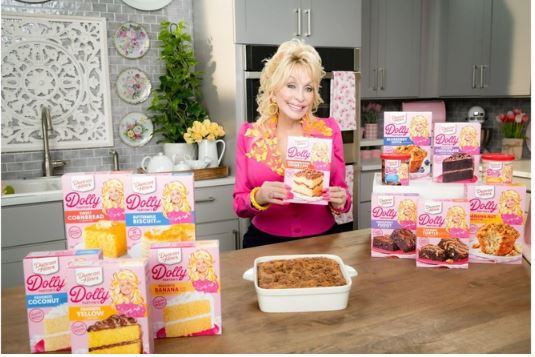
Parton and the CPG company have already had a multiyear successful partnership.

By now, unless someone lives under a rock or on some remote island, everybody knows who Dolly Parton is. The singer, philanthropist, and entrepreneur just turned 78 last week and shows no signs of slowing down.

Parton is now partnering with Conagra Brands on a new line of food products that will include frozen, refrigerated, grocery, and snack items inspired by down-home comfort cuisine.  This comes after the continued success of her multiyear partnership with Duncan Hines.

“I loved co-creating my Duncan Hines line with Conagra and I’m thrilled we’re going well beyond the baking aisle with new items across the store,” said Parton. “We’re looking to continue to inspire special moments in the kitchen, with some of my family’s favorite recipes, and I think people are really going to love them!” 

The new products will start rolling out in stores nationwide this month, with an expanded line-up of Duncan Hines’ mixes including Chocolate Cake Mix, Yellow Cake Mix, Cinnamon Crumb Cake Mix, Blueberry Muffin Mix, and Banana Nut Muffin Mix.

Additionally, the first single-branded Dolly Parton item, Buttermilk Pancake Mix, will start hitting shelves this winter and marks Dolly’s first foray into the breakfast category. More items are expected to launch later in 2024 including frozen items.

“We are beyond thrilled to build on the success of our partnership with one of the most beloved and respected women in the world,” added Lucy Brady, president of Grocery & Snacks at Conagra Brands. “With our expertise in food, we’ll help bring Dolly’s vision and favorite recipes to so many tables across America, with delicious new offerings across a wide range of eating occasions.”

Source:

https://www.packagingdigest.com/food-packaging/conagra-brands-and-dolly-parton-partner-on-new-food-line

Categories
News & Updates

Cheerios Special-Edition Packaging Gets Personal

Heart-shaped Cheerios are back in honor of American Heart Month and packed this year in special-edition generic name boxes such as Grandparents or Mamá. Or you can customize your own box.

At a Glance

  • Cheerios offers custom-printed cereal boxes for American Heart Month
  • Consumers can customize cereal boxes with any name for $20
  • Customized boxes feature names of loved ones, encouraging heart-health awareness

You may never see your face on Wheaties, but you can have your name on a Cheerios box.

That’s because the brand is bringing back its beloved Happy Heart Shapes in honor of American Heart Month with a fun new custom twist. To celebrate five years of Happy Heart Shapes and the role Cheerios can play in supporting Americans who desire a heart-healthy lifestyle, Cheerios is launching special-edition boxes featuring names of those who inspire you to make heart healthy choices.

In addition to special-edition boxes with names like Mom, Friend, Grandparents and Family in both English and Spanish available at retailers nationwide throughout February, consumers can also order personalized yellow boxes online featuring any name at Cheerios.com.

Customization will set you back $20. If you want it in an acrylic case as a keepsake, add another $20.

Shipping is free while supplies last.

The only limitation is that it be within 18 characters.Cheerios-Personalization-Group-800.png

General Mills

As the brand’s release explains, “when people see Grandma, Abuelo, Bestie, Dad, and the names of other loved ones on the cover of their box, they will be reminded to take care of their heart not only for themselves, but for those people who mean the most to them. The name boxes are a great way to remind people that, apart from the convenience and great taste, Cheerios are made with whole grain oats, which can help lower cholesterol as part of a heart healthy diet.”

“From being there to cheer on your kids’ activities to laughs across the breakfast table — these are the moments with loved ones that remind us why it’s worth saying, ‘Yes’ to taking care of our heart health,” says Kathy Dixon, Senior Brand Experience Manager for Cheerios. “This year, the special-edition Cheerios name boxes and Happy Heart Shapes are a simple reminder for people to take care of their heart so they can be there for all of life’s special moments.”

Special-edition boxes will be available at retailers nationwide in five flavors: Original yellow-box Cheerios, Honey Nut Cheerios, Chocolate, Strawberry Banana, and Apple Cinnamon.

Source:

https://www.packagingdigest.com/packaging-design/cheerios-special-edition-packaging-gets-personal

Categories
News & Updates

Hinged Fiber Containers Transform Takeout Convenience

New recyclable and compostable molded pulp packaging from Sabert Corp. elevates the overall takeout and delivery experience for consumers while reducing the environmental impact.

Packaging sustainability hinges largely on the material used. What if highly sustainable foodservice containers were made more convenient by making them hinged?

That’s the reasoning behind a new line of molded pulp (aka fiber) hinged containers and portion cups for foodservice from Sabert Corp.

“As demand grows for sustainable food packaging, we engineered our pulp hinged containers and portion cups to provide the ideal blend of convenience and quality while also being better for the environment,” says Stephny Halstead, VP of marketing and new product development, Sabert. “Our long-standing commitment to sustainability ensures we continue to help reduce food waste and ensure food is delivered to consumers safely and sustainably.”

The containers are suitable for a variety of food including chicken wings, sandwiches, quesadillas, and more.

Sourced from renewable materials including wood fiber as seen in the video of the process above, the recyclable molded pulp products extend the supplier’s popular line of sustainable and compostable products with a design that better meets the needs of foodservice operators and customers. Benefits include…

  • Easy opening/closing hinged design for consumers and operators;
  • Strong, robust lock prevents leaks and spills during delivery;
  • Perforated lids tear away easily for table-ready dining on-the-go;
  • Durable construction ensures safe transport for takeout and delivery;
  • Resistance to moisture, oil, and grease for a mess-free dining experience;
  • Made with PFAS-free pulp and are commercially compostable.

Chris Howell, the company’s director of product management, tells Packaging Digest that “the initial line features six items including three-compartment options.”Sabert-Pulp-Packaging-Green_Collection-Sauces-720.jpg

SABERT CORP.

The pulp portion cups are designed to serve an assortment of dips and sauces including ketchup, salsa, or dressings. They offer benefits include…

  • Perfect accommodation for individual portions and small servings;
  • Availability in the three popular sizes;
  • Stackable and secure lid fit available in pulp or clear PET;
  • No-leak assurance to better keep dips and sauces securely contained.

The hinged pulp containers have been favorably received.

“Early customer feedback has been highly positive,” reports Howell. “We are hyper-focused on continuing to develop best-in-class sustainable solutions for our customers.”

Source:

https://www.packagingdigest.com/food-packaging/hinged-fiber-containers-transform-takeout-convenience

Categories
News & Updates

Straight Forward Design works on new Clipper packs

Ecotone-owned tea company Clipper has unveiled revamped packaging for its ‘There’s tea, then there’s GOOD tea’ strapline.

Straight Forward Design was tasked with the new brand positioning, which was developed by creative agency Isobel.

The push aims to engage with conscious consumers, reflecting Clipper’s work to preserve and promote biodiversity through sustainable farming and working with tea-growing communities.

To bring to life Clipper’s brand positioning, the push features playful hand-drawn illustrations of insects, flowers and birds, with a bright, natural colour palette.

Hayley Murgett, European head of category – hot drinks, Ecotone, said: “At Clipper, sustainability is at our core – but it hasn’t always been easy to communicate all the good we do to consumers in a clear way.

“With our new 360 global campaign, we’ve developed a simple, yet distinctive idea, that heroes Clipper as the ‘Good’ tea, enabling consumers to make a difference just by picking up a pack.

“We want to persuade more consumers to question their tea choices, as not all tea is fair or natural, as well as reconnect them to nature. Once people re-engage with nature, the more they see the benefits and want to do more to protect it.

“Harnessing our new strategy, the Straight Forward Design team have elevated the initial thinking to a bigger idea, allowing us to seamlessly communicate complex issues with a beautiful, informative campaign, all while maintaining our signature light-hearted and approachable tone.”

Mike Foster, founder and creative director, Straight Forward Design, added: “This new work really demonstrates how Clipper are working to help people and nature thrive. The tea aisle is transformed into a veritable forest of flora and fauna through our vibrant new packaging designs, further brought to life via impactful social, digital, and out-of-home communications.”

Source:

https://www.packagingnews.co.uk/design/new-packs/straight-forward-design-works-on-new-clipper-packs

Categories
News & Updates

Lewis Moberly creates new designs for Little Freddie

Brand design agency Lewis Moberly has worked on designs for organic baby food brand Little Freddie as it launches fully recyclable packaging.

Lewis Moberly was briefed to deliver a new design system for Little Freddie across the UK market linking through to the brand’s digital expression.

Pack hierarchy also needed to be strengthened to aid navigation whilst being mindful of future NPD.

Existing packaging design hadn’t reflected the quality and superior taste of the ingredients as well as the brand’s premium positioning that made it so distinct from its competitors.

The new design builds on strong existing brand assets – the distinctive ‘squiggle’ works across all packs.

Range differentiation is delivered through fun illustration, messaging, and range imagery including a new serving spoon.

Taste appeal is achieved through fresh ingredient visuals ‘heroed’ front and centre of pack with ‘pops’ of colour.

The brand’s ‘off pack brand world’ has been introduced giving the range a premium, ‘foodie’ air but with a playful edge ensuring it doesn’t lose its reassuring feel.

Emily Fox, creative director at Lewis Moberly, said: “Unlike other brands in the baby food category Little Freddie talks to parents before their children. We’ve therefore introduced a more sophisticated colour palette reflecting the flavour of the products as well as acting as a navigational tool. We’ve very much kept the essence of the Little Freddie brand but delivered an everyday premium feel with more taste appeal and a smile in the mind.”

Joe Budge, marketing manager, Little Freddie added: “It has been a pleasure to work with Lewis Moberly to bring in more personality and warmth to our packaging while strengthening the range navigation. They have done a fantastic job to retain the brand assets that have brought us success so far, our white pack and distinctive squiggle. Exceptional ingredients remain at the core of our brand and the new design reflects this in a more succinct way with the quality of our food shining through. This helps us to appeal to discerning parents allowing them to feel good about the choice they’ve made for their children. The new design also has room to flex as our range grows.”

Source:

https://www.packagingnews.co.uk/design/new-packs/lewis-moberly-creates-new-designs-for-little-freddie

Categories
News & Updates

Limited-edition launch of Tomintoul single malt scotch whisky

Tomintoul Single Malt Scotch Whisky has recently launched a limited-release of a rare 50-year-old single cask, double wood matured Vintage expression.

Home » Design » New packsAdd to Bookmarks

By Waqas Qureshi 24 January 2024

Limited-edition launch of Tomintoul single malt scotch whisky

Tomintoul Single Malt Scotch Whisky has recently launched a limited-release of a rare 50-year-old single cask, double wood matured Vintage expression.

Tomintoul-Vintage-1973.jpg

The beautiful bottles vary in shape and have an elegant look, along with the casing.

With only 281 bottles available, the limited release of the Tomintoul Vintage 1973 Cask No. 261 is now available to collectors globally.

Source:

https://www.packagingnews.co.uk/design/new-packs/limited-edition-launch-of-tomintoul-single-malt-scotch-whisky

Categories
News & Updates

Nescafé revamps packaging in bid for further shelf appeal

Nescafé, the world’s leading coffee brand, has refreshed its branding and packaging.

The 85-year-old coffee brand’s new packaging features modern, ‘eye-catching’ designs across its product portfolio including, Nescafé Original, Nescafé Gold Blend, Nescafé Azera and Nescafé Frothy coffee range, aimed to stand out on the shelf and capture attention.

Nescafé said the design amplifies and ‘locks in place the accent in Nescafé behind the logo on all packs, and showcases the inclusion of coffee bean imagery.

Its important declaration of “100% responsibly sourced coffee” is prominently displayed on every jar and pack.

Sophie Demoulin, Nescafé marketing director, Nestlé UK and Ireland, said: “This relaunch represents a significant milestone for our brand as we continue to evolve and stay ahead in the ever-changing coffee industry.

“By introducing new captivating pack designs, and making substantial investments in the brand, we want to demonstrate that we are dedicated to delivering exceptional coffee experiences to our fans.”

Source:

https://www.packagingnews.co.uk/design/new-packs/nescafe-revamps-packaging-in-bid-for-further-shelf-appeal

Categories
News & Updates

Pearlfisher celebrates revamp of Sipsmith London Dry gin

Pearlfisher has celebrated what it says is a successful collaboration revamping designs for craft gin Sipsmith London Dry gin.

Owner Beam Suntory said the new bottle ‘up to 44% recycled content’ and weighs 20% less than the original.

Additionally, the firm said it can save seven tonnes of plastic annually by not using a “wax-dipped” lid with the bottle.

Sam Galsworthy, Sipsmith co-founder, said: “This beautiful new bottle design shows that it is possible to reduce environmental impact significantly without compromising the quality of the packaging.

“The joy for me here is in all the details – from a more sustainable closure to some hidden gems within the design. When you hold it in your hand, it’s far easier to pour from, which will please bartenders and sippers alike.”

Source:

https://www.packagingnews.co.uk/design/new-packs/pearlfisher-celebrates-revamp-of-sipsmith-london-dry-gin