Categories
News & Updates

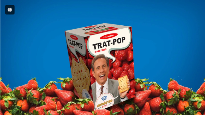
‘Unfrosted’ Film Prompts Release of Real-Life Trat-Pop

Pop-Tarts releases “Trat-Pop” limited-edition packaging responding to a Netflix film parody written by and starring Jerry Seinfeld.

Unauthorized bios or portrayals usually mean someone’s going to get less-than flattering treatment.

What happens when the fictional portrayal is a movie parody around a brand owner’s iconic product, for example, Kellanova’s Pop-Tarts?

You’ll find out in the Netflix movie, Unfrosted, written by Jerry Seinfeld, when it debuts May 3. The summary is as follows “Michigan, 1963. Kellogg’s and Post, sworn cereal rivals, race to create a pastry that will change the face of breakfast. A tale of ambition, betrayal, sugar, and menacing milkmen, Unfrosted stars Jerry Seinfeld in his directorial debut.”

Seinfeld knows a thing or two about Pop-Tarts, having referenced it several times in his stand-up routines.

Coincidentally, Unfrosted‘s release is timed to celebrate Pop-Tarts’ 60th anniversary this year.

There’s been quite a marketing campaign around the flick, but let’s get to the packaging heart of it…Kellanova went with the set-up and ran with it by creativity leveraging the one-of-a-kind opportunity: it’s introducing a chance to win limited-edition “Trat-Pops” boxes, the official box of the movie.

“Trat-Pops” origination? A typo.

According to the release, “featuring packaging from the film — the product name is a charming typo that will be explained when the movie is released — the box offers both a tasty movie snack and cinematic collectable that perfectly complements the delicious whimsy of Unfrosted.”

We editors can certainly appreciate the occasional typo, though we’d wish ours would be seen as more the charming kind, too.

And there’s the familiar face of Seinfeld himself as the front-and-center product pitch man.

“’Unfrosted’ is the ultimate flattery, and the biggest fanfiction ever,” says Heidi Ray, senior director of brand marketing, Pop-Tarts. “At every level of fandom, Pop-Tarts continues to spark creativity — from the user-generated Edible Mascot memes at the Pop-Tarts Bowl to a homemade recipe from arguably the world’s biggest pop star, and now to Jerry Seinfeld’s Unfrosted film. We’ve been at the heart of culture for 60 years, and look forward to inspiring it for many, many more.”

Additionally, Pop-Tarts offers multiple in-aisle and online activations at retailers across the country, encouraging fans to “Stream It. Eat It. We got you either way.”

There’s also social content and media partnerships that demonstrate the best way to stream the film while enjoying Pop-Tarts and “more surprises and Crazy Good antics throughout the film’s press tour.”

Among those is Pop-Tarts’ own parody…

Sign up is found on poptarts.com/Unfrosted starting today, April 29.

Don’t wait for the book, see the movie! And we can all find out about that darn “charming” typo.

Source

https://www.packagingdigest.com/packaging-design/-unfrosted-film-prompts-release-of-real-life-trat-pops

Categories
News & Updates Uncategorized

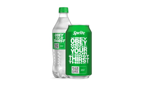
Sprite launches limited-edition packs for retro ‘Obey Your Thirst’ campaign

Sprite is reintroducing its iconic ‘Obey Your Thirst’ campaign, 30 years after its initial introduction in 1994.

The campaign features all-new creative with NBA All-Star Anthony Edwards and the world’s fastest woman Sha’Carri Richardson and Sprite’s first female athlete, including new packaging.

Sprite is introducing the limited-edition packaging which features four ‘Obey Your Thirst’ designs taking centre-stage, including an on-pack experience created to inspire Sprite drinkers everywhere.

Consumers can can the on-pack QR code can access ‘Obey Days’, a digital hub featuring fashion, arts, music, entertainment, and sports and more.

Brian Rogers, senior director of brand marketing for Sprite North America, said: “With the revival of ‘Obey Your Thirst,’ we’re excited to introduce this timeless message to Gen Z and inspire them to embrace their uniqueness and confidently chart their own path.”

Source:

https://www.packagingnews.co.uk/design/new-packs/sprite-obey-your

Categories
Uncategorized

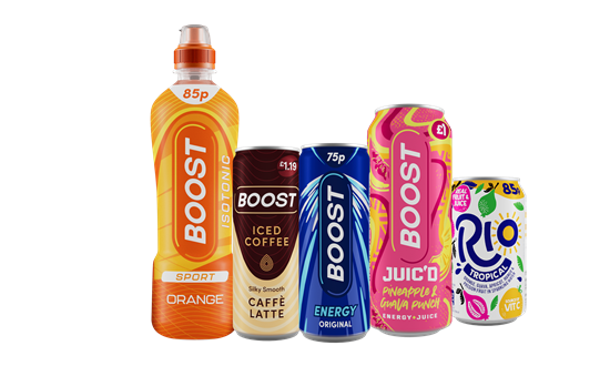
Boost Drinks revamps pack designs

Boost Drinks has revamped its packaging to increase shelf-appeal.

The revised pack designs feature the brand’s iconic lozenge logo with a subtle modern twist – a streamlined design approach.

Consumer testing has helped the brand craft a fresh identity which it says resonates with evolving customer preferences while maintaining its market position.

Adrian Hipkiss, commercial director, Boost Drinks, said: “The new pack designs offer an exciting new visual identity for consumers to enjoy, whilst feeling assured that they will be enjoying the same great taste and value they’ve come to know and love – and that’s what makes Boost among the top three selling brands across three functional drinks categories.”

Source:

https://www.packagingnews.co.uk/design/new-packs/boost-drinks-revamps-pack-designs

Categories
Uncategorized

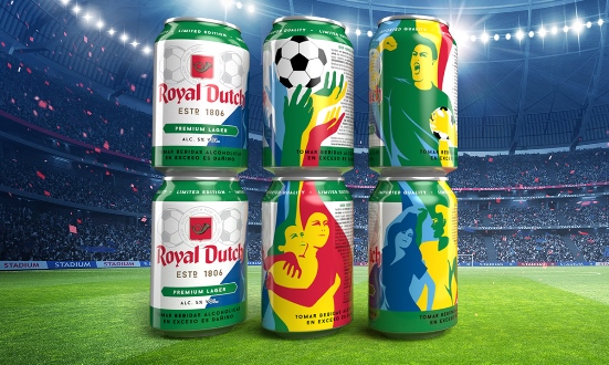
Royal Dutch launches special edition football cans with Canpack

United Dutch Breweries has worked with Canpack to produce a limited edition football-themed cans for its flagship Royal Dutch Premium Lager.

Using Quadromix can printing technology for this special edition, the classic Royal Dutch label has been replaced with a commissioned lithography.

Canpack said innovative techniques such as Quadromix significantly enhance the story-telling capabilities of beverage cans. It allows cans to be printed with up to four different designs in the same production batch.

Krystyna Rojewska, sales manager, Canpack, said: “Brand relationships with consumers are enriched by these mixed design sets because they are actively engaged with the product while it is still on the shelf as they choose their own combination of cans. The Quadromix technology is ideal for creating limited and collectible editions that boost the perception of a brand’s uniqueness.

Source:

https://www.packagingnews.co.uk/design/new-packs/royal-dutch-launches-special-edition-football-cans-with-canpack

Categories
News & Updates

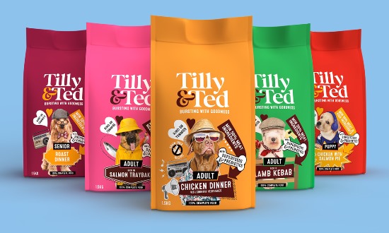
Slice Design creates packaging design for Tilly & Ted pet food

Slice Design has created branding for premium pet food brand Tilly & Ted.

The brief was to create a brand that is engaging, contemporary and can capture a millennial audience. It was key that the brand should be visually distinctive and playful with a straight talking down to earth tone of voice.

The packaging design for Tilly & Ted uses light hearted, quirky and unique photo montages that combine personality, flavour and benefits.

The packs are designed for a vibrant and playful feel, which gives stand out on shelf.

Alan Gilbody form Slice Design said: “It was key for us that the packaging design for Tilly & Ted captured that pets are an integral part of the family and their characters can be quite unique and eccentric just as we are. We used this insight to create a range of unique individual characters, capture the owners attention and provide an engaging way to talk about the flavours.”

Source:

https://www.packagingnews.co.uk/design/slice-design-creates-packaging-design-for-tilly-ted-pet-food

Categories
News & Updates

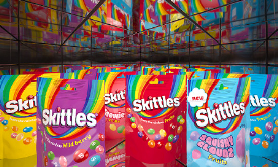
Elmwood works on Skittles pack design revamp

Skittles has announced a global brand refresh, working with design consultancy Elmwood.

The Mars-owned fruit-flavoured sweet brand is unveiling all its product ranges in the EU following a similar launch in China, and ahead of a wider rollout to the UK and US next year.

Elmwood said Skittles’ new-look packaging features fresh, more ‘characteristic’ typography with a series of ‘quirks’ – such as an up flick on the letter K.

The brand’s signature twisted upside down rainbow, meanwhile, is reimagined as a more vibrant and colourful motif.

Its iconic lentils now have a dynamic signature layout, with a sense of movement captured by flowing visual effects.

Greg Taylor, ‘chief provocation officer’, Elmwood, said: “In the first part of our work with Skittles, we focused on evolving its master assets to make them more fluid – we let the rainbow shine and the lentils fly. The aim is to make the Skittles brand more distinctive to consumers, so that they can spot innovation and identify their favourite ranges more easily on-shelf.”

The packaging upgrade also focused on creating more consistency across its brand system.

Source:

https://www.packagingnews.co.uk/design/new-packs/elmwood-works-to-revamp-skittles-pack-design