Categories
News & Updates

Pitango unveils resealable zipper soup pouch

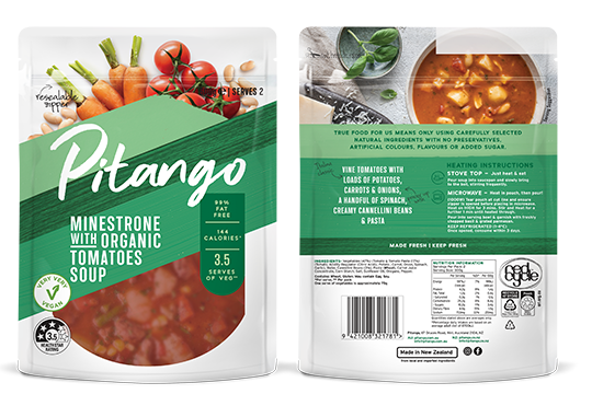
Fresh, chilled soup brand Pitango, is preparing to launch its new packaging, the Pitango resealable zipper pouch, which will roll out in stores this winter.

Pitango says its new pouch for chilled soup has an easy-to-open, easy-to-seal design. The company told PKN that it undertook extensive consumer home testing of various packaging types before determining that a zippered pouch was the way to go. 

“We are a true ‘serves 2’ size at 600g and wanted to give our consumers more user-friendly packaging that allows them to pour out just the amount they want, then easily reseal the rest for later. Consumer research revealed this was a large pain point and barrier to purchasing soup pouches as they often spill in the fridge or are messy. Our zipper means the whole soup eating process is made easier and more convenient for our customers,” Grace Greenhalgh, Pitango brand manager NZ told PKN.

“This new design is the result of the recent investment in detailed consumer research we undertook to get a deeper understanding of the ever-changing needs of the Australian consumer,” commented John Stathis, head of marketing for Beak & Johnston Australia. 

The graphic design for the pouch is the result of collaboration with several different agencies throughout the process. As the company told PKN, it first worked with an agency called Boxer & Co in Sydney on the initial design, then SGK on the finalisation.  

“We then did focus groups in both Australia and New Zealand with research agency Bread & Butter to determine which elements of the past design resonated with those familiar with the Pitango brand and then which elements of the new design best conveyed our ‘true food’ essence,” Greenhalgh explained. 

“It was important to us that this new design was an evolution not a revolution to the brand, showing photography of real ingredients on pack plus a window so customers could see the product instore were key elements that resonated in our research,” she concluded.

The result is the Pitango resealable zipper pouch, which the company claims is a design not seen before on chilled shelves within Australian supermarkets.

Source:

Categories
News & Updates

Mars piloting paper wrappers in UK

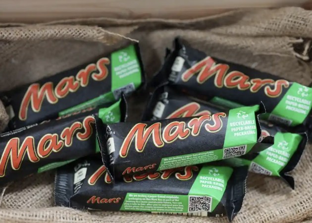
Following a successful rollout in Australia, Mars Incorporated is now expanding the trial of paper packaging for its Mars bars to the UK as part of a new pilot test to explore different packaging options. 

Mars says it will produce the Mars bars wrapped in recyclable paper packaging that will be available for a limited time at Tesco stores. Mars Wrigley Australia has already rolled out paper-based wrappers across its range of Mars bars, Snickers and Milky Way, which are produced by Amcor. 

After extensive development work and investments in the UK, the company believes the trial will achieve a reduction in plastic on the Mars bar packaging, a significant step in its journey to innovate toward its packaging commitments. 

Following the trial, Mars says it will use the learnings from the launch with Tesco to inform other trials across the region, all in the name of the company’s Sustainable in a Generation plan. 

Richard Sutherland-Moore, packaging expert at Mars Wrigley UK’s Research and Development Centre in Slough, said: “We are exploring different types of alternative packaging solutions for our confectionery products. For Mars bar, the challenge was to find the right paper packaging solution with an adequate level of barrier properties to protect the chocolate whilst guaranteeing the food safety, quality and integrity of the product to prevent food waste.” 

Adam Grant, general manager, Mars Wrigley UK said: “With our Mars bar pilot project, we are taking a big step to see how paper-based packaging works in everyday life. From the test, we will derive insights for our sustainable packaging strategy.” 

Andrew Flood, Tesco packaging development manager, said: “We’re delighted to partner with Mars Wrigley to trial an alternative version of their iconic Mars bar packaging, aligning to our own strategy of removing plastic and packaging in our business where we can, reducing it where we can’t, reusing more and recycling what’s left.” 

As part of Mars’ Sustainable in a Generation Plan, the company says it is investing hundreds of millions of pounds to meet its goal of reducing its use of virgin plastics by a third in the short-term, which includes using less plastic, recycled plastic and alternatives to plastic packaging.

Source:

https://www.packagingnews.com.au/food/mars-piloting-paper-wrappers-in-uk

Categories
News & Updates

Costa’s premium grapes debut in paper bunch bag

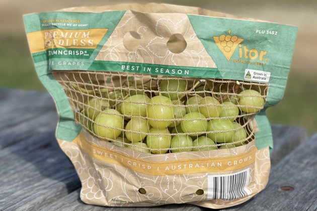
In partnership with Navi Co Global, Australian fresh fruit company Costa has released a paper-based bunch bag for premium grapes. 

Gilad Sadan is Navi Co Global’s managing director, and PKN sat down with him to learn about this new paper bunch bag, which Sadan describes as “not only an Australian first, but a global first in terms of grapes”. 

This is not the first time Sadan has worked with Costa. Their previous collaboration was the Hippie Punnet, a hybrid punnet which used both FSC cardboard and 100 per cent recycled PET, which took a bronze at the PIDA awards 2023. For this latest innovation, however, Sadan says he has cut out the plastic [Ed’s note: apart from the sealant and bonding layer].

Sadan is quick to point out the man who started the whole process is Costa’s grape marketing divisional manager, Campbell Banfield. As Sadan explains, Banfield had tasked him with moving to a more sustainable format for a grape bag. “We are very aware of the consumer sentiment toward soft plastics and want to move to 100 per cent recyclable option at kerbside. We still need consumers to be able to view as much of the product as possible, so they can have a level of trust to purchase that over something else,” he says. 

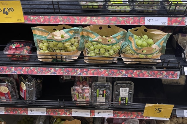
The packaging is designed to allow consumers to see the product at eye level.

The challenge then was how to make the product visible inside while still using paper. “We had to come up with a way to be able to view the fruit not only from the top, but from the side,” he goes on to say, as he points to the mesh window on the front of the packaging. “Paper is not new to anyone, but the ability for it to increase the visibility from the sides, while also withstanding a cold supply chain was,” he says, adding that the main point of the brief was that the product must be visible on the shelf at eye level. 

One question that may be on consumers’ minds, though, is how does paper compare to plastic when maintaining shelf life of the product? Sadan says that through rigorous testing that included storing the product for extended durations as well as high moisture conditions in the supply chain, the paper substrate used was able to withstand and maintain a good shelf life. During tests, he says, it was found that there was significant ventilation through the bag, cooling the product down, while at the same time, the bag was able to absorb excess moisture while still maintaining structural integrity. 

“The other amazing feature in the bag is that it is genuinely 100 per cent paper including the mesh. Yes, people find it hard to believe, however, you can just throw it in your recycling bin at home without needing to remove anything from the packaging,” Sadan says. 

Sadan’s passion for creating a more sustainable future is clear. His drive is to make the sustainability of the packaging a prominent part of the marketing of the product. “You have to cut through some clutter and create a point of difference,” he says, emphasising the importance of packaging that both protects the product (and environment) and tells a story on the shelf. 

“Packaging is a genuine marketing tool that is just as strong as social media or ads on the side of a bus,” he says. “It is a vessel the consumer carries home and therefore you have the opportunity to tell your story to them.” 

The story of this grape bunch bag is that not only are the grapes of premium quality. Most of Australia’s premium grapes are currently exported to overseas markets, which presents a great challenge on how to range a premium grape alongside regular grapes. 

“The new paper bunch bag creates recycling opportunities at kerbside, and also creates a great point of difference on shelf,” he says. 

“We wanted to ensure the sustainability message was loud and clear. On this bag we put it front and centre, saying ‘I am 100 per cent plastic free, please recycle me at home’,” he says. 

Sadan is confident there will be more innovations with Costa on the horizon. There are plans to use a similar type of packaging for other fruits, starting with red and black grapes, citrus and expanding into other varieties in the future.

Source:

https://www.packagingnews.com.au/food

Categories
News & Updates

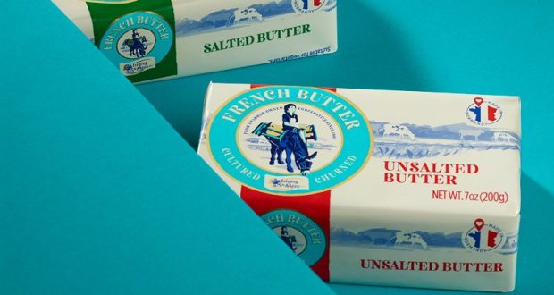
Isigny Sainte-Mère gets revamp from Bluemarlin

Design agency bluemarlin has worked on refreshing the brand identity for French dairy Isigny Sainte-Mère.

The aim is to heighten brand awareness in overseas market and the redesign includes packaging.

According to Bluemarlin, some of the brand’s key assets had been downplayed over time and the brand story had been muted.

Marthe the milkmaid and her donkey – brand icons since 1909 – have been refreshed and are now central to the design. Bluemarlin introduced a new teal master-brand colour to capture the coastal terroir and the proximity to the sea, where the herds graze.

Andrew Eyles, CEO and Founder at Bluemarlin, said: As love of product, legacy and location are everything to Isigny Sainte-Mère, it was so important for us to go in deep. We were able to learn about the brand’s progression, where it had triumphed – or gone a little off track.

“The packaging needed to attract trial and deliver an authentic and unique Normandy experience in the heart and mind.  There’s a worldwide desire for authentic, natural products that have been made with care. Our collaboration with Isigny Sainte-Mère fulfils the brand’s ambitions, given the highly competitive nature of the category and the growing curiosity of customers to experience and learn more.”

Tom Rougereau, marketing manager at Isigny Sainte-Mère, said: “We want to make beautifully produced artisan products more accessible, and to help consumers identify and understand the brand, while expressing the quality of the product.

“People all over the world are developing a greater appreciation for real food, from real places, made by real farmers, with real integrity. Our rebrand speaks to that evolution in consumer thinking.”

Source:

https://www.packagingnews.co.uk/design/isigny-sainte-mere-gets-revamp-from-bluemarlin

Categories
News & Updates

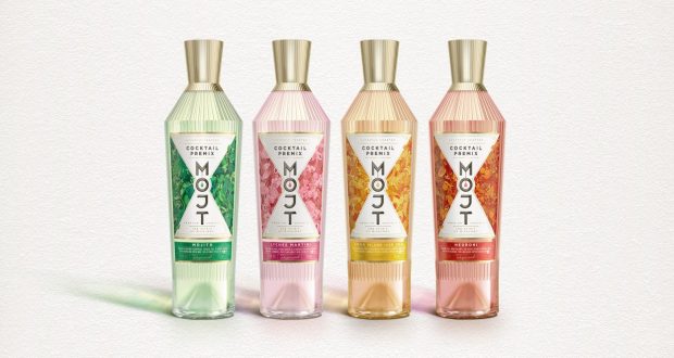
Butterfly Cannon creates premium bottles for MOJT

Butterfly Cannon has designed stylish new bottles for MOJT’s ready-to-serve cocktails.

The form of the bespoke bottle structure is inspired by the angular, tapered silhouette of classic cocktail shakers. The embossed facets covering the bottle deliver premium cues, whilst helping consumers and bartenders grip the bottle. Topped off with a bespoke faceted, metallic closure that can be used as a functional jigger.

Butterfly Cannon worked with illustrator Philip Harris to craft a series of intricately illustrated panels that capture the vibe of each of the cocktails. Each one is full of details, including serve suggestions, ingredients and local wildlife, such as the Cuban Tocororo bird on the Mojito variant.

In a statement, Butterfly Cannon said: “Every aspect of our designs had to telegraphically convey cocktail culture to consumers who had little or no experience of it. Inspired by the concentrated nature of the liquid, our identity consciously draws the eye to the coloured droplet being squeezed into the ‘O’ of the impactful, vertically stacked MOJT word mark. The negative space alluding to the characteristic hourglass shape of a cocktail jigger whilst symbolising an open doorway into the world of cocktail culture.”

Source:

https://www.packagingnews.co.uk/design/butterfly-cannon-creates-premium-bottles-for-mojt

Categories
News & Updates

New fermented crunchy veg packs from Mrs Elswood

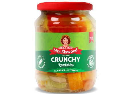
Empire Bespoke Foods has recently launched a duo of colourful fermented crunchy vegetables under the Mrs Elswood brand.

Mrs Elswood is the premium 1 gherkin brand, and the new packs are in line with the standard range from the brand, in clear jars with a label wrapped around the middle, giving consumers full view of the products inside.

Source:

https://www.packagingnews.co.uk/design/new-packs/new-fermented-crunchy-veg-packs-mrs-elswood

Categories
News & Updates

Beatson Clark supplies white flint glass bottles for JJ Whitley drinks range

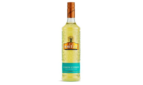
Beatson Clark has produced 70cl white flint glass bottles for Halewood’s new variant JJ Whitley range – a Lemon Citron Spirit drink. 

The new bottles will be used on numerous products across the JJ Whitley Vodka and Gin line up, including existing products such as Artisanal Vodka, Raspberry, Blood Orange and Vanilla.

More sustainable bottles updates have also been made across Halewood’s Whitley Neill and Dead Man’s Fingers spirits ranges, including Whitley Neill Apple & Red Berries Gin which has just launched in a new Beatson Clark bottle.

Halewood says one of the reasons it has returned to Beatson Clark is sustainability – the new bottles are made in the UK using 45% recycled material.

“Beatson Clark’s closed loop recycling system ensures that large volumes of post-consumer glass are processed on site and used in the production of its new bottles, significantly reducing the environmental impact of the manufacturing process,” said Scott Kilshaw, Supply Chain Director at Halewood Artisanal Spirits.

“We’re pleased to unveil our new glass bottles from local suppliers Beatson Clark, showcasing our dedication to providing more sustainable solutions across our business to reduce our carbon footprint.”

Source:

https://www.packagingnews.co.uk/design/new-packs/beatson-clark-supplies-white-flint-glass-bottles-for-jj-whitley-drinks-range

Categories
News & Updates

Hennessy launches limited-edition marking Hip Hop 50 celebrations

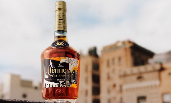
Hennessy has collaborated with Hip Hop artist Nas, unveiling a new, limited-edition bottle titled ‘HenNassy’ to mark Hip Hop 50, taking place in New York on 11 August.

Hip Hop 50 is celebration of the 50th anniversary of Hip Hop in 2023, featuring original series, films & experiences.

The Hennessy Hip Hop 50 Limited Edition Bottle will be showcased through a film, narrated by Nas, creating anticipation for what is to come.

The design has black & white images and typography, giving a raw feel the packaging.

Hennessy said the bottle is a “symbol of the mindset, lifestyle, and culture of Hip Hop”, and the inspiration behind ‘Rep Yours,’ a new movement to give fans and creators across the globe a chance to ‘rep’ where they’re from.

Source:

https://www.packagingnews.co.uk/design/new-packs/hennessy

Categories
News & Updates

Knockout redesigns Bacardi’s Breezer packaging

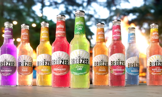
Knockout began by introducing a new crown icon to represent the brand’s long-standing heritage. The crown carries a second interpretation of playful refreshment to appeal to a modern audience of spontaneous consumers. Knockout said the new wordmark has been updated with a type that is more balanced and contemporary, with rays of sunshine emanating from …

Knockout began by introducing a new crown icon to represent the brand’s long-standing heritage.

The crown carries a second interpretation of playful refreshment to appeal to a modern audience of spontaneous consumers.

Knockout said the new wordmark has been updated with a type that is more balanced and contemporary, with rays of sunshine emanating from behind it to evoke a ‘horizon and bring the daytime drink occasion to life’.

Dominic Burke, founder and creative director at Knockout, said: “Beneath the horizon line and on the neck label are colourful abstract patterns that convey the different flavours of the range. Influenced by urban street art, these innovative patterns combine dotted screen-printing and varnish texturing to add visual vibrancy and tactility that feels like fruit skin. The new design also introduces a descriptor to each variant to heighten flavour appeal.

“The RTD category has evolved considerably since Breezer first debuted, with increased quality of both product and branding. The updated identity gives Breezer a premium touch to meet these new expectations whilst elevating that playful edge that the brand has always possessed.”

Source:

https://www.packagingnews.co.uk/design/new-packs/knockout-redesigns-bacardis-breezer-packaging