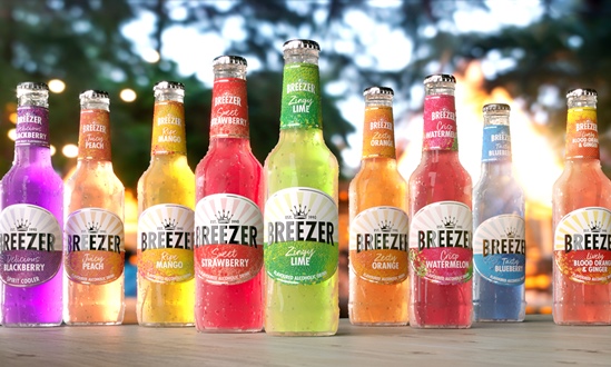
Knockout began by introducing a new crown icon to represent the brand’s long-standing heritage. The crown carries a second interpretation of playful refreshment to appeal to a modern audience of spontaneous consumers. Knockout said the new wordmark has been updated with a type that is more balanced and contemporary, with rays of sunshine emanating from …
Knockout began by introducing a new crown icon to represent the brand’s long-standing heritage.
The crown carries a second interpretation of playful refreshment to appeal to a modern audience of spontaneous consumers.
Knockout said the new wordmark has been updated with a type that is more balanced and contemporary, with rays of sunshine emanating from behind it to evoke a ‘horizon and bring the daytime drink occasion to life’.
Dominic Burke, founder and creative director at Knockout, said: “Beneath the horizon line and on the neck label are colourful abstract patterns that convey the different flavours of the range. Influenced by urban street art, these innovative patterns combine dotted screen-printing and varnish texturing to add visual vibrancy and tactility that feels like fruit skin. The new design also introduces a descriptor to each variant to heighten flavour appeal.
“The RTD category has evolved considerably since Breezer first debuted, with increased quality of both product and branding. The updated identity gives Breezer a premium touch to meet these new expectations whilst elevating that playful edge that the brand has always possessed.”
Source:
https://www.packagingnews.co.uk/design/new-packs/knockout-redesigns-bacardis-breezer-packaging