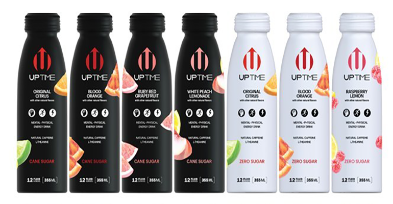
Along with a new graphics design, Uptime Energy bottles are squatter to fit into shrinking cooler spaces and to improve 12-pack stability.
Energy drinks are experiencing growth that’s nothing short of energetic. An Allied Market Research report released in March pegs the market’s growth at 8.2% annually to reach $108.4 billion from 2022 to 2030.
That means more sales, more brands, and more stockkeeping units. It follows that space at retail is growing ever tighter in what was already a highly competitive
It’s a survival of the fittest scenario, exacerbated by stores shrinking the height of shelves in coolers to create more shelves with more products crammed into the same overall space.
In response, Uptime Energy redesigned its aluminum bottles to better fit into a new and tighter retail reality while reaping secondary packaging benefits as well.
Claimed as the first-to-market premium and better-for-you energy drinks, the brand unveiled the new bottles during the NACS Show 2022, an event for the convenience store (and fueling) market held in early October.
“NACS was an excellent opportunity to debut our new packaging with national convenience-store chains and secure new partnerships for 2023,” Chris Spiegel, SVP Operations, informs Packaging Digest.
“We’ve always been proud of our unique aluminum bottle and the refreshing, sparkling liquid inside,” says Benjamin Kim, CEO. “Our latest packaging innovation allows for increased visibility and placement opportunities which supports our continued strong growth. Consumers love our delicious flavors and the productive energy we provide. Being able to increase availability and bring Uptime to all their favorite retail chains will greatly expand our loyal fan base. We are very excited to see our new shorter aluminum bottle launch with the 2023 resets!”
The innovative new bottle design remains resealable, but is shorter with a wider base. The extra width increases the bottle stability as well as that of the 12-count multipack. It also improves retail displays, while reducing shrinkage.Image courtesy of Uptime Energy, Packaging Digest
The resized aluminum bottles also sport a new graphics look.
The goal of the graphics design was two-fold, explains Spiegel. “Maintain consistency with our current package by keeping all key elements — colors, fonts, and layout — while introducing images representative of the flavor. Our delicious, refreshing flavors are a key attribute that our consumers comment on and love.
“Also, by adding the fruit image, we hope to convey this to new consumers to entice them to try Uptime.”
The energy drinks are split into two distinct product lines identified by the main color theme: black for products sweetened with natural cane sugar and white for products formulated without sugar.
Spiegel tells us that the artwork was designed internally by the art department led by Chief Creative Officer, Carrie Kim.
Spiegel notes that the project required development time by both the bottle manufacturer to create it and for Uptime to work with its contract bottling network.
Initial feedback from distributors and chain partners has been great on both the bottle height, new graphics, and the fruit images on the bottle.
The new packaging will start shipping in January, he informs us.
Source: