Categories
News & Updates

Eco wine brand Tread Softly moves into spirits with design by Denomination

Denomination has created a powerful and category changing brand and packaging identity for Fourth Wave Wine’s Tread Softly Gin.

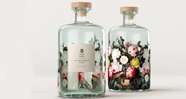
The brand packaging is quietly disruptive, moving away from the masculine block branding associated with gin to create a ‘gently powerful presence on the shelf’. The sustainable, feminine and natural style reflects the high percentage of female gin drinkers as well as consumers concerned for the planet.

All elements of the brand have been carefully selected based on the sustainability credentials of Tread Softly. The small font label is fashioned from natural paper stock and the design on the back is screen printed and features beautiful illustrations of flora and fauna – all of which can be seen through the glass and the liquid to amplify the natural message and reflect the brand’s awareness of its environmental footprint.

The glass is made from 100% recycled glass with a paper seal over a wooden stopper.

“The original brand was developed as a ‘new generation of wine for a new generation of drinker’, and it exceeded budget forecasts by 515% in the first year,” says Nicholas Crampton, co-owner at Fourth Wave. “We felt there was room for that ethos to be carried over into spirits to respond to the growing desire among consumers for brands that care about the planet.”

Rowena Curlewis, CEO at Denomination, says: “We originally created this brand to speak to consumers’ rising ethical engagement and awareness. One of the key objectives behind the strategy was to futureproof Fourth Wave Wine’s portfolio and make room for sustainable diversification. Taking this ‘gentle juggernaut’ of a wine brand into spirits shows just how effective brand strategy and packaging identity can be when they are developed to flex and grow, accommodating business development and changing consumer needs.

“This type of futureproof approach is becoming essential as our industry responds to increasing environmental challenges and consumer scrutiny. We wanted to create a brand that would convey Fourth Wave’s commitment to safeguarding the sector and the planet.”

Source:

https://www.packagingnews.co.uk/design/new-packs/eco-wine-brand-tread-softly-moves-spirits-design-denomination

Categories
News & Updates

StormBrands creates packaging for EBM’s kids’ cake range ‘smile’

StormBrands has developed the strategy and crafted a name, visual identity and packaging range for ‘smile,’ a kids’ single-serve, packaged cake range for international baked good company, EBM.

The new brand launch comes off the back of StormBrands’ partnership with EBM on ‘Cake-Up’ which has already established a strong position in the cupcakes category in Pakistan.

EBM, a market leader within the biscuit category has sought to significantly shake up the packaged cakes market under its Peek Freans brand in Pakistan. With cupcakes only making up 53% of the Pakistan cake market, the business identified an opportunity to launch a new format range of packaged single serve Doughnut Cakes with distinct positioning, marking a notable category innovation.

StormBrands said it approaches each new piece of work through the lens of their own purpose: “Energising brands to move mindsets, markets and culture.” In the case of ‘smile,‘ Storm’s brand strategy based on consumer insight was to allow kids to ‘eat happy!’

The new brand design for ‘smile’ reflects StormBrand’s strategy with playful typography and a colour palette based on the flavours of the doughnuts themselves. An integrated logo encompassing both typography and product photography brings the brand to life and the team at Storm have ensured coherency of the visual and verbal identity across the brand’s channels and all touchpoints.

Zoe Phillipson, StormBrands creative director, commented: “Our new visual identity and range design for ‘smile’ is bold, vibrant, happy and positive. The brand’s playful visual language is translated across the whole design from the name, identity and packaging design, right through to the hidden tone of voice inside the packs. In an increasingly complex and unstable world, we wanted to create a kids’ brand that promotes happiness and generates delight – a welcome relief to the serious side of growing up, and let’s face it no-one can eat a donut without smiling!”

Shahzain Munir, executive director at EBM added: “’Smile’ doughnut cakes are little icing coated, sprinkle covered, cream filled rings of delight.  They just taste of happiness!  Together with the team at Stormbrands we have created a brand that speaks to kids (and big kids) and counter-balances the serious by providing a generous dose of playful, fun! The brand is already loved by consumers and we’re seeing a tremendous impact in the market.”

Source:

https://www.packagingnews.co.uk/design/new-packs/stormbrands-creates-packaging-ebms-kids-cake-range-smile

Categories
News & Updates

Ardagh creates ‘sound wave’ look for Absolut limited edition pack

Glass packaging specialist Ardagh is behind the latest limited edition from vodka brand Absolut.

Absolut Voices incorporates a sound waves design and has been released to celebrate the “wavemakers and trailblazers of the world”.

Ardagh’s product design team worked with Absolut and design agency Brand Union. The limited-edition bottle is available worldwide in 700ml, 750ml and 1litre.

The sapphire blue-coloured premium bottle contains 80% recycled glass, the highest percentage yet for Absolut. Ardagh said that is thanks largely to the high recycling rate in Sweden, meaning more recycled glass cullet is available to Ardagh for use in the furnace

Elin Furelid, global head of Absolut portfolio and design, said: “Celebrating diverse and different viewpoints has always been in our spirit. We’re continuously inspired by the idea that the world becomes a better place when we come together beyond differences, share good times and empower one another. That spirit is what Absolut Voices is all about.”

Maria Persson, NPD project manager at Ardagh Glass Packaging – Europe, added: “We worked with Brand Union to ensure the design met the creative brief to convey the effect of expanding sound waves rather than ripples of water. The effect of the 360-degree design feature was achieved by creating irregular circles with shallow embossing to give life to the waves. Our product design team created the desired effect using their in-house sculptured embossing technology and expertise to give it a lifelike quality and standout impact”.

“It was exciting to see the first bottles come off the production line in the deep sapphire blue, with light bouncing around the bottle from the edges of the sound wave design.”

Source:

https://www.packagingnews.co.uk/design/ardagh-creates-sound-wave-look-absolut-limited-edition-pack

Categories
News & Updates

Wilko starts revamp of own label range with Free The Birds

High street retail chain Wilko has begun a revamp of its own label products, working with creative agency Free The Birds.

Beginning with its heritage paint and pet ranges, the brand refresh is part of a three-year partnership that will see Free The Birds’ designs rolled out across the company’s entire portfolio.

According to the agency, the new packaging design sees the brand architecture shift to a consistent and easier navigation system with Wilko’s logo at the top, followed by the product name below. Other elements of the design include the introduction of clear iconography on the front-of-pack, as well as navigation bars at the bottom to aid simplicity and browsing on the physical and digital shelf.

Nick Vaus, partner and creative director at Free The Birds said: “With a portfolio of this size, we had to create a consistent brand thread across varying labels that is delivered simply and effectively. We developed three overarching design structures ‘Core’, ‘Core Light’ and ‘Core Plus’ to help customers distinguish the different ranges. For the Paint and Pet labels, we introduced a coherent colour scheme and photography to offer a level of intimacy with consumers, making wilko feel both engaging and ownable in a crowded category.”

Source:

https://www.packagingnews.co.uk/design/wilko-starts-revamp-label-range-free-birds