Categories
News & Updates

Tesco etches product information onto avocado skin and trials cardboard trays

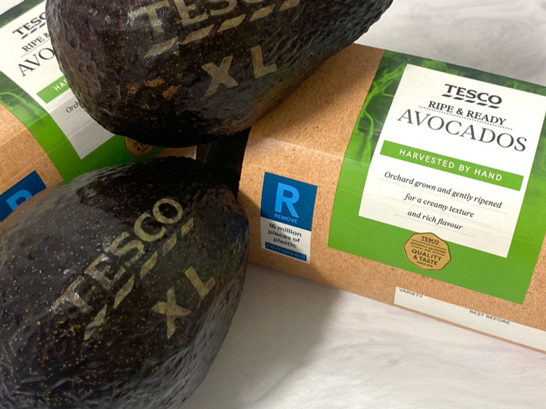
Tesco plans to save nearly a million stickers and up to 25 million plastic trays in its avocado product lines by laser etching product information directly onto the fruit and trialling a recyclable cardboard container.

Barcode stickers will be removed from Tesco’s loose, extra-large avocados. Instead, Westfalia Fruit’s technology will remove a small section of the top layer of avocado skin, with a computer programme directing high-powered lasers to etch information (e.g. fruit size or variety) directly onto the fruit in a third of a second.

“We’re always looking for innovative ways to reduce the environmental impact of our products, and cut down on plastic waste in the home through changes to our packaging,” said Lisa Gilbey, avocado buyer at Tesco. “We’re really excited to hear customer feedback on our new laser-etched avocados, avoiding the need for a barcode sticker that can easily be forgotten and left on when recycling through household food waste.”

Apparently, Westfalia Fruit has conducted ‘extensive’ trials to ensure that laser etching does not impact the quality, shelf life, or taste of the avocados.

General manager Graham Isaac commented: “Westfalia Fruit continually seeks ways to improve our environmental performance and operate in a responsible manner, by focusing on priorities such as reducing and wherever possible, removing plastic from our packaging to contribute to solving the plastic waste challenge.

“We are confident that, with a clear focus and united effort as an industry, we will be able to significantly reduce our waste, use natural resources responsibly and protect the environment and biodiversity for all our futures.”

Tesco will simultaneously implement a cardboard container into two of its most popular avocado lines, aiming to simplify recycling for consumers. If the move is rolled out across all Tesco stores, it is expected to save over 20 million plastic trays from the twin-pack avocado range alone, and up to 25 million across the pre-packed range.

Around 270 Tesco stores in south-east England will conduct the trials. If consumer feedback is positive, the changes are set to be rolled out across its stores.

Almost 70 million avocados are sold at Tesco stores every year, the retailer reports, with demand for the fruit said to have increased by 15% in the last year.

Late last year, Tesco told The Grocer that the UK government should ban fruit and vegetable packaging to level the playing field between marketing competitors in the fight against waste. However, other retailers were cautious about selling fresh produce loose, fearing a negative impact on product quality and consumer uptake.

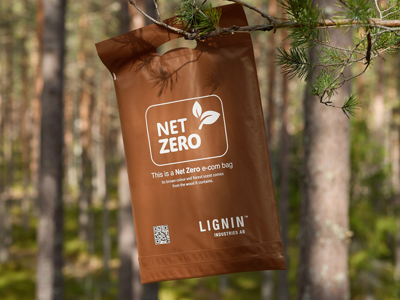
In other news, Gamma Supplies Ltd has unveiled a certified paper-based, home-compostable, and biodegradable label for direct contact with fresh produce like avocados. Reportedly, it breaks down at the same rate as food skins without leaving harmful toxins in the compost.

Source:

https://packagingeurope.com/news/tesco-etches-product-information-onto-avocado-skin-and-trials-cardboard-trays

Categories
News & Updates

Swedish company launches bio-based plastic derived from forest residues

Swedish greentech company Lignin Industries AB has announced the mass commercialisation of its Renol technology, a bio-based material developed from lignin, often found in trees.

Lignin Industries claims it has developed a way to end reliance on fossil fuel-based plastics by transforming lignin, an organic material, into ‘renewable, circular’ bioplastics. Apparently, Lignin is an organic polymer most commonly found in trees. It provides structure and aids in water retention, while preventing toxins from entering.

The company has created Renol, a bio-based material developed from the lignin, with the technology implemented at a factory just outside Stockholm, Sweden, with multiple applications and commercial use cases either ready to launch or in advanced development stages.

Renol is said to have industrial uses such as Acrylonitrile Butadiene Styrene (ABS), Polyethylene (PE), and Polypropylene (PP); which includes domestic goods, automotive, consumer electronics, and PE films among other applications.

After five years of research and development, the company’s technology has been implemented at a factory situated just outside Stockholm, Sweden, with multiple applications and commercial use cases either ready to launch or in advanced development stages.

Fredrik Malmfors, CEO of Lignin Industries, said: “Lignin Industries makes use of an abundantly available base resource and provides a solution to the market that is highly scalable and remarkably resource efficient, with low CO2 emissions. Lignin Industries is a viable partner for companies of all sizes as the material can be supplied at both the scale and price point required for the competitive industrial edge, in addition to our strong sustainability credentials and the adaptability of Renol.”

At the start of this year, LeadEdge Flexo released a new mounting material made of bio-based polyethylene, seeking to lower the reliance on synthetic virgin material in corrugated post-printing solutions while maintaining high performance and versatility. The material, known as cbak evolve, is a closed-cell foam mounting material said to contain at least 30% bio-based, third-party certified C14 material.

More recently, AIMPLAS has announced its participation in the EU-funded SYMBA project in hopes of using AI-driven solutions to promote circular economy principles within the biobased industrial ecosystem.Its focus is the development of a unique Industrial Symbiosis (IS) methodology specifically tailored to local and regional biobased ecosystems.

Source:

https://packagingeurope.com/news/swedish-company-launches-bio-based-plastic-derived-from-forest-residues

Categories
News & Updates

Coca-Cola’s Tropico packaging redesigned by Coley Porter Bell

Coley Porter Bell has redesigned packs for French fruit drink brand Tropico, owned by The Coca-Cola Company.

The new visual identity aims to expand Tropico’s appeal to a Gen Z audience and is being launched in the run-up to the Paris Summer Olympics.

The updated brand identity features a suite of bespoke fruit illustrations to ‘highlight Tropico’s refreshing taste’.

Tropico’s mascot, Coco the Parrot, has been simplified and modernised with a new illustration.

Source:

https://www.packagingnews.co.uk/design/new-packs/coca-colas-tropico-packaging-redesigned-by-coley-porter-bell

Categories
News & Updates

Rowse Honey relaunches limited-edition ‘Hot Honey’

Rowse Honey has relaunched the limited-edition ‘Hot Honey’, available now exclusively at Waitrose, in-store or online.

The packaging design conforms to the standard range of Rowse Honey, with its distinct jaggered plastic bottle.

Libby Nicholson, Brand Manager for Rowse Honey, says: “As honey lovers and culinary innovators, we’re hugely excited to bring back our much-loved Hot Honey in partnership with Waitrose.

“The result is a fusion of sweet and spicy that makes for an irresistible flavour experience – ideal for those who love to dial up the heat during mealtime without a long list of ingredients.”

Source:

https://www.packagingnews.co.uk/design/new-packs/rowse-honey-relaunches-limited-edition-hot-honey

Categories
News & Updates

Elmwood revamps packaging design for E45 skincare brand

Skincare brand E45 has worked with Elmwood to unveil new packaging designs to modernise its distinctive heritage.

The new design features a refined brand mark, an updated colour palette, new iconography, pack visuals and a new pattern library.

These appear alongside newly created photography principles, intended to champion the many unique types of consumer skin tones and conditions.

The new branding reimagines skin cells as visual building blocks, providing the pathway to healthy and confident skin.

Extracted from E45’s rebalanced logo, the cells can be rearranged across a broad portfolio of use cases.

The logo follows letterforms that link visually with its distinctive cell shape, and a new colour palette features a cobalt, electric-style blue and a more lifestyle coral tone, pointing to E45’s heritage and helping the brand to pop across a variety of digital and physical settings.

Rob Dyer, associate creative director, Elmwood London, said: “Early on in the process, our studio research revealed that E45’s distinctive, cell-shaped logo is something that consumers instantly recognise and connect with.

“This finding sparked the cornerstone concept of our new design identity. The healthy skin cell is a visual device that can expand and flex in different ways. Cells can be used interactively with one another in motion, or they can provide a window for conversational extracts or lifestyle photography.

Kyle Whybrow, executive creative director at Elmwood London, said: “E45 is a household name that caters for a diverse range of customers and their complex skincare demands. That meant our design strategy for revitalising its brand had to strike a balance between capturing scientific expertise – summed up by pharmacists and people seeking help with specific skin conditions – and those who use E45 products on a more everyday basis. It’s about marrying up that brand knowledge with delivery that feels friendly, personable and inclusive.”

Steve Binding, global head of design and creative at E45 parent brand Karo Healthcare, added: “Elmwood’s idea for the ‘building blocks of skin’ not only unlocked and unveiled E45’s unique core asset, but also breathed life into a versatile design system that we can seamlessly integrate across our entire marketing spectrum. The adaptability and flexibility of skin cells enable us to weave meaningful narratives for our experts and consumers alike.”

Source:

https://www.packagingnews.co.uk/design/new-packs/elmwood-revamps-e45-skincare

Categories
News & Updates

Burgopak designs packaging for Chuckling Goat gut health testing

Gut health expert brand Chuckling Goat has partnered with packaging design agency Burgopak to create a microbiome test kit, in which the packaging is an integral part of the product.

The packaging is designed to make the test process straightforward to do at home and has everything clearly laid out, as part of a three step process.

Chuckling Goat selected Burgopak’s telescopic packaging design, with the addition of a ribbon for a touch of personality.

The first step is the instructions, the second step is the test itself and the third step is the return packaging.

The packaging has two trays and the top tray contains the instructions. The second tray holds the test tube with integrated stool sample collection device on the left inside a fitment, and the return box is on the right in its own compartment. The return biohazard bag and sample collection aid are also packed inside the return mailer.

The return mailer is smaller than the complete collection kit and therefore more efficient to ship. The customer can keep the main box – the physical record of their purchase, or recycle it.

Shann Jones, founder of Chuckling Goat, said: “Getting the packaging right was so important to us – it had to convey value, professionalism and yet have our signature personal touch. We’re confident we’ve achieved that, and we’re thrilled that we’ve been able to help thousands of people fully understand their gut health.”

Willemijn Zandt, senior project manager, healthcare, Burgopak, said: “Our design team worked hard to make the sample collection process as easy as possible – minimising the chance of an incorrect test. It’s rewarding for us to design packaging for Chuckling Goat, whose priority is to help people live better, healthier lives.”

Source:

https://www.packagingnews.co.uk/design/new-packs/burgopak-designs-packaging-for-chuckling-goat-gut-health-testing

Categories
News & Updates

Outlaw works on redesign project for Crusha milkshake syrup

Crusha milkshake syrup brand has revamped its branding, working with Bristol-based design studio Outlaw.

The brief was to rejuvenate key brand assets, with a focus on its distinctive reputation.

Outlaw needed to balance shelf standout with personality and broad appeal, ensuring the brand’s youthful attitude shone through across every touchpoint.

The new design leverages the visual codes of ‘proper’ diner milkshakes, including striped straws, tall glasses and thick, creamy, frothy shakes.

Visual elements like the checkerboard pattern ground the design in the classic diner aesthetic and re-establish Crusha as the authentic, original milkshake syrup – the only choice when it comes to a real at-home milkshake experience.

Alex Rexworthy, Outlaw design director, said: “Our new design channels the irreverent attitude of Errol the cat, who was the heart and soul of the original advertising. Drawing inspiration from classic milkshakes mixed with Americana, our design promises joy, to the very last slurp.”

Tim Albert, The Silver Spoon Company marketing director, added: “We’re delighted to work with Outlaw again on creating an exciting new future for our beloved Crusha brand. Milkshakes are super popular, for all ages, so we’re excited for the impact the new reimagining will have on purchase intent.”

Source:

https://www.packagingnews.co.uk/design/new-packs/outlaw-works-on-redesign-project-for-crusha-milkshake-syrup

Categories
News & Updates

‘Unfrosted’ Film Prompts Release of Real-Life Trat-Pop

Pop-Tarts releases “Trat-Pop” limited-edition packaging responding to a Netflix film parody written by and starring Jerry Seinfeld.

Unauthorized bios or portrayals usually mean someone’s going to get less-than flattering treatment.

What happens when the fictional portrayal is a movie parody around a brand owner’s iconic product, for example, Kellanova’s Pop-Tarts?

You’ll find out in the Netflix movie, Unfrosted, written by Jerry Seinfeld, when it debuts May 3. The summary is as follows “Michigan, 1963. Kellogg’s and Post, sworn cereal rivals, race to create a pastry that will change the face of breakfast. A tale of ambition, betrayal, sugar, and menacing milkmen, Unfrosted stars Jerry Seinfeld in his directorial debut.”

Seinfeld knows a thing or two about Pop-Tarts, having referenced it several times in his stand-up routines.

Coincidentally, Unfrosted‘s release is timed to celebrate Pop-Tarts’ 60th anniversary this year.

There’s been quite a marketing campaign around the flick, but let’s get to the packaging heart of it…Kellanova went with the set-up and ran with it by creativity leveraging the one-of-a-kind opportunity: it’s introducing a chance to win limited-edition “Trat-Pops” boxes, the official box of the movie.

“Trat-Pops” origination? A typo.

According to the release, “featuring packaging from the film — the product name is a charming typo that will be explained when the movie is released — the box offers both a tasty movie snack and cinematic collectable that perfectly complements the delicious whimsy of Unfrosted.”

We editors can certainly appreciate the occasional typo, though we’d wish ours would be seen as more the charming kind, too.

And there’s the familiar face of Seinfeld himself as the front-and-center product pitch man.

“’Unfrosted’ is the ultimate flattery, and the biggest fanfiction ever,” says Heidi Ray, senior director of brand marketing, Pop-Tarts. “At every level of fandom, Pop-Tarts continues to spark creativity — from the user-generated Edible Mascot memes at the Pop-Tarts Bowl to a homemade recipe from arguably the world’s biggest pop star, and now to Jerry Seinfeld’s Unfrosted film. We’ve been at the heart of culture for 60 years, and look forward to inspiring it for many, many more.”

Additionally, Pop-Tarts offers multiple in-aisle and online activations at retailers across the country, encouraging fans to “Stream It. Eat It. We got you either way.”

There’s also social content and media partnerships that demonstrate the best way to stream the film while enjoying Pop-Tarts and “more surprises and Crazy Good antics throughout the film’s press tour.”

Among those is Pop-Tarts’ own parody…

https://youtu.be/6Uv1ofWr8Zk

Sign up is found on poptarts.com/Unfrosted starting today, April 29.

Don’t wait for the book, see the movie! And we can all find out about that darn “charming” typo.

Source

https://www.packagingdigest.com/packaging-design/-unfrosted-film-prompts-release-of-real-life-trat-pops

Categories
News & Updates Uncategorized

Sprite launches limited-edition packs for retro ‘Obey Your Thirst’ campaign

Sprite is reintroducing its iconic ‘Obey Your Thirst’ campaign, 30 years after its initial introduction in 1994.

The campaign features all-new creative with NBA All-Star Anthony Edwards and the world’s fastest woman Sha’Carri Richardson and Sprite’s first female athlete, including new packaging.

Sprite is introducing the limited-edition packaging which features four ‘Obey Your Thirst’ designs taking centre-stage, including an on-pack experience created to inspire Sprite drinkers everywhere.

Consumers can can the on-pack QR code can access ‘Obey Days’, a digital hub featuring fashion, arts, music, entertainment, and sports and more.

Brian Rogers, senior director of brand marketing for Sprite North America, said: “With the revival of ‘Obey Your Thirst,’ we’re excited to introduce this timeless message to Gen Z and inspire them to embrace their uniqueness and confidently chart their own path.”

Source:

https://www.packagingnews.co.uk/design/new-packs/sprite-obey-your

Categories
Uncategorized

Boost Drinks revamps pack designs

Boost Drinks has revamped its packaging to increase shelf-appeal.

The revised pack designs feature the brand’s iconic lozenge logo with a subtle modern twist – a streamlined design approach.

Consumer testing has helped the brand craft a fresh identity which it says resonates with evolving customer preferences while maintaining its market position.

Adrian Hipkiss, commercial director, Boost Drinks, said: “The new pack designs offer an exciting new visual identity for consumers to enjoy, whilst feeling assured that they will be enjoying the same great taste and value they’ve come to know and love – and that’s what makes Boost among the top three selling brands across three functional drinks categories.”

Source:

https://www.packagingnews.co.uk/design/new-packs/boost-drinks-revamps-pack-designs