Categories
Uncategorized

Into the Light agency designs new kids brand for Horlicks

Into The Light, the Stockport and Liverpool-based branding and design agency, has created the look for a new kids drink from Horlicks, owned by Warrington-based Aimia Foods.

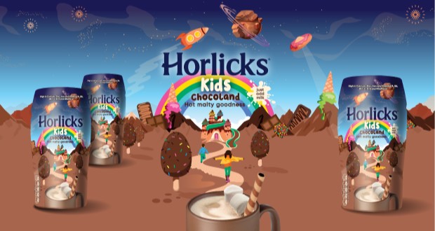
Horlicks, a celebrated name in malted beverages for over 150 years, has embarked on an exciting journey with the launch of Horlicks Kids Chocoland. This innovative product represents the brand’s first venture into the young family market, specifically crafted to meet the nutritional needs of children. Enriched with ten essential vitamins and minerals, this delightful milk-based beverage aims to deliver the malty goodness that Horlicks is renowned for, nurturing the next generation of loyal consumers.

Horlics_Kids_1920x1080_V1-02-1024x576.jpg

To complement this launch, design agency Into the Light has developed a captivating brand world that sparks children’s imaginations. The vibrant and whimsical universe of Horlicks Kids includes enchanting features such as chocolate lollipop trees and ice cream mountains, designed to resonate across various platforms—from packaging to social media communications.

Simon Ellis, managing director of Into the Light, remarked on the project, stating, “This was a dream brief, and our creative team really enjoyed having fun and creating the ‘blast off moment’ for Horlicks Kids. It’s great to finally see the brand taking off in retail!”

Michelle Younger, marketing director at Aimia Foods, emphasized the significance of this launch. She noted, “Building on this significant history, the launch of Horlicks Kids is a hugely exciting development for the brand. Into the Light have really nailed the brief, coming up with a brand identity that will be loved by kids and parents alike.”

Horlicks Kids Chocoland not only introduces a new product but also revitalizes the beloved brand’s promise of quality and nutrition, ensuring its legacy endures for years to come.

Source:

https://www.packagingnews.co.uk/design/new-packs/into-the-light-agency-designs-new-kids-brand-for-horlicks

Categories
Uncategorized

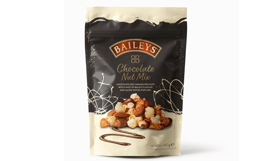
Korozo Group provides stand-up pouches for Baileys Chocolate Nut Mix

Flexible packaging specialist Korozo Group has worked with confectionery group Zertus UK & Ireland on the introduction of Baileys Chocolate Nut Mix pouches.

In an exciting development for the renowned Irish cream liqueur brand, Zertus UK & Ireland has ventured into the adult snack market with a new range of products. This strategic move aims to expand the brand’s footprint into innovative product categories while maintaining its reputation for quality.

To achieve this, Zertus UK & Ireland partnered with Korozo Group to create cutting-edge stand-up pouches that not only meet functional requirements but also captivate consumers visually. Utilizing advanced flexographic printing technology, the pouches are printed in eight vibrant colors, enhanced by a partial surface matte lacquer that elevates their aesthetic appeal. The KoroRCY film, proprietary to Korozo, is laminated to a PE layer with an EVOH component, ensuring optimal barrier properties that preserve product integrity while promoting recyclability.

The design features laser scribing for an easy-tear opening, complemented by an integrated zipper for resealing, catering to the convenience sought by modern consumers. Irem Altinay, Field Sales Manager for Food Flexibles at Korozo Group, emphasized the importance of creating packaging that is both functional and visually striking, reflecting the luxurious nature of the product.

Louise O’Reilly, Product Development Manager at Zertus UK & Ireland, noted the competitive landscape of the adult snack and festive nut mix categories. She highlighted the necessity for packaging that balances functionality with visual appeal, aligning with consumer preferences for convenience, quality, and sustainability. The collaboration with Korozo Group has proven to be a valuable partnership in delivering an exceptional flexible packaging solution for this new product launch.

As this innovative range hits the shelves, it stands poised to capture the attention of consumers, reinforcing the brand’s commitment to quality and sustainability in a crowded market.

Source:

https://www.packagingnews.co.uk/design/new-packs/korozo-pouches-baileys-chocolate-nut

Categories
Uncategorized

LOVE agency unveils rebrand for American snack brand Back to Nature

Manchester-based creative agency LOVE has unveiled a colourful new identity for US snack brand Back to Nature.

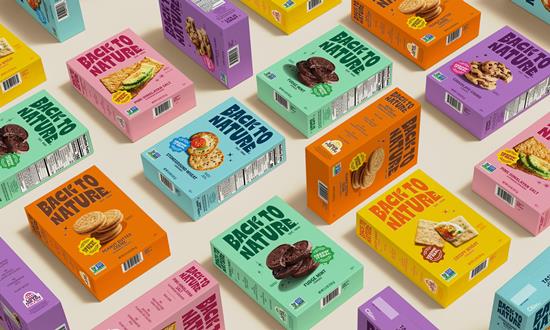
Back to Nature has recently unveiled an exciting redesign that captures the essence of its origins while appealing to contemporary consumers. The refreshed logo, inspired by the Californian sunrise, incorporates the brand’s iconic leaf, paying homage to its pioneering role in the natural food movement. This thoughtful design choice reflects a commitment to nature and quality.

The typography draws from vintage-style sign writing, reminiscent of classic screen prints, which adds a nostalgic charm to the packaging. Complementing this aesthetic is a vibrant colour palette and flavour-forward product photography that brings the packaging to life, emphasizing taste and quality in a way that resonates with today’s consumers.

In conjunction with the redesign, Back to Nature has introduced a new tagline: “Tasty Snacks Since Way Back.” This phrase, coupled with a confident and easy-going tone of voice, highlights the brand’s rich history while ensuring it remains approachable and relevant. The rebrand targets a new audience of “Snack Surfers”—real individuals browsing the aisles—capturing a ‘modern retro’ look that channels the laid-back spirit of 1960s California, the birthplace of Back to Nature.

Jennifer Jorgensen, Chief Executive of Back to Nature, expressed her enthusiasm for the rebrand, stating, “I’m so pleased to show this sunny new brand to the world! We set out with huge ambitions, and we’ve delivered.” She emphasized the remarkable on-shelf presence of the new packaging and the depth it brings to the brand. Jorgensen also extended her gratitude to LOVE, the agency behind the revitalization, for breathing new life into Back to Nature.

This rebranding effort not only enhances the visual appeal of Back to Nature’s products but also reinforces its commitment to quality and authenticity, ensuring that it continues to resonate with both loyal customers and new snack enthusiasts alike.

Source:

https://www.packagingnews.co.uk/design/love-agency-unveils-rebrand-for-american-snack-brand-back-to-nature

Categories
Uncategorized

“Tattooed” Fruits Grab Attention, Save Plastic with Laser Date Coding

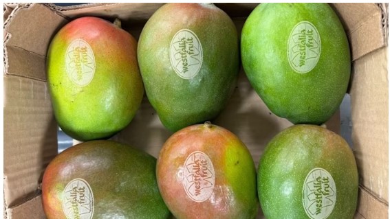
Laser etching directly onto suitably thick-skinned fruits like mangos and avocados lets Westfalia Fruit eschew plastic price look-up tags with date codes, while standing out on the shelf. Possibilities for unique designs, even 2D codes, abound.

In an era where sustainability is paramount, Westfalia Fruit has taken a significant step towards reducing plastic waste while enhancing the presentation of its products. The multinational supplier, renowned for its avocados and mangos, has launched a pioneering process of laser etching codes and branding directly onto the fruit. This initiative, spearheaded by operations in the Netherlands, effectively eliminates the need for plastic price look-up (PLU) stickers, a common yet environmentally taxing practice.

Mathijs Benard, head of operations for Central Europe at Westfalia, emphasizes the dual objectives of this project: reducing plastic usage and maintaining the quality of the fruit. “Since joining Westfalia, my focus has been on improving collaboration and efficiency,” he states. The introduction of laser etching, likened to a tattoo on the mango, not only enhances the visual appeal of the fruit but also has the potential to save up to 10 million plastic stickers annually.

The creative possibilities of laser etching extend beyond mere identification. Initially aimed at providing functional details such as product origin and reference, the project has evolved to include health-related messages and seasonal promotions, offering a unique opportunity to engage consumers directly at the point of sale.

The laser etching process itself is both innovative and efficient. Utilizing a Videojet laser positioned above a conveyor tunnel, the system ensures precise marking of the fruit while adhering to stringent safety measures. The tunnel’s design allows for the laser to activate only after confirming the correct positioning of the fruit, thereby preventing accidents and ensuring consistent quality.

Benard notes that the speed of the laser etching process is comparable to traditional PLU sticker application, with the efficiency varying based on the complexity of the printed message. The advantages of this method are clear: no need for label replacements, reduced susceptibility to environmental conditions, and a significant reduction in plastic waste.

As Westfalia Fruit continues to innovate, the integration of laser etching not only aligns with global sustainability efforts but also sets a new standard in the fresh produce industry, proving that creativity and environmental responsibility can go hand in hand.

Source:

https://www.packworld.com/coding-printing-labeling/coding-markin

Categories
Uncategorized

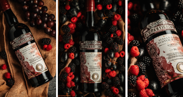
Douglas Laing introduces new addition to Old Particular Red Wine Cask Collection

Douglas Laing & Co. has announced an exciting addition to their portfolio with the release of the Girvan 16-Year-Old Single Grain Scotch Whisky. This limited edition is finished in a single Merlot Red Wine Cask, marking its place as the fourth bottling in the distinguished Old Particular Red Wine Cask collection.

The Old Particular series is renowned for its meticulous selection of cask pairings, expertly chosen to enhance the inherent qualities of both Malt and Grain Scotch Whiskies. The aim is to elevate complexity and depth, offering consumers novel and enriching tasting experiences.

thumbnail_IMG_6390-683x1024.jpg

Bottled at a robust 48.4% alcohol strength, this exquisite whisky is distinguished further by its commitment to quality. Douglas Laing & Co. has ensured that this release is free from artificial colouring and chill filtration, preserving the whisky’s integrity. The bottle is elegantly presented with a premium red wax dip, a fitting tribute to the richness within.

As a limited release, the Girvan 16-Year-Old Single Grain Scotch Whisky stands as a testament to Douglas Laing’s dedication to craftsmanship and innovation in the world of whisky. Enthusiasts and collectors alike will undoubtedly appreciate this new entry into the Old Particular collection

thumbnail_IMG_6355-683x1024.jpg

Source:

https://www.packagingnews.co.uk/design/new-packs/douglas-laing-introduces-new-addition-to-old-particular-red-wine-cask-collection

Categories
Uncategorized

Bluemarlin unveils redesigned Cisk beer portfolio

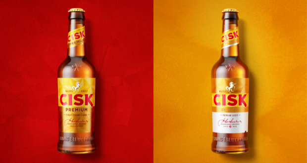
Global brand design consultancy Bluemarlin has recently unveiled a comprehensive redesign of Cisk beer, one of Malta’s most cherished brands. This extensive project showcases a refreshed visual identity for the Cisk range, celebrating its rich heritage while appealing to a contemporary audience.

02_Cisk_Hero_Pilsner_Premium_Strong-1024x771.png

The redesign process commenced with the flagship Cisk Lager, renowned for its distinctive yellow branding, along with its low-calorie variant, Cisk Excel. Following the success of these initial endeavors, Bluemarlin extended the new visual system across the entire Cisk lineup, which now includes Cisk 0.0%, Cisk Pilsner, Cisk Premium, Cisk Strong, Cisk Extra Strong, and the innovative Cisk Chill range.

06_Cisk_Chill-1024x771.png

The challenge faced by Bluemarlin was to create a cohesive and modern look for Cisk’s diverse portfolio while preserving the brand’s iconic elements. The result is a unified range that prominently features the recognizable Maltese cross and sunray motifs across all products, from the classic yellow lager to the vibrant Chill range.

Charlie Spiers, account director at Bluemarlin, emphasized the importance of harmonizing Cisk’s rich traditions with the evolving market demands. “We had to consider the brand’s appeal across different consumer segments—from the loyal older generation, the ‘Patriots’, to the younger, more adventurous ‘Modernists’,” remarked Spiers.

Each variant is designed to reflect its unique character while contributing to an overall consistent brand experience. For instance, the newly designed Cisk Pilsner and Premium beers present a sleek gold and white palette, while the 0.0% variant employs a crisp white can to symbolize purity and lightness. In contrast, the Strong and Extra Strong beers showcase bold black and gold designs, encapsulating robustness and flavour depth.

08_Cisk_0.0-1024x563.png

Special attention was also given to the Cisk Chill range, which targets light, summer drinkers with its flavour variations of Lemon, Berry, and Ginger & Lime. Bluemarlin crafted a vibrant visual language for this line, incorporating lively greens and yellows that resonate with the core Cisk identity while accentuating its distinct fruity profiles.

In conclusion, the redesigned Cisk beer range embodies a strategic fusion of tradition and modernity, catering to a broad spectrum of consumers while preserving the essence of this legendary Maltese brand

04_Cisk_Premium-1024x771.png
03_Cisk_Pilsner-1024x771.png

Source:

https://www.packagingnews.co.uk/design/new-packs/bluemarlin-unveils-redesigned-cisk-beer-portfolio

Categories
Uncategorized

Bristol agency Outlaw creates new packaging for Peroni Nastro Azzurro

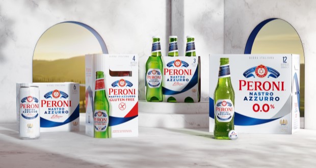
In an exciting development for one of the world’s leading beer brands, Bristol-based strategic brand design agency Outlaw has undertaken the first global redesign of Peroni Nastro Azzurro’s secondary packaging since 2018. This initiative aligns with Peroni’s ambition to ascend to the ranks of the top ten beer brands globally by 2030, recognizing that packaging is a critical element of brand growth and market presence.

Historically, Peroni Nastro Azzurro’s secondary packaging adhered to traditional codes of premium branding, rendering it less visible against more striking competitors. The previous design had faltered, overshadowed even by its own launches, such as the non-alcoholic Peroni 0.0% and the ‘Stile Capri’. The new design aims to rectify this, enhancing the brand’s shelf visibility and premium perception in over 70 international markets.

03-PNA_Flay-Lay-1024x576.jpg

Outlaw’s approach involved extensive distinctive asset research to identify the most powerful visual elements of the brand. Their findings led to the bold decision to elevate the blue ribbon – or ‘Nastro Azzurro’ – as the central feature of the new design. This elegant element sweeps across the packaging, embodying the brand’s Italian flair and creating a striking presence that enhances findability and appeal. The updated logo, referred to as the ‘Amaretti’, has been rebalanced for improved visibility while maintaining its premium essence.

06-PNA_Box-stack-1024x576.jpg

This redesign not only enhances the aesthetic qualities of the product but also streamlines a global rollout process. Outlaw effectively extended the core design to include variants like Peroni 0.0% and Gluten Free, ensuring a cohesive branding strategy across diverse markets. The new packaging is anticipated to capture consumer attention and encourage trial, which is vital for Peroni’s growth objectives.

07-PNA_Before-and-After-1024x576.jpg

Alex Rexworthy, design director at Outlaw, succinctly captured the essence of the redesign, stating, “It was an honour to unleash the ‘Nastro Azzurro’ and send it rippling around the world.” Meanwhile, Mike O’Donoghue, global head of brand at Peroni Nastro Azzurro, expressed enthusiasm for the result, affirming its potential to resonate with consumers worldwide.

As the new secondary packaging begins to roll out across various markets, it symbolizes not just a fresh visual identity, but also a renewed commitment to standing out in a competitive landscape, inviting more consumers into the elegant world of Peroni Nastro Azzurro.

05-PNA_12x330ml-Macro-734x1024.jpg

Source:

https://www.packagingnews.co.uk/design/new-packs/bristol-agency-outlaw-creates-new-packaging-for-peroni-nastro-azzurro

Categories
Uncategorized

Sealed Air launches new flexible printing solution for e-commerce packaging

Sealed Air has introduced a groundbreaking on-demand printing system, AutoPrint, designed specifically for late-stage customisation of protective packaging. This innovative solution aims to provide logistics and fulfilment operators with a flexible and efficient means of catering to the growing consumer demand for personalised branding and messaging on packaging.

Alessandra Secchi, Executive Director of Digital Packaging Europe at Sealed Air, emphasises the increasing trend among brands and retailers to customise e-commerce packaging as a strategy to engage consumers and enhance brand visibility. The rise of social media unboxing videos has further amplified the need for distinct packaging, presenting challenges for logistics and fulfilment companies that must manage numerous design templates while efficiently handling the ordering and storage of pre-printed boxes.

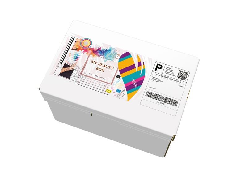
AutoPrint addresses these challenges by offering a digital printing solution that seamlessly integrates into existing packaging lines. This system allows for direct printing of customised designs and information onto closed boxes, thereby minimising storage requirements and reducing waste associated with unused pre-printed materials.

Featuring a full-colour CMYK printer, AutoPrint automatically adjusts to accommodate box heights of up to 200 cm and widths of 14 cm, with side printing options available and plans to expand the printing width in the future. The system boasts an impressive capability of printing up to 15 boxes per minute, compatible with both white and brown corrugated boxes. By eliminating the need for on-pack labels, AutoPrint facilitates quick transitions between different designs, enabling operators to produce premium quality graphics, text, and barcodes that meet the evolving demands for personalised packaging.

Moreover, AutoPrint can be integrated with Sealed Air’s Brand I-Pack Automated Void Reduction Packaging system, which optimises fulfilment processes by dynamically adjusting pack sizes. I-Pack calculates product dimensions in real time to ensure that corrugated boxes are accurately sized, folded, closed, and sealed according to the specific requirements of the items being packaged.

In conclusion, Sealed Air’s AutoPrint represents a significant advancement in customised packaging solutions, empowering logistics and fulfilment operators to meet contemporary consumer expectations while enhancing operational efficiency.

Source:

https://packagingeurope.com/news/sealed-air-launches-new-flexible-printing-solution-for-e-commerce-packaging

Categories
News & Updates

ames Cropper reveals garment tags made from recycled coffee cups

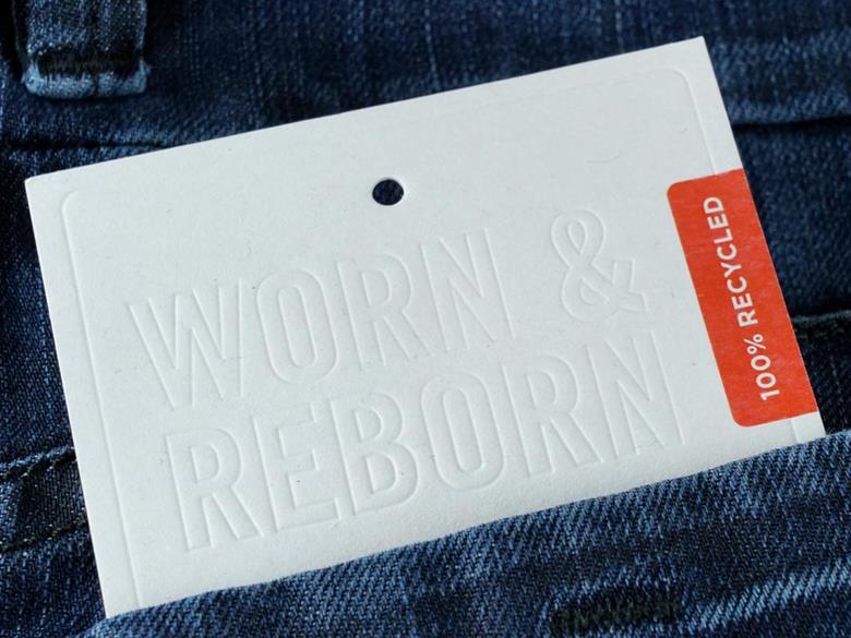
In a significant step towards sustainable fashion, James Cropper has unveiled its premium garment tags made from recycled coffee cups, designed for the New Zealand lifestyle brand Untouched World. This initiative addresses the pressing issue of textile waste, particularly within the denim industry, which sees the production of approximately eight billion pairs of jeans each year. Alarmingly, the World Economic Forum reports that 73% of discarded clothing ends up incinerated or in landfills, with only a mere 12% being recycled into insulation or mattresses, and less than 1% repurposed into new products.

The innovative tags from James Cropper are composed of 100% recycled materials, featuring 20% post-consumer denim fiber and 80% recycled fiber sourced from coffee cups. This cellulose-based product is not only recyclable globally but also embodies the principles of a circular economy, allowing the fibers to have multiple lives.

Untouched World has selected Rydal Apparel to replace traditional swing tags on its new range of recycled denim tote bags, coinciding with the launch of their new store in Auckland, New Zealand, this November.

Kate Gilpin, Product Manager for Luxury Packaging at James Cropper, emphasized the importance of such innovations in fostering a circular economy within the fashion industry. She remarked, “Brands like Untouched World are highlighting what’s possible and how a simple shift, like replacing paper or plastic tags with recycled fiber tags, can make a world of difference to our planet.”

Lucinda LeHeron, Creative Director at Untouched World, echoed this sentiment, stating, “We use time-honoured practices and luxurious natural materials to break away from the fast fashion model. Every detail of our garments’ life cycle and each step in our supply chain is carefully considered.” She further noted the significance of selecting sustainable materials, highlighting the collaboration with James Cropper as a testament to their commitment to circularity and waste reduction.

This partnership marks a pivotal moment in the movement towards sustainable fashion, showcasing how thoughtful innovation can lead to meaningful environmental impact.

Source:

https://packagingeurope.com/news/james-cropper-reveals-garment-tags-made-from-recycled-coffee-cups

Categories
News & Updates

Albertsons Releases Buzz-Worthy rPET Wine Bottles

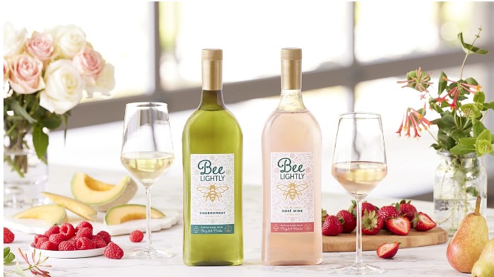
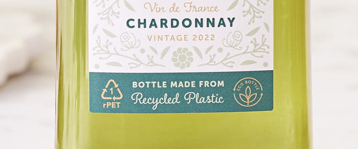
In a significant leap toward sustainable packaging, Albertsons Companies, Inc. has unveiled its Bee Lightly wine line, packaged in 100% recycled PET (rPET) bottles. This initiative marks a pioneering moment in the U.S. beverage industry, showcasing a commitment to eco-friendly practices while introducing innovative packaging solutions.

The Bee Lightly collection features two distinct varietals: the 2022 Bee Lightly Chardonnay and the 2023 Bee Lightly Rosé, both of which represent a harmony of quality and sustainability. The introduction of flat rPET bottles not only minimizes the carbon footprint associated with wine distribution but also reduces pallet usage by an impressive 44%, thereby enhancing shipping efficiency.

“It is our ongoing mission at Albertsons Cos. to distinguish ourselves in the wine sector and expand our quality offerings,” asserts Curtis Mann, master of wines. “With the launch of our Bee Lightly selection, we provide customers with affordable wines from France while setting new standards in wine packaging.”

Bee-Lightly-Wines-Label-Close-1200x550.jpg

This innovative project is the result of a collaborative effort between Albertsons’ Own Brands team, WX Brands, and Packamama, a climate tech packaging firm recognized for its distinctive flat-bottle design. Together, they have established a sustainable model that prioritizes environmental responsibility without compromising consumer choice.

Bee Lightly wines are available at select Albertsons, Safeway, Vons, Jewel-Osco, and ACME stores, with plans for delivery through Vine & Cellar in California. Sourced from the Hérault and Limoux regions, these wines elevate the standards for both taste and sustainability.

As the grocery chain moves forward, the Bee Lightly initiative serves as both a reminder and an inspiration for innovative practices in the beverage industry, promoting a greener future through thoughtful packaging solutions.

The Advantages of Recyclable rPET Bottles in Wine Packaging

In the quest for sustainable packaging solutions, the introduction of recyclable rPET bottles marks a significant advancement in the wine industry. These innovative bottles are 87% lighter than traditional glass bottles of the same volume, presenting a compelling case for eco-conscious producers and consumers alike.

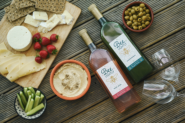
One of the most notable benefits of rPET bottles is their flat packaging design, which significantly reduces the carbon footprint associated with transportation. This design not only enhances logistical efficiency but also allows for nearly double the number of products to be shipped on a single pallet. For instance, Albertsons’ Bee Lightly application utilizes this flat-back bottle design, resulting in a remarkable 44% reduction in pallet usage when shipping the same volume of wine compared to standard glass bottles.

Bee-Lightly-Wines-Laydown-1000x667.png

Brandon Brown, Senior Vice President of Own Brands at Albertsons Companies, emphasizes the importance of this innovation: “The introduction of Bee Lightly into our Own Brands portfolio marks an innovative partnership and venture into wine packaging, highlighting our dedication to product quality and environmental stewardship.” He further notes that today’s consumers appreciate the quality and value offered by private label products, making the Bee Lightly premium wine varietals an attractive option for those seeking both affordability and excellence in flavor.

In summary, the adoption of recyclable rPET bottles not only supports sustainability efforts but also enhances operational efficiency in the wine industry, paving the way for a more environmentally responsible future.

Source:

https://www.packagingdigest.com/beer-wine-spirits/albertsons-releases-buzz-worthy-rpet-wine-bottles