Categories
News & Updates

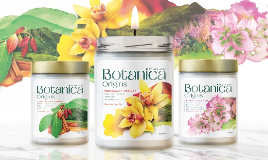
Air Wick Botanica brand launches a premium range

Air Wick’s Botanica brand has launched a new premium range, Botanica Origins.

In a remarkable collaboration with Design Bridge and Partners, a new core brand strategy has emerged, intricately weaving the themes of people, places, and plants. Central to this initiative is the concept of terroir, which has significantly influenced the visual expression of the newly launched product range.

The packaging design draws inspiration from the aesthetic of a botanist’s scrapbook, resulting in a collage that harmoniously combines photography, abstract watercolours, and graphical elements. This meticulous design process reflects a profound dedication to craftsmanship, embodying a true labour of love.

Accompanying the striking packaging is a refreshed brand identity that features a new logo. Drawing from the beauty of the natural world, the logo showcases elegant flicks and flourishes reminiscent of unfurling leaves. This design not only encapsulates the essence of the brand but also reinforces its commitment to nature.

Additional branding elements include a distinctive ‘B’ monogram and a beautifully illustrated stamp device, signaling the brand’s promise of offering fragrances infused with natural and responsibly sourced ingredients. This thoughtful integration of design and philosophy positions the brand as a leader in sustainability and aesthetic appeal.

In summary, this collaborative effort underscores the powerful intersection of design and nature, crafting a compelling narrative that resonates with consumers.

Source:

https://www.packagingnews.co.uk/design/new-packs/air-wick-botanica-brand-launches-a-premium-range

Categories
News & Updates

KP Snacks revamps designs for Discos packaging

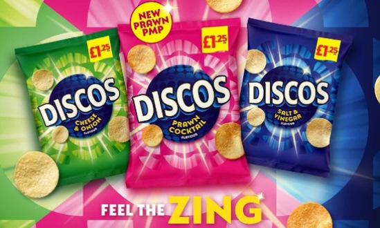
KP Snacks’ Discos packs have been redesigned with a ‘modern’ look for the brand, starting with its Prawn Cocktail flavour.

In a dynamic retail landscape, the importance of visually striking packaging cannot be overstated. This principle is exemplified by the recent launch of new packs for Discos, which feature vibrant colours and carry the evocative tagline “Feel the Zing.” Such a redesign aims to significantly enhance shelf presence, attracting both loyal customers and new consumers alike.

Pauline Warren, Heritage Portfolio Manager at KP Snacks, articulated the brand’s commitment to evolution, stating, “Discos is a familiar and well-loved brand that has been providing great tasting snacks for decades. We are thrilled to be refreshing this iconic brand with a bold packaging redesign, continuing to support its growth and relevance within the category.”

This strategic move not only modernizes the brand but also reinforces Discos’ standing in an increasingly competitive snack market. The fresh aesthetic is poised to resonate with consumers seeking both nostalgia and novelty in their snacking choices, ensuring that Discos remains a delightful staple on the shelves.

Source:

https://www.packagingnews.co.uk/design/new-packs/kp-snacks-revamps-designs-for-discos-packaging

Categories
News & Updates

Sunhouse redesigns Tropicana packaging

Tropicana has revamped its iconic packaging design working with Sunhouse.

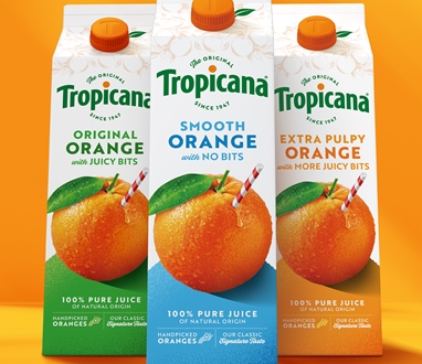
Tropicana has recently unveiled a striking redesign that places the iconic orange back at the center of its identity, reaffirming its commitment to quality and heritage. The evolved brand mark features a distinctive horizon arch, punctuated by an orange accent on the ‘i,’ and is paired with the tagline “The Original since 1947.” This integration not only enriches the brand’s narrative but also reinforces its authenticity and promise of superior quality.

The visual identity of Tropicana has been enhanced with the classic symbol of a whole orange and a red-and-white straw, which has been refined to heighten its taste appeal. This updated graphic embodies a more robust shape language, underscoring the brand’s dedication to delivering juice straight from the source.

Final touches to the design include founder Anthony T. Rossi’s signature, a hand-drawn illustration of oranges, and a photograph of the original grove, all of which amplify Tropicana’s craftsmanship and authenticity.

Mick van Ettinger, chief marketing officer of Tropicana Europe, emphasized the significance of this redesign, stating, “This marks a pivotal moment for Tropicana. It represents an opportunity to blend modern iconicity with decades of heritage, reinforcing our leadership in the juice category.” He noted the collaborative effort with Sunhouse to reconnect with the brand’s roots and celebrate its enduring identity.

James Giles, executive creative director at Sunhouse, pointed out the goal of rejuvenating the brand’s visual assets, highlighting the compelling stories behind Tropicana to convey the message that “Not All Juices are Created Equal.”

In essence, Tropicana’s new design serves not just as a visual update, but as a profound acknowledgment of its rich history and unwavering commitment to quality, embodying the essence of “pure, delicious natural goodness straight from the source.”

Source:

https://www.packagingnews.co.uk/design/new-packs/sunhouse-redesigns-tropicana-packaging

Categories
News & Updates

Knockout designs Hennessy X.O Travel Collection to take brand on ‘global odyssey’

Maison Hennessy has launched a special collection of Hennessy X.O cognac exclusive travel edition featuring meticulously crafted packaging by independent design agency Knockout.

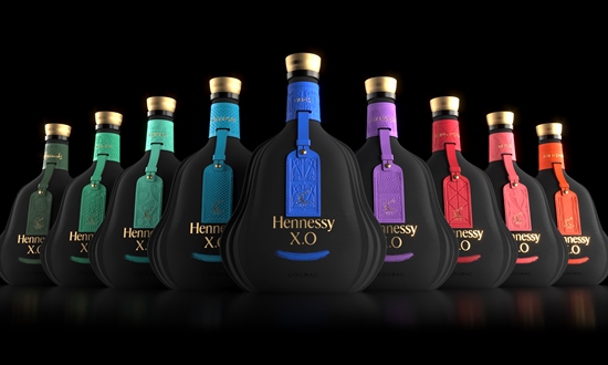
In an innovative collaboration, Knockout has been entrusted with the design of a limited-edition collection that celebrates ‘nine extraordinary destinations’ cherished by Hennessy. These locales—Macau, Hainan, Singapore, Paris, Shanghai, Hong Kong, Taipei, Shenzhen, and a bespoke offering for Harrods—serve as the brand’s homes away from home.

At the core of this project lies a commitment to sustainability, guiding the design towards a forward-thinking approach that departs from traditional packaging. The collection features bottles protected by cases crafted entirely from recyclable paper pulp, molded to reflect the elegant silhouette of the Hennessy X.O bottle. This unique casing not only offers protection but also enhances the visual allure of each bottle, characterized by fluid lines that echo the bottle’s distinctive form.

A luxurious leather luggage tag accompanies each bottle, embossed with patterns inspired by the architectural marvels of their respective destinations. The labels further amplify the design’s richness, showcasing bespoke illustrations that encapsulate the vibrant energy and character of each locale. A thoughtfully curated color palette injects a sense of dynamism into the collection, merging tradition with modernity.

The Paris edition of this collection debuted in conjunction with the 2024 Olympics, encapsulating the city’s classical elegance through a stunning illustration of its iconic landmarks.

“Beyond its sustainability, the beauty of this material lies in its ability to imbue depth and drama, enriching the brand’s narrative,” remarked Dom Burke, founder and executive creative director of Knockout. “Through the marriage of sustainable materials and premium treatment, the design embodies the ethos of sustainable luxury, achieving a harmonious blend of striking beauty and environmental responsibility.”

This endeavor not only highlights Hennessy’s commitment to sustainability but also reinforces its status as a purveyor of luxury, showcasing how conscientious design can enhance the experience of premium products while respecting our planet.

Source:

https://www.packagingnews.co.uk/design/new-packs/knockout-designs-hennessy-x-o-travel-collection-to-take-brand-on-global-odyssey

Categories
News & Updates

The Label Makers ‘transforms’ Halfpenny Green’s premium wine labels

The Label Makers has worked with Halfpenny Green Wine Estate to produce a new look sustainable label for their oak-aged Solaris wine.

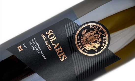
The wine industry continues to evolve, and at Halfpenny Green Wine Estate, an exciting update is on the horizon. The signature coin featured prominently on the estate’s labels— a hallmark of its premium offerings— is set to be rolled out across other premium range bottles. This enhancement not only accentuates the brand’s identity but also exemplifies a commitment to quality and sustainability.

Crafted from uncoated white matt, wood-free printing paper with a felt-marked finish, the new labels marry aesthetic excellence with environmental responsibility. Designed to endure challenging conditions, these labels boast wet strength and a fungicidal treatment, ensuring they remain pristine even when submerged in ice buckets.

The innovation does not stop there. The laminate used in the production of these labels comprises 70% post-consumer recycled content, reflecting both The Label Makers’ and their clientele’s dedication to sustainability.

Furthermore, the labels are designed using advanced printing techniques, including a full-colour digital print, intricate line work, foils, embossing, and high-build spot varnish. This results in a visually striking appeal, particularly evident in the attention to detail found in the coin elements and vibrant colours.

Julian Sollom, head of sales at Halfpenny Green Wine Estate, praised The Label Makers for their proficiency in producing high-quality labels tailored for the wine sector. He remarked, “They really understand drinks labels, producing consistently high-quality products, such as scuff-resistant labels that maintain their integrity in shipping and in ice buckets.”

As Halfpenny Green Wine Estate prepares to unveil these redesigned labels, it reinforces its commitment to excellence and sustainability in the ever-competitive wine market.

Source:

https://www.packagingnews.co.uk/design/the-label-makers-transforms-halfpenny-greens-premium-wine-labels