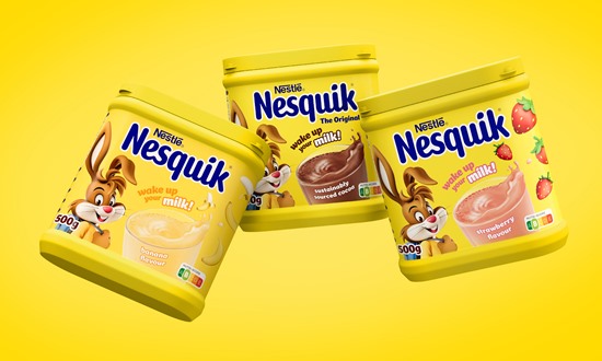
Nestle’s long-established milkshake brand Nesquik has revamped its branding, working with designers at FutureBrand.
The focus of the new design is Nesquik’s mascot Quicky, which has been reimagined for a digital future. With a focus on purpose and relevance.
FutureBrand said it looked to the ‘phygital’ world that the next generation play in for inspiration, drawing on cues from computer animation films and the gaming industry to bring contemporary relevance and real longevity.
The agency also created a bespoke typeface called Nesquik Sans, with the aesthetic reflecting the brand’s playful and fun personality – and the new logo features an animated milk splash.
Stephen McGilvray, executive creative director, FutureBrand said the new packaging for Nesquik is bold and has a real presence on the shelf, with a simplified packaging design system.
“We knew we needed to make Quicky a true icon for the brand once more, and by evolving his character we’ve opened the door for him to engage with new audiences and flex to new product lines. Creating ‘Quicky’s World’ and taking him into fresh new territory has been so rewarding and we can’t wait to see him brought to life across pack and online.”
Source:
