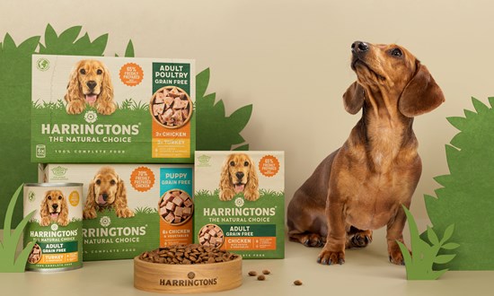
Robot Food has rebranded Harringtons pet food, modernising and clarifying its positioning and visual identity.
The agency was brought in to retain Harringtons’ position in a rapidly shifting category, as well as setting up their cat range for increased success.
The new designs are used across wet and dry food and treats for dogs and cats.
The new packs needed to communicate with a clear information hierarchy and better on-shelf standout.
Robot Food worked to eliminate problems like a lack of clarity across the brand’s various products and subbrands, and create a stronger, more unified look and feel that better reflected its expertise and history, which stems back to 1923.
The new designs unite each of the products in the range under a single, simplified design system; stripping the front of pack information down to its most essential details.
The height of the former packs meant that they were often folded over on shelves, obscuring the brand name. These have now been moved down the packs, which use a ‘horizon of grass’ that’s consistent across dog and cat products.
Simon Forster, Robot Food founder and executive creative director, said: “These are relatively simple design updates, but they were essential to create a much prouder, more united brand, with greater impact on-shelf. We’ve shown them our working and our thinking leading up to that point of arriving at a more simplistic design, so that when they see the solution, they just know it’s better than previous.”
Source:

