Categories
News & Updates

StormBrands creates new design system for Morrisons Free From range

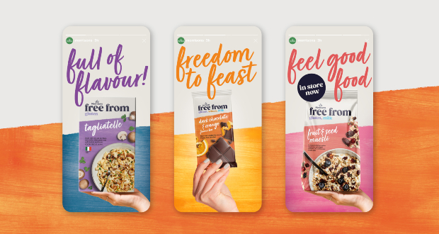
Brand and design consultancy StormBrands, has continued its partnership with Morrisons to create a new design direction for the supermarket’s ‘Free From’ range.

The new design system, for the roll out across more than 100 SKUs represents a shift in approach for the range, emphasising the products’ flavour story rather than just the removal of potential allergens such as wheat, gluten and milk.

Morrisons ‘Free From’ range has gained a loyal customer base over time and has the benefit of being merchandised together in one place creating a ‘Free From’ destination in store.

The supermarket briefed Storm to redesign and revitalise the range, which, whilst still prominent and ownable, needed to compete more powerfully against the increasingly personality-led brands entering the market.

Storm needed to define a bold and exciting new identity that offered clarity as well as being flexible enough to travel across ranges, appeal to an increasingly diverse spectrum of consumers and all while delivering a very clear and important allergen message and communicating fullness of flavour.

The agency carried out a strategic market and competitor audit and identified an opportunity to elevate the Free From range from a portfolio of products that solely removes allergens to a range that is packed full of flavour, has vibrant and inspiring meal options and delivers food freedom for all.

The new design needed to find a balance which spoke to both ‘have to’ consumers who have serious allergy intolerances and consumers who choose to eat ‘Free From’ products as part of a lifestyle choice.

Zoe Phillipson, StormBrands creative director commented: “Our new range design for Morrisons ‘Free From’ products feels like the perfect balance of trust and taste. We’ve broken free from the functional constraints of the brand and unleashed a full-on flavour extravaganza with expressive typography and a mouth-watering ingredient story. Nutritional signposting and clarity of messaging is still key, but is now delivered via a life-affirming and joyous visual language and tone of voice.”

Source:

Categories
News & Updates

Seymourpowell creates look for Republic of Fremantle premium spirits

Design and innovation agency Seymourpowell has collaborated with Republic of Fremantle to design the new premium flagship range of Aromatic Gin, Full Bodied Gin and Signature Vodka.

Western Australian urban distillery in the heart of Fremantle’s bustling West End, Republic of Fremantle, was established in 2019 and is one of the few distilleries in the world crafting their spirits from scratch, using innovative ‘grape to glass’ distilling methods to create the base spirit from locally sourced wine.

Seymourpowell’s creative solution for this flagship range garnered inspiration from the brand’s Antipodean provenance with a fresh and differentiating colour palette, and inclusion of familiar symbols of the historic port of Fremantle. Sails, lighthouse and compasses weave through the linear horizon, echoing the style of modern banknotes – treating the physicality of the bottle itself as an embodiment or symbol of currency for the Republic.

Allison Spence, creative director, brand, Seymourpowell, commented:“At the heart of the conceptual thinking, the visual storytelling was focused around the unique production method, from grape to glass. The multifaceted, complex and layered tasting notes of the product itself, are reflected in the detail of the designs.”

The symbols featured on each product are embellished in foil and are inspired by the vintage bottles found at the site during excavation at the beginning of the build. These symbols represent a bold spirit, all the while reiterating the renegade drive of the makers. Each of the icons portrayed on the bottle designs have been created to form a ‘kit of parts’ that transcend the packaging and adapt and flex across all touchpoints for the brand from website assets to signage.

The result is an intriguing multi-layered 360 design which encourages the consumer to rotate the bottle and discover more about the Republic of Fremantle proposition.

“The team at Seymourpowell tackled our brief exceptionally well, bringing the philosophy of the Republic to life by incorporating the core of our brand’s origin and offering at the heart of its visual identity,” said John McVeigh, co-founder, Republic of Fremantle. “The designs tell our story and encourages our customers to interact with the product. We wanted to develop something that celebrates our origin, unique distilling process and provenance at every pour, proudly standing out from other brands.”

Source:

Categories
News & Updates

Eat Real Snacks gets new look in bid to modernise

Snacks brand, Eat Real, is seeking to broaden its appeal to a wider audience of health-conscious shoppers by rebranding its full range.

Under the new brand positioning ‘Relishing the Alternative’, the better-for-you snacking brand is following the growing movement around healthier, yet delicious plant-based snacking.

The new refreshed packs, designed by Bristol-based design studio Outlaw, aim to bring Eat Real’s big bold flavours to life.  By highlighting its culinary ingredients and artisanal food experiences, they call on food lovers to take pleasure in discovering alternative, healthy combinations.

Launching in May, the updated packs will extend across its full Lentil, Quinoa, Hummus and Veggie Chip ranges, starting with hero flavours including Hummus Tomato & Basil, Lentil Chilli & Lemon, Hummus Salted and Quinoa Sour Cream & Chive.

Keeping its pioneering roots at the forefront, the new design highlights both its flavour combinations and better-for-you credentials, including vegan and gluten-free.

All Eat Real products remain free from artificial colours, flavours and ingredients, with the Hummus and Lentil ranges containing 30% less fat than regular potato chips.

The rebrand coincides with the redevelopment of the Hummus Chips range, in which four of its flavours are now HFSS compliant thanks to a reduction of its salt content by more than 50%.

Eat Real marketing director, Helen Pomphrey explained: “Eat Real has become pioneers in better-for-you thanks to its unusual ingredients layered with bold, unexpected flavours inspired by the combinations you find in your own cooking.

“We’ve found that Eat Real’s flavours are a key driver to consumer purchase, as more people opt for delicious, yet healthy alternatives.

“|Using bright bold colours and showcasing our mouth-watering ingredients on-pack, the new look and feel is set to bring excitement to the range, whilst also bringing the bold flavours to life.”

Source:

Categories
News & Updates Sustainability

Walki introduces portfolio of recyclable materials for frozen food segment

Walki, a specialist in packaging and engineering materials, says it is answering to the growing demand for frozen food by expanding its portfolio of recyclable materials.

The global market for frozen food is expected to grow to 322bn by 2026. Although the demand is growing globally across all age groups, it is said to be especially popular among younger consumers.

“Frozen food is an ideal way to prolong shelf life without losing out on the vitamins. It is also an excellent way to combat food waste. This is important as up to 9 % of global carbon emissions can be attributed to food waste, especially fruit and vegetables”, said Dudley Jones, consumer sales at Walki.

Walki is introducing a broad portfolio of different materials, including printed solutions, to suit the needs of the frozen food market with the aim of making the packaging fully recyclable in the paper stream.

“Frozen food places high demands on the packaging. It needs to be both sturdy and puncture-resistant to handle diverse situations like pressures of sealing and mechanical tear during transportation. The packaging also needs to withstand variability in temperatures as some frozen food is defrosted in its packaging”, explained Jones.

WalkiEVO Seal and WalkiOpti Seal are recyclable paper-based packaging intended especially for pillow-pouches for frozen food. WalkiEVO Seal has a dispersion coating as barrier against water vapour and grease while WalkiOpti Seal has an optimised PE-extrusion coating.

“The dispersion coating makes WalkiEVO Seal recyclable in the waste-paper stream without any separation process, while the minimised PE-coating on WalkiOpti Seal makes it suitable to be recycled with paper with an acceptable fibre yield”, said Andreas Rothschink, head of product development at Walki.

Both are suitable for all kind of frozen food: vegetables, seafood, bakery products to name a few.

LamibelMDO-PE is a film-based material for pillow pouches made of reverse printed MDO-film and solvent-free laminated with low sealing LDPE. According to Walki, the film thickness is minimised while performance is maximised by replacing other sorts of materials such as PP- or PET-films, thanks to the MDO technology,.

“This combination of two PE-films makes the packaging fully recyclable in the plastics stream. The stretched film has better optics with high stiffness and mechanical properties than standard PE. The film can also be transparent, allowing the consumer to see the product”, said Rothschink.

LamibelMDO-PE is a suitable material for all type of packaging (doypack, flowpack, pouches, etc.) as well as all kind of frozen food like vegetables, sharp-edges seafood and bakery.

WalkiPack Tray is a board-based tray suitable for frozen ready-made meals, designed to replace aluminium, plastic or plastic-coated trays.

“The tray is easy to fill, transport and store, and is also the convenient choice for the consumer as the fibre-based tray is safe to use in microwaves and in conventional ovens up to 220 degrees for up to 60 minutes,” said Jones.

Source: