
Free The Birds has refreshed Bayer’s drink and vitamin tablets Berocca.
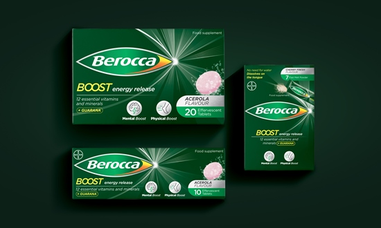
The colour palette was improved across the portfolio to ease navigation; primary Berocca colours define the Energy and Boost ranges whereas flavour colour palette differentiates the lozenges across the portfolio.
Free The Birds also created bespoke illustrations on packs to clearly communicate the benefit of each product and the iconic Berocca fizz moment, which is a key asset for the brand.
Chris Padain, VP head of design & packaging from Berocca added: “Our brand needed a refresh in order to further engage the consumers, who are putting self-care and wellbeing at the forefront of their shopping experience. Free The Birds has been an excellent partner to our brand journey and has reinforced our product benefits on pack, whilst remaining consistent with our legacy.”
Nick Vaus, partner and creative director at Free The Birds, said: “Berocca is a heritage brand that you can spot in almost every household. As such, the new brand identity had to retain the existing brandmark, but elevate its positioning on the consumer health market. The new global cohesive design framework stands out on shelf and emphasizes the brand’s key messaging around positive energy.”
Source:
https://www.packagingnews.co.uk/design/new-packs/free-birds-refreshes-berocca-packaging
3 replies on “Free The Birds refreshes Berocca packaging”
Can you be more specific about the content of your article? After reading it, I still have some doubts. Hope you can help me. https://accounts.binance.com/de-CH/register-person?ref=W0BCQMF1
Thank you for your sharing. I am worried that I lack creative ideas. It is your article that makes me full of hope. Thank you. But, I have a question, can you help me?
Your article helped me a lot, is there any more related content? Thanks!