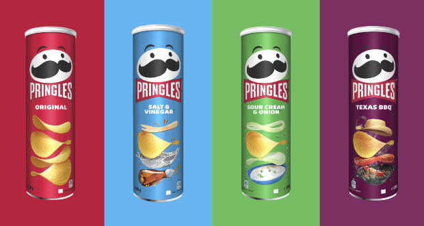
Mr. P, the moustachioed mascot for Pringles, has enjoyed his first makeover in 20 years, to coincide with the 30-year anniversary of the famous snack brand’s UK launch.
After an eye-catching transformation, the playful Mr. P will now sport a modern look, including bold new eyebrows and a fancy new red bow tie. Mr.P’s new look, designed by creative agency Jones Knowles Ritchie (JKR), has also seen him lose his hair.

The iconic cans have also been given a fresh new look. They will now feature new bright and bold packaging, highlighting Pringles’ range of flavours and of course, their famous stackable shape.
The original Mr. P was designed by Arch Drummond in New York in 1967 and the mascot has since become a global icon synonymous with fun times, and even once found himself guest-starring in an episode of The Simpsons.

Since Pringles launched, Mr. P has had six new looks to keep in tune with the times. Twenty years since his last redesign, the 2021 version of Mr. P is his boldest look yet.
After 30 years, Pringles’ popularity is still going strong, with an average of five cans of Pringles flying off shelves each second in the UK.
Pete Matthews, brand design director from Pringles, said: “Pringles has always had such an iconic look and feel, we wanted to refresh the design and Mr P without losing our strong visual identity. The intention with the new look is to simplify and modernise the design, giving the brand’s mascot a bold makeover and highlighting the stackability of the crisps across the range.’’
Consumers will soon be able to spot the new design cans and Mr. P’s glow up across stores nationwide from late September.

Source:
https://www.packagingnews.co.uk/design/new-packs/pringles-pack-gets-redesign-mascot-makeover