Categories
News & Updates

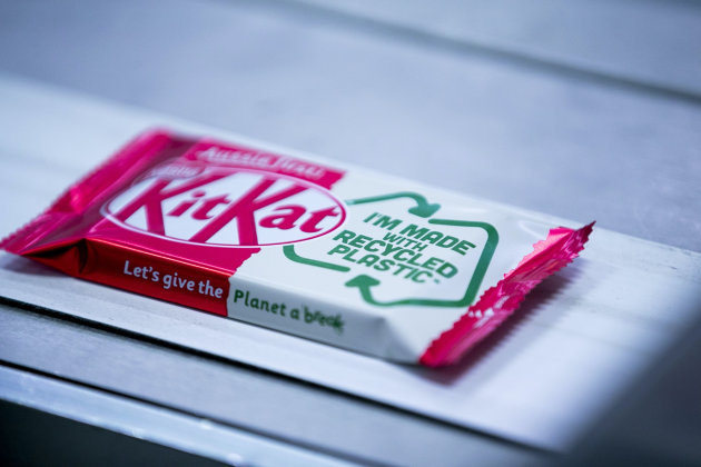
Kit Kat prototypes recycled soft plastic wrapper

A coalition of companies with a shared vision to close the loop on soft plastics have produced the country’s first ever soft plastic food wrapper made with recycled content for the Kit Kat brand of chocolate bars.

Food grade recycled soft plastic packaging is a key missing link in Australia’s bid to improve waste management and build a circular economy, and the prototype Kit Kat wrapper represents Australia’s opportunity to close the loop on recycling soft plastics.

The coalition of companies consists of Nestle, CurbCycle, iQ Renew, Licella, Viva Energy Australia, LyondellBasell, REDcycle, Taghleef Industries and Amcor – all of whom brought their individual expertise to the table for the prototype’s creation.

Turning soft plastic back into oil is currently the only path plastic waste can take if it is to be transformed into a food safe wrapper. Unfortunately, this is technology that Australia does not have yet at scale.

“Between us, we have shown that there’s a pathway to solve the soft plastics problem,” said Sandra Martinez, CEO of Nestle Australia.

“To build this at scale, across all states and territories, across hundreds of councils, is going to take a huge effort from government at all levels, from industry and from consumers.

“Manufacturers like Nestle will have a key role in driving demand for food grade recycled soft plastic packaging, and creating market conditions that will ensure all stakeholders throughout the value chain view soft plastics as a resource and not waste.”
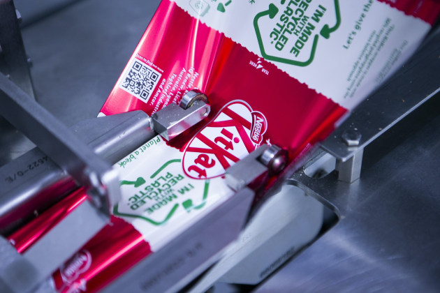
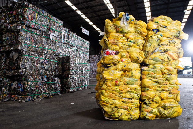
The initiative emerged from a trial underway on the NSW Central Coast, where Australian Recycler iQ Renew and Nestle are working together on a trial of kerbside collection of soft plastics.

These collected plastics, together with plastics collected via REDcycle supermarket soft plastic collection, formed the starting point for the project.

To date, soft plastics collected in Australia have been made into products like outdoor furniture, added to road base or used in waste to energy.

“To improve the recycling rate of soft plastics, kerbside collection is an important point of convenience,” explains Danial Gallagher, CEO of iQ Renew.

“In the trial, soft plastics are collected from kerbside recycling bins in a dedicated bright yellow bag, then sorted from the recycling stream at our MRF.

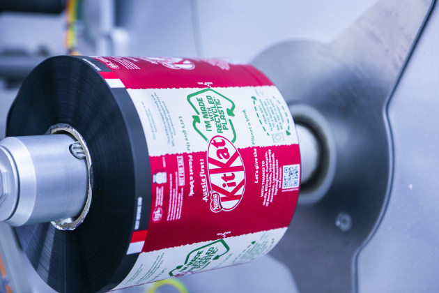
“To create the Kit Kat wrapper with 30 per cent recycled content, the soft plastics were processed, then sent to Licella for conversion back into the oil from which they originally came. This oil was then used to produce new food grade soft plastics.”
According to Tanya Barden, CEO of the Australian Food and Grocery Council (AFGC), learnings from the Central Coast trial will be informative as the AFGC works to develop an extended producer responsibility scheme for hard to recycle plastics, funded by a National Product Stewardship Investment Fund grant.

“Among other things, we’ll be looking at how this model can be scaled up, ensuring there is healthy demand for packaging with recycled content and helping bring to life local industries that can unlock billions of dollars of value that’s currently lost to landfill,” Barden continues.

On 19 March, Nestle will host leaders from across the plastic packaging value chain for a roundtable event, The Wrap on Soft Plastics, exploring the opportunities and hurdles for soft plastics recycling.
Source

https://www.packagingnews.com.au/latest/kit-kat-prototypes-recycled-soft-plastic-wrapper

Categories
News & Updates

The inside story of McDonald’s packaging rebrand

McDonald’s recently teamed up with Pearlfisher to rethink its packaging design, with a focus on aesthetic minimalism. We talked with Matt Sia, creative director at Pearlfisher, to get the inside story on the rethink and assess its importance to McDonald’s’ wider brand.

Could you introduce the rebrand to us and unpack some of its key features?

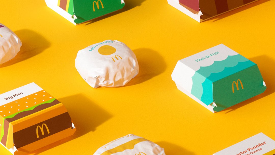
Our focus in partnering with McDonald’s was on redesigning their global system of packaging. What we created is a system led by thoughtful, colourful illustrations of every menu item. Transitioning from a design system with prominent on-pack messaging, the graphic representations of menu items help make each of the structures more connected and evocative of McDonald’s’ playful point-of-view.

No matter the combination of each unique order, from the cool, blue waves on the Filet-O-Fish clamshell or the golden, melting cheese on the Quarter Pounder with Cheese clamshell, the packaging makes for an expressive, visual system.

From McDonald’s’ perspective, what was the reasoning behind the rebrand?

The packaging redesign is part of a broader brand evolution. With so much fresh and new at McDonald’s – from smart kiosks to menu innovations – it made sense for the global packaging to change in step with the direction the brand is taking.

We took into consideration how we could support the renewed brand identity to foster a feel-good experience that works around the world. No matter the region or language, we wanted the packaging design to communicate joyful moments while being immediate and universal.Expand

McDonald's-Case-Study-6.jpg

What feelings did you want to convey with the new packaging?

We were very excited to have the opportunity to design the innate joy of the McDonald’s brand back into the packaging by allowing each unique menu item to speak for itself. The packaging became a creative space to showcase the specialness of the menu and the brand.

What we created is about delighting customers. It’s about bringing them into the playfulness of the McDonald’s brand through the packaging, while also providing the crew with a design system that is easy to navigate and work with, no matter where you are in the world.

The new look you’ve created seems to favour a more minimalist style, which is a trend that we’ve seen proliferating in brand design over the past few years. In your view, in the context of branding as a whole, what has motivated this trend?

A sense of ease and simplicity for consumers should be a goal for all brands. With McDonald’s, we focused on what felt the most fitting for their personality – what felt the most natural. This is what led to the joy and simplicity of the graphic expression, rather than being driven by style or trend.

It’s important for every brand to represent itself in a unique and truly special way, considering the details – especially when the expression is stripped back to its most personable form. The full family of products looks confident and simple now, but it’s because a lot of thought and consideration went into each item.Expand

McDonald's-Case-Study-5.jpg

Above and beyond striking a chord with consumers, we’ve read that another purpose of these design changes was to help McDonald’s employees work more efficiently. Could you break this idea down for us?

While it is playful, the new McDonald’s packaging is easy to understand and easy to navigate. This was important not only for resonating with customers around the world, but also to ensure that the redesigned packs didn’t add any new complexities for the crew assembling orders in restaurants.

The graphics-led system we created is identifiable on every wrap, clamshell, carton, and pack, making continued efficiency a guarantee, not a possibility.

How does this packaging rebrand fit into McDonald’s’ overall brand refresh?

This new packaging redesign lives seamlessly with the brand identity, as they were created in parallel over the course of four years. The point-of-view and principles hold true across every menu item to make way for a cohesive system that is aesthetically connected, functionally immediate, and emotionally uplifting.

Consistency through visual language from brand identity to packaging is key – especially for a brand as universal as this – and we were able to design a joyful, simple way forward for McDonald’s’ global system.

Source : https://packagingeurope.com/the-inside-story-of-mcdonalds-packaging-rebrand/