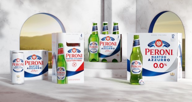
In an exciting development for one of the world’s leading beer brands, Bristol-based strategic brand design agency Outlaw has undertaken the first global redesign of Peroni Nastro Azzurro’s secondary packaging since 2018. This initiative aligns with Peroni’s ambition to ascend to the ranks of the top ten beer brands globally by 2030, recognizing that packaging is a critical element of brand growth and market presence.
Historically, Peroni Nastro Azzurro’s secondary packaging adhered to traditional codes of premium branding, rendering it less visible against more striking competitors. The previous design had faltered, overshadowed even by its own launches, such as the non-alcoholic Peroni 0.0% and the ‘Stile Capri’. The new design aims to rectify this, enhancing the brand’s shelf visibility and premium perception in over 70 international markets.

Outlaw’s approach involved extensive distinctive asset research to identify the most powerful visual elements of the brand. Their findings led to the bold decision to elevate the blue ribbon – or ‘Nastro Azzurro’ – as the central feature of the new design. This elegant element sweeps across the packaging, embodying the brand’s Italian flair and creating a striking presence that enhances findability and appeal. The updated logo, referred to as the ‘Amaretti’, has been rebalanced for improved visibility while maintaining its premium essence.

This redesign not only enhances the aesthetic qualities of the product but also streamlines a global rollout process. Outlaw effectively extended the core design to include variants like Peroni 0.0% and Gluten Free, ensuring a cohesive branding strategy across diverse markets. The new packaging is anticipated to capture consumer attention and encourage trial, which is vital for Peroni’s growth objectives.

Alex Rexworthy, design director at Outlaw, succinctly captured the essence of the redesign, stating, “It was an honour to unleash the ‘Nastro Azzurro’ and send it rippling around the world.” Meanwhile, Mike O’Donoghue, global head of brand at Peroni Nastro Azzurro, expressed enthusiasm for the result, affirming its potential to resonate with consumers worldwide.
As the new secondary packaging begins to roll out across various markets, it symbolizes not just a fresh visual identity, but also a renewed commitment to standing out in a competitive landscape, inviting more consumers into the elegant world of Peroni Nastro Azzurro.

Source:


