Categories
News & Updates

Fearne & Rosie reveals new packaging design & listing with Tesco

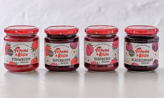
Bun Studio has worked with British jam brand Fearne & Rosie on a packaging design refresh for its range of reduced sugar spreads.

The evolution of brand identity is a critical aspect of business strategy, particularly in the competitive food sector. The recent collaboration between Bun Studio and Fearne & Rosie exemplifies a successful endeavor to enhance product appeal while preserving core brand values. The brief for this project was to cultivate a more mature and premium aesthetic without losing the playful spirit that initially defined the brand.

Under the guidance of Victoria Hemphill, Bun Studio implemented a design strategy characterized by striking visuals and vibrant graphics. By introducing bright red berry lids and employing a refined logo, the packaging achieves greater shelf visibility, an essential factor for consumer engagement. Hemphill emphasized the use of soft textures, hand-drawn illustrations, and a simplified color palette, all of which contribute to a clean and modern appearance. This design approach not only enhances the product’s aesthetic appeal but also evokes a sense of home and comfort, which is critical for establishing emotional connections with consumers.

From the perspective of Rachel Kettlewell, founder of Fearne & Rosie, the rebranding was imperative for broadening the market appeal of their jams. By positioning the product as an accessible yet premium alternative, Kettlewell aims to establish Fearne & Rosie as a prominent brand within the UK marketplace. The synergy between fear of being niche and the ambition to become a mainstream favorite reflects a strategic vision for market leadership.

Moreover, this refreshed branding coincides with a key opportunity: the brand’s inclusion in Tesco’s 2024 Accelerator Programme. This strategic placement has the potential to amplify visibility and accessibility, further propelling Fearne & Rosie towards its goal of becoming the most trusted family brand in the UK.

In conclusion, the redesign initiated by Bun Studio serves as an exemplary model of how thoughtful design can harmonize with strategic business objectives. By melding a mature, premium look with elements of playfulness, Fearne & Rosie is poised to capture a broader audience while maintaining the essence that originally endeared them to customers.

Source:

https://www.packagingnews.co.uk/design/new-packs/fearne-rosie-reveals-new-packaging-design-listing-with-tesco

Categories
News & Updates

Douglas Laing launches limited-edition Big Peat pack

Douglas Laing has launched its Islay blended malt scotch whisky Big Peat in new bottling in celebration of its 15 year anniversary.

The recent release of the special edition of Big Peat encapsulates the rich heritage of Islay whisky in a uniquely crafted, giftable carton. This limited edition not only showcases the charm of Big Peat but also invites consumers to discover 15 notable points about the whisky, the Isle of Islay, and the iconic spirit itself. The design of the carton transcends mere presentation; it serves as an educational tool, enhancing the consumer’s appreciation for the complexities of Islay’s whisky-making traditions.

In addition to its engaging packaging, the special edition includes a scannable QR code, paving the way for enthusiasts to join Big Peat’s Club. This initiative promises to deliver further exciting developments in 2025, fostering a sense of community among whisky aficionados. The integration of technology into the whisky experience exemplifies Big Peat’s commitment to evolving alongside consumer expectations.

Chloe Wood, the brand manager of Big Peat, emphasizes the innovation behind this release. She notes that the hand-selected Red Wine Casks impart a distinctive flavour profile, harmoniously blending the renowned peat smoke with a delectable complexity of fruit-driven, chocolatey nuttiness. This careful maturation process culminates in a dram that is best appreciated slowly, highlighting the rich, multifaceted character of the whisky.

In conclusion, the special edition of Big Peat not only exemplifies the esteemed qualities of Islay whisky but also represents a thoughtful approach to consumer engagement. With its exquisite flavour and educational packaging, this release invites both seasoned connoisseurs and newcomers to immerse themselves in the enchanting world of Big Peat.

Source:

https://www.packagingnews.co.uk/design/douglas-laing-launches-limited-edition-big-peat-pack

Categories
News & Updates

Wenlock Spring’s recent introduction of a bold new design for its 330ml still and sparkling cans marks a strategic shift in its branding approach. This move is characterized by a typography-led aesthetic aimed at enhancing the cans’ presence in chillers, particularly against the backdrop of a burgeoning number of canned beverage options within the HORECA (Hotel, Restaurant, and Café) sectors. This shift not only reflects a commitment to aesthetic innovation but also responds to changing consumer preferences, particularly among younger demographics.

Research from First Insight indicates that 60% of Generation Z favors brands that exhibit sustainable credentials. Furthermore, over half of UK adults perceive cans as a more environmentally friendly packaging option. The recyclable nature of these new cans is poised to capture the attention of environmentally conscious consumers, aligning with the growing trend towards sustainability in the beverage industry. This initiative is not Wenlock Spring’s first engagement with canned products; the introduction of canned water in 2022 exemplified its dedication to reducing environmental impact and enhancing product offerings.

The company employs sustainable manufacturing methods that minimize its carbon footprint, with each can capable of being recycled and remade within just 60 days, utilizing 95% less energy compared to the use of raw materials. This closed-loop system underscores the environmental benefits inherent in aluminum can production. Moreover, the new cans cater to the increasing popularity of ready-to-drink (RTD) beverages—both alcoholic and non-alcoholic—reflecting a market trend that Wenlock Spring aims to capitalize on.

Matthew Orme, director of Wenlock Spring, emphasizes that the choice of aluminum cans aligns with the shifting consumption habits of younger generations. With 40% of Gen Z reportedly limiting their alcohol intake in 2023, there is an evident shift towards non-alcoholic and healthier options. Orme highlights that aluminum cans offer convenience and are particularly suited for outdoor events, contributing to both aesthetic appeal and practicality.

The redesign aims to foster stronger brand cohesion and enhance shelf presence, reinforcing Wenlock Spring’s position within the industry. As consumer preferences continue to evolve towards eco-friendly products and healthier lifestyles, Wenlock Spring’s new can designs symbolize a forward-thinking approach that recognizes and adapts to these trends. In conclusion, the introduction of the new sustainable cans represents not merely a rebranding exercise but a holistic strategy that integrates environmental responsibility, market positioning, and consumer engagement in an increasingly competitive landscape.

Source:

https://www.packagingnews.co.uk/design/new-packs/wenlock-spring-targets-eco-conscious-genz-with-new-look-cans