Categories
News & Updates

It’s Showtime! Fanta Celebrates Beetlejuice’s Epic Return to Theaters

Limited-edition cans of Beetlejuice-themed drinks will thrill a new generation of fans, while QR codes will send them to the “Afterlife.”

It is remarkable to acknowledge that 36 years have passed since Michael Keaton first donned the iconic guise of Beetlejuice, introducing audiences to the mischievous Ghost With The Most. As fans eagerly await the forthcoming sequel, Beetlejuice Beetlejuice, Keaton’s return promises to reintroduce this beloved character to a new generation.

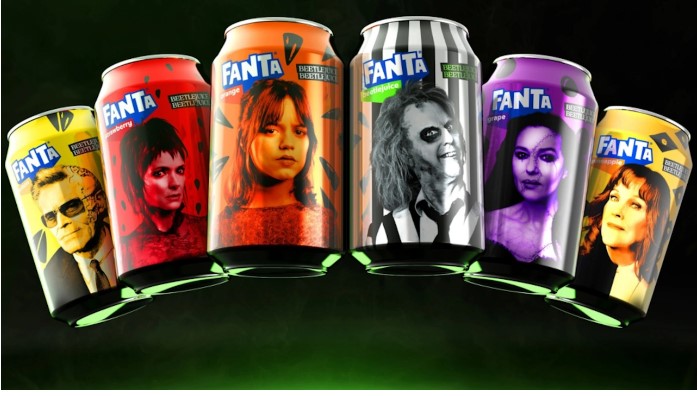
To commemorate this reunion, Fanta has launched an exciting tie-in campaign featuring five new flavors inspired by the film’s main characters. Each limited-edition flavor will come in themed cans, allowing consumers to partake in the Beetlejuice nostalgia while enjoying refreshing beverages. The flavors include Orange for Astrid (played by Jenna Ortega), Strawberry for Lydia Deetz (portrayed by Winona Ryder), and Pineapple for Delia Deetz (Catherine O’Hara). Additionally, fans can delight in Grape for Delores (Monica Bellucci), Lemon for Wolf Jackson (Willem Dafoe), and a unique Strawberry Kiwi flavor for Bob, the voiceless Shrinker.

This collaboration not only promises to enhance the viewing experience of Beetlejuice Beetlejuice but also serves as a delightful reminder of the film’s enduring legacy and its ability to captivate audiences across generations.

Each can is also printed with a QR code that can be scanned to access exclusive physical and digital “Afterlife” experiences, including the chance to win tickets to the new movie. 

The Fanta movie cans launched in more than 50 markets across the globe on August 12 and will be complemented by Beetlejuice Beetlejuice-themed virtual and in-person experiences in the weeks leading up to the movie and the Halloween holiday season.

The movie, from Warner Bros. Pictures, will debut on September 4 internationally and on September 6 in US theaters and IMAX — but you can watch the trailer now:

Source:

https://www.packagingdigest.com/packaging-design/it-s-showtime-fanta-celebrates-beetlejuice-s-epic-return-to-theaters

Categories
News & Updates

Cox & Co launching Christmas tree bars in compostable packaging

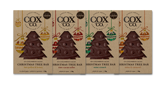
Cox & Co is launching Christmas tree bars crafted from single-origin Colombian cacao.

As the holiday season approaches, consumers increasingly seek meaningful gifts that reflect their values. In response to this growing demand, Cox & Co has introduced a new line of chocolate packaging that prioritizes sustainability without compromising on quality.

The innovative packaging features biodegradable card for the outer layer, ensuring that it can break down naturally after use. Additionally, the use of vegetable-based inks promotes a safe and environmentally friendly printing process. Complementing these materials are compostable film bags crafted from wood pulp, further enhancing the eco-friendliness of the product.

Gavin Cox, founder of Cox & Co, articulates the brand’s dedication to sustainability: “Cox & Co’s mission is to create delicious chocolate that is truly different, made with care and sustainability in mind, perfect for eco-conscious consumers looking to gift sustainably this Christmas.”

This initiative not only reflects the brand’s commitment to environmental stewardship but also offers consumers an opportunity to indulge in exquisite chocolate while supporting sustainable practices. As gifting season approaches, Cox & Co stands as a beacon for eco-conscious choices in the confectionery market.

Source:

https://www.packagingnews.co.uk/design/new-packs/cox-co-launching-christmas-tree-bars-in-compostable-packaging

Categories
Uncategorized

Stormbrands designs branding for Pets at Home’s Noble premium pet accessories

Stormbrands has worked on designs for Pets at Home’s launch of Noble – a premium pet accessories brand.

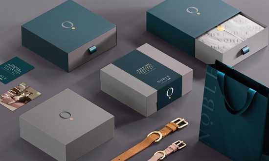
n an innovative branding strategy, the agency has effectively utilized the ‘O’ in the Noble brand name as a versatile icon, reminiscent of a pendant or tag on a pet collar. This distinctive design not only enhances brand recognition but also serves as a monogram on smaller formats, symbolizing the essence of the brand identity.

The icon’s presence extends beyond mere visuals; it can be elegantly embossed or embroidered on the accessories themselves, or employed as a recurring pattern in the luxurious packaging and product wrapping. This tactile experience is further elevated by utilizing thick textured stock for labels and hangers, creating a palpable sense of discovery for consumers.

Additionally, the premium aesthetic is amplified through meticulously crafted technical illustrations, alongside striking photography and gold foil embellishments. These elements collectively invoke a sophisticated yet inviting demeanor, appealing to discerning customers.

Kristina Potts, Senior Brand Manager at Pets at Home, articulated the vision succinctly: “The creative is pitched perfectly to appeal to the next wave of younger consumers looking for pet accessories that match their values and style, as well as our core audience. The comms platform provides us with the tools to easily promote our growing range and continue to build equity and recognition in the Noble brand.”

In conclusion, the strategic integration of the brand icon alongside luxurious design elements positions Noble as a leader in the pet accessories market, resonating with both new and existing consumers by aligning with their values and aesthetic preferences. This thoughtful approach not only enhances the brand’s image but also fosters a deeper connection with its audience.

Source:

https://www.packagingnews.co.uk/design/new-packs/stormbrands-designs-branding-for-pets-at-homes-noble-premium-pet-accessories

Categories
News & Updates

Patch & Pieces revamp pack designs for Mother Nature’s Recipes tea

Loose-leaf brand Mother Nature’s Recipes has worked with brand designers Patch & Pieces to carry out a full rebrand.

In a significant shift that underscores the evolution of Mother Nature’s Recipes, the brand has introduced a fresh identity that resonates with its mission to support mothers. Formerly characterized by a logo featuring a mother and child, along with bold two-toned pouched packaging, the new branding embodies a more artisanal and nurturing approach.

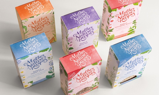
The redesigned packaging showcases organic, flowing lettering and a prominently displayed wordmark, reflecting a hand-crafted aesthetic. Each of the six tea boxes is adorned with delicately illustrated foliage, echoing the natural ingredients within. This thoughtful design choice not only enhances the visual appeal but also reinforces the brand’s commitment to authenticity and quality.

The ‘Garden of Eden’ concept is further highlighted through bright yet subdued color palettes unique to each tea flavor. The new apertured boxes allow consumers to glimpse the loose tea ingredients, fostering transparency and enhancing the overall experience. Iconography depicting cups, teapots, women, plants, and fruits enriches the brand’s narrative, creating a cohesive and inviting brand presence.

Kheyla Anderson, founder of Mother Nature’s Recipes, articulates the rationale behind the rebranding: “The change in branding reflects how we are growing as a business; I started the business when I first became a mother, and like any business we grow and evolve. In this new chapter for us, we will hopefully be able to support more and more women, be inclusive to all types of mothers, and be more environmentally friendly.”

Jennifer Falowo, creative director at Patch & Pieces, emphasizes the collaborative approach taken in this rebranding effort. “We aimed to give greater feelings of care and compassion while ensuring sustainability solutions for the brand,” she noted. With the incorporation of biodegradable pyramid tea bags and sustainable packaging materials, the new direction of Mother Nature’s Recipes signifies a commitment not only to mothers but also to the environment.

As this beloved brand embarks on a new chapter, its reimagined identity encapsulates a promise of nurturing, inclusiveness, and sustainability, inviting all mothers to take a moment for themselves amidst the warmth of their brewing tea.

Source:

https://www.packagingnews.co.uk/design/new-packs/patch-pieces-revamp-pack-designs-for-mother-natures-recipes-tea

Categories
News & Updates

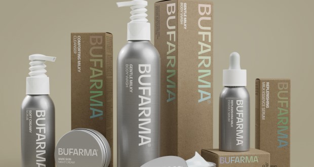
Domizia rebrands as Bufarma with new look from SoreThumbStudio

SoreThumbStudio was tasked to reposition and rebrand products from cosmetics brand Domizia, helping it to find its ‘extra-ordinariness’

SoreThumbStudio recently undertook the challenge of repositioning Bufarma, formerly known as Domizia, to better align the brand with its core expertise in natural skincare formulations. With a soft launch set for a trade show in just ten weeks, the task was both urgent and critical.

Bufarma specializes in harnessing the skin-repairing properties of organic buffalo milk, complemented by responsibly sourced local botanicals from southern Italy. The repositioning strategy aimed to set Bufarma apart in a saturated skincare market characterized by conventional packaging—a generic aesthetic defined by bland white boxes and minimalist black branding.

Recognizing the need for a distinctive visual identity, SoreThumbStudio drew inspiration from traditional aluminium milk urns that have historically housed buffalo milk. This approach not only highlights the brand’s heritage but also results in packaging that is infinitely recyclable, premium, and safer for transportation compared to glass.

To further bolster Bufarma’s eco-friendly image, the agency implemented a unique single-material bellow pump. This innovative design eliminates the need for springs, making it easily recyclable in its entirety. Additionally, the outer boxboard packaging features premium iridescent foil-blocked details, all of which are 100% recyclable, reinforcing Bufarma’s commitment to an ‘extra-ordinary’ ethos.

A tactile tear-open strip was incorporated to enhance the unboxing experience, inviting customers to engage with the brand story in a tangible way. As a final touch, Bufarma has enlisted the talented Kiera Chaplin as its brand ambassador, further elevating its market presence.

Through this comprehensive repositioning, SoreThumbStudio has effectively aligned Bufarma’s brand identity with its expertise, setting the stage for a successful entry into the competitive skincare landscape

Source:

https://www.packagingnews.co.uk/design/new-packs/domizia-rebrands-as-buframa-with-new-stand-out-look-from-sorethumbstudio