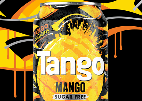
Brand-design agency Bloom has designed the packaging for Britvic’s new Tango Mango soft drink.
The packaging features lively mango imagery, silver accents and flowing lines, all handcrafted with chunky paint markers in bright mango hues.
Set against Tango’s signature black, the design stands out with its dynamic and bold aesthetic, incorporating confident marks and embracing imperfections.
Stu Witter, Bloom’s associate creative director, said: “We drew inspiration from various art forms, including graffiti and street culture, infusing cultural relevance into our graphics. Our design concept, which we call Tiger Style, draws from hip hop and street creativity, blending graffiti elements with the intricate detailing seen in custom car culture.
“We’ve also incorporated the vibrant colours of mango into the work, creating a pattern that’s not only eye-catching on pack but also adaptable to streetwear, merchandise and interior design.”
Dave Laidler, Britvic’s Carbonates Brand Director, said: “The Tango Mango design is hugely eye-catching and will appeal to our younger audience looking for excitement within fruit carbonates. We’re delighted with the results and can’t wait to see how our consumers react.”
Source:

