Global soft drinks brand Mirinda has revamped its branding, targeting Gen Z consumers in particular.
The ‘There’s no flavour like your flavour’ theme places ‘boldness at the forefront of Mirinda’s ‘M’pactful new look’, said the brand.
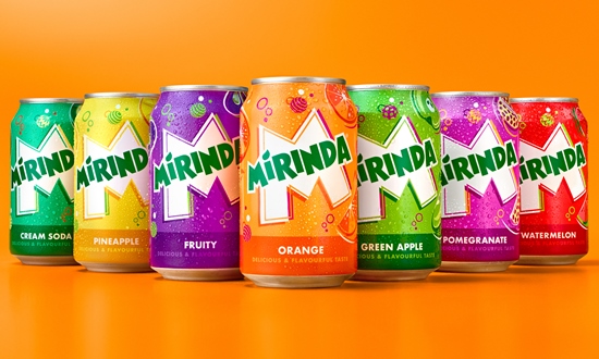
The new visual identity was developed by PepsiCo Design and Innovation, and the Mirinda logo has been refreshed with a brighter green, along with sharper corners and cleaner lines.
The iconic Mirinda ‘M’ serves as a canvas of creativity from which the brand is brought to life.
The new visual identity features playful colour palettes which provide a burst of refreshment, while twirling spheres, fizzing bubbles and zesty fruit illustrations convey a sense of playfulness and energy throughout.
Mauro Porcini, SVP & chief design officer of PepsiCo, said: “PepsiCo Design and Innovation brought Mirinda to life with vibrant, contrasting colours and bespoke illustrations that create a sense of dynamic energy and playfulness. We know Mirinda fans engage with the brand digitally as much as they do physically, so we created a visual identity that retains its excitement and distinction across all platforms.”
Source: