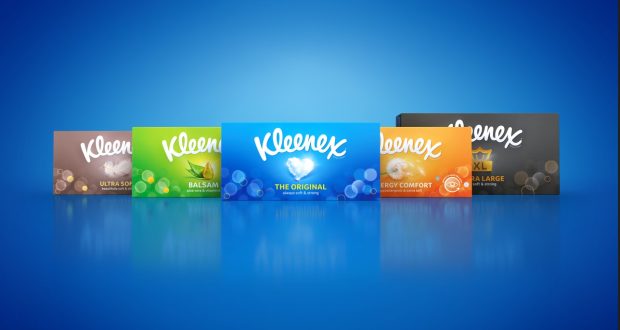
Brand design agency Echo has revamped the look for household name Kleenex.
A simplified redesign has brough out bold colours and “powerful associated iconography”. According to Echo, the design “brings a defined stamp of quality and identification to the products, resulting in effective shelf navigation across various markets in addition to overall market stand-out”.
Nigel Ritchie, creative director at Echo, said: “We needed to ensure the redesign was impactful and ownable. Through bold use of colour, refined benefit driven iconography and the use of aesthetics rooted in the brand DNA, we have moved the brand significantly forwards whilst retaining strong brand recall at shelf.”
Lucy Fretwell, design manager at Kleenex added: “The key challenge for Echo was to create a family of individuals within a holistic portfolio, retaining current loyalists whilst appealing to new, younger shoppers. The new designs capture the essence of the brand with a unique Kleenex look and feel that is impactful at shelf and attractive in-home.”
The new design features across all variants and including boxes, pocket packs and wipes.
Source:
https://www.packagingnews.co.uk/design/echo-revamps-branding-for-all-kleenex-products