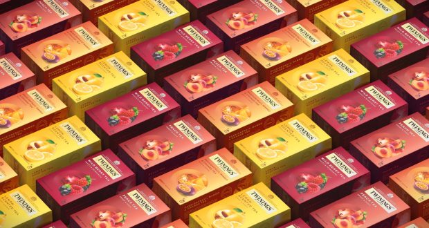
Butterfly Cannon has redesigned packaging for Twinings, targeting a younger audience in China and South-East Asia.
The design agency incorporated a roundel that acts as a unifying device across the range. The window is split in two and uses hand-crafted graphical illustrations. On the left of the Black Tea range are the three uppermost tea leaves, while on the right, “a provenance-based scene layered with uplifting iconography”.
With the pack graphics, Butterfly Cannon said that it had “selected the new straight Twinings International wordmark, making the branding feel more contemporary and premium”.
Butterfly Cannon specified a “complementary two-tone palette for each pack, executed in a unique gradient for each sub-range, to ensure each blend or flavour feels both coherent within its range and easy to differentiate not only on shelf but also in e-commerce – responsible for 50% of Twinings’ sales in China”.
A spokesperson for the Twinings South-East Asia brand team said: “We set Butterfly Cannon a triple target of improving Twinings’ recognition, shelf standout and range navigation. Their exceptional packaging redesign achieved all three, whilst making our rich heritage more relevant to our evolving consumer base. It will stand Twinings in good stead for our future growth and innovations.”
source:
https://www.packagingnews.co.uk/design/butterfly-cannon-designs-twinings-rebrand-for-south-east-asia