Coca-Cola’s in-house global design team collaborated with Kenyon Weston on the package redesign.
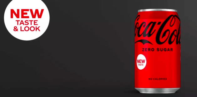
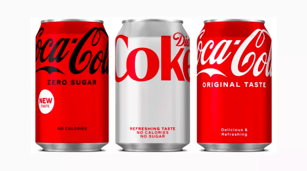
The new look is clean and minimal, with the redesign seeing the company strip back all the visual clutter from the packaging. These added elements include the red disc and wave line around the can, which has now been removed.
According to the company, its intent with the redesign was to provide a “simple and intuitive navigation system that carries across all Coca-Cola variants, while simultaneously celebrating the Coca-Cola logo”.
Also, as a “visual metaphor to uplift”, the new design raises the Coca-Cola logo to the top of the label.
The updated design will be led by the Coca-Cola Zero Sugar range, which also recently debuted a new recipe – bringing the taste closer to the original variant.
The new design is currently only launched in Europe and Latin America. The global rollout of the new design on the other variants will take place throughout 2021, with a complete conversion of its trademarks expected by 2022.

Source:
https://www.packagingnews.com.au/design/coca-cola-unveils-fresh-new-look


