We don’t need to remind you, but the beer can is one of the most consequential canvases around. Take a walk around your favorite liquor store—not the 7-Eleven, mind you—and take a gander at the beer cooler. Plenty of craft breweries bring the art gallery to the fridge, and it’s a perfect way for designers to get their work to the masses.
Of course, strategic drinks design agency Thirst Craft is saying “no duh” right this second.
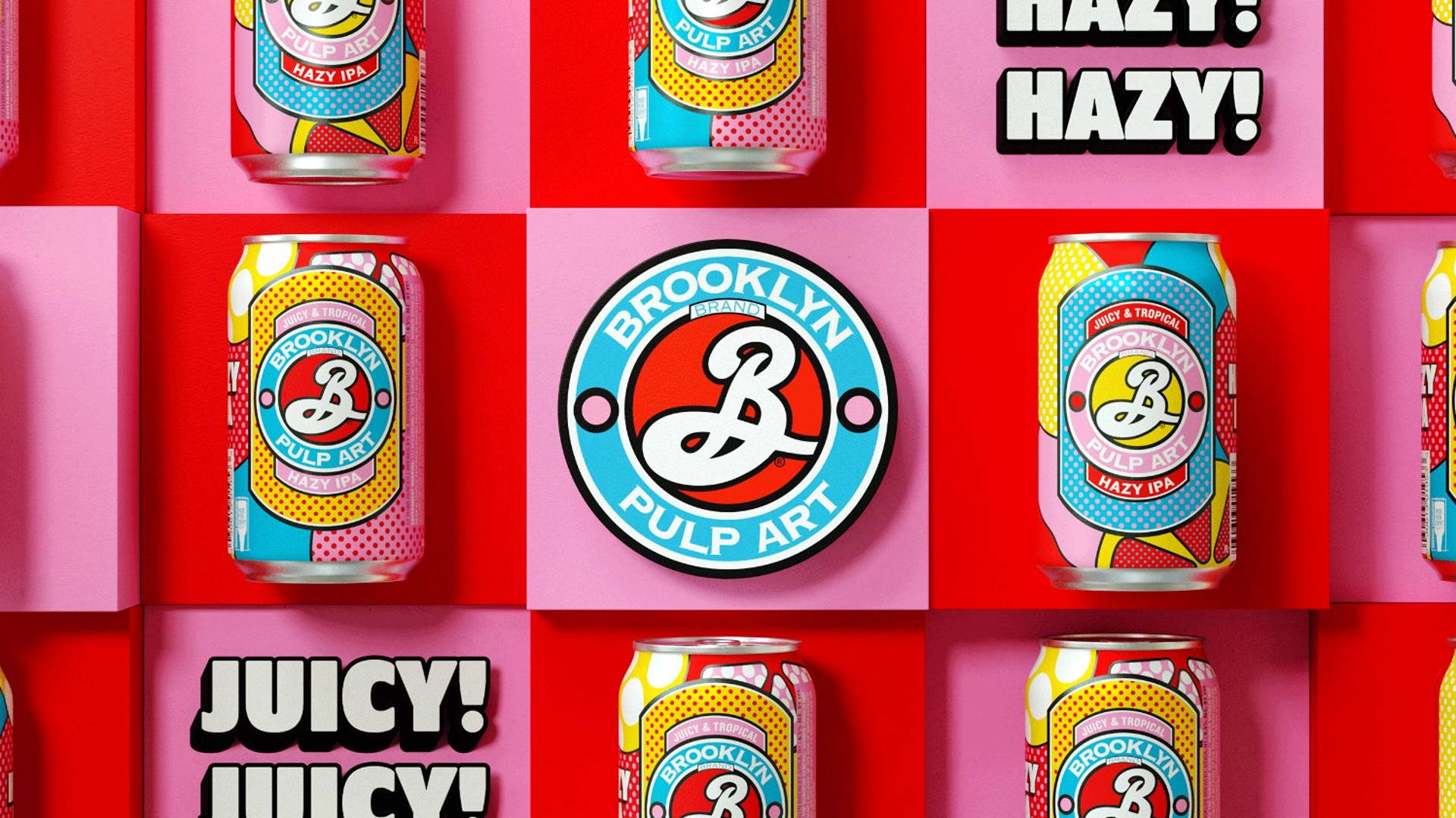
Well, they have an unveiling happening at the beer cooler right now for Brooklyn Brewery’s new Hazy IPA. With clear nods to Warhol and Lichtenstein, the new brew leans heavily on the pop art aesthetic, with plenty of bold black lines and polka dots to boot. The iconic Brooklyn Brewery Badge by Milton Glaser gets a cartoonish makeover, with a wilding-out background of colors matching the fruit segments that wedge themselves into the design. Pulp art, indeed.
Even the visual identity outside of the packaging is a literal exclamation point, whether it’s experienced in your natural environment or on a social media platform. It’s juicy and tropical, the perfect bright-ass balm to get you through these final weeks of winter.
“Thirst really took the time to understand the fundamentals of our brand, which made the project truly collaborative at every point,” commented Samantha Itzkovitz, VP of marketing at Brooklyn Brewery, in a press release. “Thirst knows how to identify the sweet spot where fun and engaging branding meets consumer need and market opportunity, which is arguably the biggest challenge when it comes to developing new brands these days. They were a joy to work with every step of the way.”
“To us and the world, Brooklyn has never been just another brewery,” added Matt Burns, Thirst creative director and founder. “It’s a true product of its neighborhood: spirited, creative, authentic. So we knew when we got this brief, it could never be ‘just another’ hazy IPA. We needed to give it the Brooklyn twist. When we landed on the name, ‘Pulp Art,’ we saw the opportunity to mash up two New York icons. One wanted to democratize art, and the other wanted to democratize Hazy IPAs. It was a perfect match. With such a strong core idea, we could have so much fun with the brand. And we did.”
Anyway, if you ever wanted to know what a Milton Glaser logo would look like if it went through a pop art filter, this is likely what you’d get. And it’s a bright, bold, and incredibly playful addition to your beer cozy
Source


