Categories
Uncategorized

“Tattooed” Fruits Grab Attention, Save Plastic with Laser Date Coding

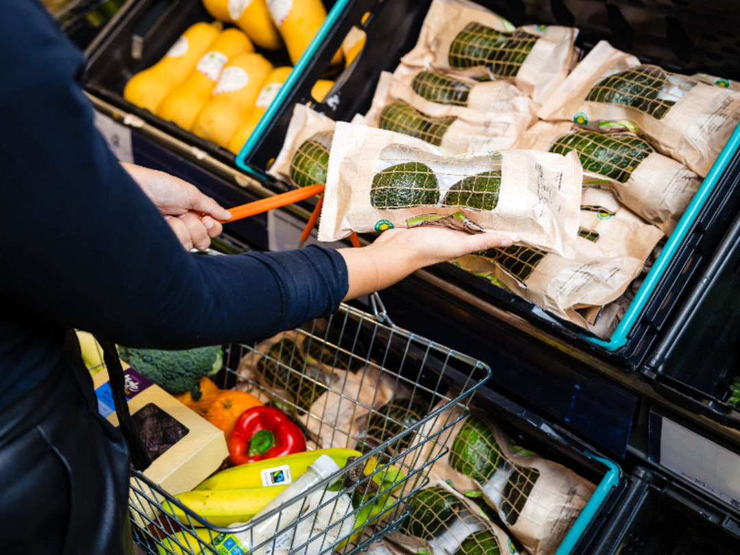
Laser etching directly onto suitably thick-skinned fruits like mangos and avocados lets Westfalia Fruit eschew plastic price look-up tags with date codes, while standing out on the shelf. Possibilities for unique designs, even 2D codes, abound.

In an era where sustainability is paramount, Westfalia Fruit has taken a significant step towards reducing plastic waste while enhancing the presentation of its products. The multinational supplier, renowned for its avocados and mangos, has launched a pioneering process of laser etching codes and branding directly onto the fruit. This initiative, spearheaded by operations in the Netherlands, effectively eliminates the need for plastic price look-up (PLU) stickers, a common yet environmentally taxing practice.

Mathijs Benard, head of operations for Central Europe at Westfalia, emphasizes the dual objectives of this project: reducing plastic usage and maintaining the quality of the fruit. “Since joining Westfalia, my focus has been on improving collaboration and efficiency,” he states. The introduction of laser etching, likened to a tattoo on the mango, not only enhances the visual appeal of the fruit but also has the potential to save up to 10 million plastic stickers annually.

The creative possibilities of laser etching extend beyond mere identification. Initially aimed at providing functional details such as product origin and reference, the project has evolved to include health-related messages and seasonal promotions, offering a unique opportunity to engage consumers directly at the point of sale.

The laser etching process itself is both innovative and efficient. Utilizing a Videojet laser positioned above a conveyor tunnel, the system ensures precise marking of the fruit while adhering to stringent safety measures. The tunnel’s design allows for the laser to activate only after confirming the correct positioning of the fruit, thereby preventing accidents and ensuring consistent quality.

Benard notes that the speed of the laser etching process is comparable to traditional PLU sticker application, with the efficiency varying based on the complexity of the printed message. The advantages of this method are clear: no need for label replacements, reduced susceptibility to environmental conditions, and a significant reduction in plastic waste.

As Westfalia Fruit continues to innovate, the integration of laser etching not only aligns with global sustainability efforts but also sets a new standard in the fresh produce industry, proving that creativity and environmental responsibility can go hand in hand.

Source:

https://www.packworld.com/coding-printing-labeling/coding-markin

Categories
Uncategorized

Douglas Laing introduces new addition to Old Particular Red Wine Cask Collection

Douglas Laing & Co. has announced an exciting addition to their portfolio with the release of the Girvan 16-Year-Old Single Grain Scotch Whisky. This limited edition is finished in a single Merlot Red Wine Cask, marking its place as the fourth bottling in the distinguished Old Particular Red Wine Cask collection.

The Old Particular series is renowned for its meticulous selection of cask pairings, expertly chosen to enhance the inherent qualities of both Malt and Grain Scotch Whiskies. The aim is to elevate complexity and depth, offering consumers novel and enriching tasting experiences.

thumbnail_IMG_6390-683x1024.jpg

Bottled at a robust 48.4% alcohol strength, this exquisite whisky is distinguished further by its commitment to quality. Douglas Laing & Co. has ensured that this release is free from artificial colouring and chill filtration, preserving the whisky’s integrity. The bottle is elegantly presented with a premium red wax dip, a fitting tribute to the richness within.

As a limited release, the Girvan 16-Year-Old Single Grain Scotch Whisky stands as a testament to Douglas Laing’s dedication to craftsmanship and innovation in the world of whisky. Enthusiasts and collectors alike will undoubtedly appreciate this new entry into the Old Particular collection

thumbnail_IMG_6355-683x1024.jpg

Source:

https://www.packagingnews.co.uk/design/new-packs/douglas-laing-introduces-new-addition-to-old-particular-red-wine-cask-collection

Categories
Uncategorized

Bluemarlin unveils redesigned Cisk beer portfolio

Global brand design consultancy Bluemarlin has recently unveiled a comprehensive redesign of Cisk beer, one of Malta’s most cherished brands. This extensive project showcases a refreshed visual identity for the Cisk range, celebrating its rich heritage while appealing to a contemporary audience.

02_Cisk_Hero_Pilsner_Premium_Strong-1024x771.png

The redesign process commenced with the flagship Cisk Lager, renowned for its distinctive yellow branding, along with its low-calorie variant, Cisk Excel. Following the success of these initial endeavors, Bluemarlin extended the new visual system across the entire Cisk lineup, which now includes Cisk 0.0%, Cisk Pilsner, Cisk Premium, Cisk Strong, Cisk Extra Strong, and the innovative Cisk Chill range.

06_Cisk_Chill-1024x771.png

The challenge faced by Bluemarlin was to create a cohesive and modern look for Cisk’s diverse portfolio while preserving the brand’s iconic elements. The result is a unified range that prominently features the recognizable Maltese cross and sunray motifs across all products, from the classic yellow lager to the vibrant Chill range.

Charlie Spiers, account director at Bluemarlin, emphasized the importance of harmonizing Cisk’s rich traditions with the evolving market demands. “We had to consider the brand’s appeal across different consumer segments—from the loyal older generation, the ‘Patriots’, to the younger, more adventurous ‘Modernists’,” remarked Spiers.

Each variant is designed to reflect its unique character while contributing to an overall consistent brand experience. For instance, the newly designed Cisk Pilsner and Premium beers present a sleek gold and white palette, while the 0.0% variant employs a crisp white can to symbolize purity and lightness. In contrast, the Strong and Extra Strong beers showcase bold black and gold designs, encapsulating robustness and flavour depth.

08_Cisk_0.0-1024x563.png

Special attention was also given to the Cisk Chill range, which targets light, summer drinkers with its flavour variations of Lemon, Berry, and Ginger & Lime. Bluemarlin crafted a vibrant visual language for this line, incorporating lively greens and yellows that resonate with the core Cisk identity while accentuating its distinct fruity profiles.

In conclusion, the redesigned Cisk beer range embodies a strategic fusion of tradition and modernity, catering to a broad spectrum of consumers while preserving the essence of this legendary Maltese brand

04_Cisk_Premium-1024x771.png
03_Cisk_Pilsner-1024x771.png

Source:

https://www.packagingnews.co.uk/design/new-packs/bluemarlin-unveils-redesigned-cisk-beer-portfolio

Categories
Uncategorized

Bristol agency Outlaw creates new packaging for Peroni Nastro Azzurro

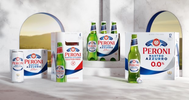
In an exciting development for one of the world’s leading beer brands, Bristol-based strategic brand design agency Outlaw has undertaken the first global redesign of Peroni Nastro Azzurro’s secondary packaging since 2018. This initiative aligns with Peroni’s ambition to ascend to the ranks of the top ten beer brands globally by 2030, recognizing that packaging is a critical element of brand growth and market presence.

Historically, Peroni Nastro Azzurro’s secondary packaging adhered to traditional codes of premium branding, rendering it less visible against more striking competitors. The previous design had faltered, overshadowed even by its own launches, such as the non-alcoholic Peroni 0.0% and the ‘Stile Capri’. The new design aims to rectify this, enhancing the brand’s shelf visibility and premium perception in over 70 international markets.

03-PNA_Flay-Lay-1024x576.jpg

Outlaw’s approach involved extensive distinctive asset research to identify the most powerful visual elements of the brand. Their findings led to the bold decision to elevate the blue ribbon – or ‘Nastro Azzurro’ – as the central feature of the new design. This elegant element sweeps across the packaging, embodying the brand’s Italian flair and creating a striking presence that enhances findability and appeal. The updated logo, referred to as the ‘Amaretti’, has been rebalanced for improved visibility while maintaining its premium essence.

06-PNA_Box-stack-1024x576.jpg

This redesign not only enhances the aesthetic qualities of the product but also streamlines a global rollout process. Outlaw effectively extended the core design to include variants like Peroni 0.0% and Gluten Free, ensuring a cohesive branding strategy across diverse markets. The new packaging is anticipated to capture consumer attention and encourage trial, which is vital for Peroni’s growth objectives.

07-PNA_Before-and-After-1024x576.jpg

Alex Rexworthy, design director at Outlaw, succinctly captured the essence of the redesign, stating, “It was an honour to unleash the ‘Nastro Azzurro’ and send it rippling around the world.” Meanwhile, Mike O’Donoghue, global head of brand at Peroni Nastro Azzurro, expressed enthusiasm for the result, affirming its potential to resonate with consumers worldwide.

As the new secondary packaging begins to roll out across various markets, it symbolizes not just a fresh visual identity, but also a renewed commitment to standing out in a competitive landscape, inviting more consumers into the elegant world of Peroni Nastro Azzurro.

05-PNA_12x330ml-Macro-734x1024.jpg

Source:

https://www.packagingnews.co.uk/design/new-packs/bristol-agency-outlaw-creates-new-packaging-for-peroni-nastro-azzurro

Categories
Uncategorized

Sealed Air launches new flexible printing solution for e-commerce packaging

Sealed Air has introduced a groundbreaking on-demand printing system, AutoPrint, designed specifically for late-stage customisation of protective packaging. This innovative solution aims to provide logistics and fulfilment operators with a flexible and efficient means of catering to the growing consumer demand for personalised branding and messaging on packaging.

Alessandra Secchi, Executive Director of Digital Packaging Europe at Sealed Air, emphasises the increasing trend among brands and retailers to customise e-commerce packaging as a strategy to engage consumers and enhance brand visibility. The rise of social media unboxing videos has further amplified the need for distinct packaging, presenting challenges for logistics and fulfilment companies that must manage numerous design templates while efficiently handling the ordering and storage of pre-printed boxes.

AutoPrint addresses these challenges by offering a digital printing solution that seamlessly integrates into existing packaging lines. This system allows for direct printing of customised designs and information onto closed boxes, thereby minimising storage requirements and reducing waste associated with unused pre-printed materials.

Featuring a full-colour CMYK printer, AutoPrint automatically adjusts to accommodate box heights of up to 200 cm and widths of 14 cm, with side printing options available and plans to expand the printing width in the future. The system boasts an impressive capability of printing up to 15 boxes per minute, compatible with both white and brown corrugated boxes. By eliminating the need for on-pack labels, AutoPrint facilitates quick transitions between different designs, enabling operators to produce premium quality graphics, text, and barcodes that meet the evolving demands for personalised packaging.

Moreover, AutoPrint can be integrated with Sealed Air’s Brand I-Pack Automated Void Reduction Packaging system, which optimises fulfilment processes by dynamically adjusting pack sizes. I-Pack calculates product dimensions in real time to ensure that corrugated boxes are accurately sized, folded, closed, and sealed according to the specific requirements of the items being packaged.

In conclusion, Sealed Air’s AutoPrint represents a significant advancement in customised packaging solutions, empowering logistics and fulfilment operators to meet contemporary consumer expectations while enhancing operational efficiency.

Source:

https://packagingeurope.com/news/sealed-air-launches-new-flexible-printing-solution-for-e-commerce-packaging

Categories
Uncategorized

Stormbrands designs branding for Pets at Home’s Noble premium pet accessories

Stormbrands has worked on designs for Pets at Home’s launch of Noble – a premium pet accessories brand.

n an innovative branding strategy, the agency has effectively utilized the ‘O’ in the Noble brand name as a versatile icon, reminiscent of a pendant or tag on a pet collar. This distinctive design not only enhances brand recognition but also serves as a monogram on smaller formats, symbolizing the essence of the brand identity.

The icon’s presence extends beyond mere visuals; it can be elegantly embossed or embroidered on the accessories themselves, or employed as a recurring pattern in the luxurious packaging and product wrapping. This tactile experience is further elevated by utilizing thick textured stock for labels and hangers, creating a palpable sense of discovery for consumers.

Additionally, the premium aesthetic is amplified through meticulously crafted technical illustrations, alongside striking photography and gold foil embellishments. These elements collectively invoke a sophisticated yet inviting demeanor, appealing to discerning customers.

Kristina Potts, Senior Brand Manager at Pets at Home, articulated the vision succinctly: “The creative is pitched perfectly to appeal to the next wave of younger consumers looking for pet accessories that match their values and style, as well as our core audience. The comms platform provides us with the tools to easily promote our growing range and continue to build equity and recognition in the Noble brand.”

In conclusion, the strategic integration of the brand icon alongside luxurious design elements positions Noble as a leader in the pet accessories market, resonating with both new and existing consumers by aligning with their values and aesthetic preferences. This thoughtful approach not only enhances the brand’s image but also fosters a deeper connection with its audience.

Source:

https://www.packagingnews.co.uk/design/new-packs/stormbrands-designs-branding-for-pets-at-homes-noble-premium-pet-accessories

Categories
News & Updates Uncategorized

Sprite launches limited-edition packs for retro ‘Obey Your Thirst’ campaign

Sprite is reintroducing its iconic ‘Obey Your Thirst’ campaign, 30 years after its initial introduction in 1994.

The campaign features all-new creative with NBA All-Star Anthony Edwards and the world’s fastest woman Sha’Carri Richardson and Sprite’s first female athlete, including new packaging.

Sprite is introducing the limited-edition packaging which features four ‘Obey Your Thirst’ designs taking centre-stage, including an on-pack experience created to inspire Sprite drinkers everywhere.

Consumers can can the on-pack QR code can access ‘Obey Days’, a digital hub featuring fashion, arts, music, entertainment, and sports and more.

Brian Rogers, senior director of brand marketing for Sprite North America, said: “With the revival of ‘Obey Your Thirst,’ we’re excited to introduce this timeless message to Gen Z and inspire them to embrace their uniqueness and confidently chart their own path.”

Source:

https://www.packagingnews.co.uk/design/new-packs/sprite-obey-your

Categories
Uncategorized

Boost Drinks revamps pack designs

Boost Drinks has revamped its packaging to increase shelf-appeal.

The revised pack designs feature the brand’s iconic lozenge logo with a subtle modern twist – a streamlined design approach.

Consumer testing has helped the brand craft a fresh identity which it says resonates with evolving customer preferences while maintaining its market position.

Adrian Hipkiss, commercial director, Boost Drinks, said: “The new pack designs offer an exciting new visual identity for consumers to enjoy, whilst feeling assured that they will be enjoying the same great taste and value they’ve come to know and love – and that’s what makes Boost among the top three selling brands across three functional drinks categories.”

Source:

https://www.packagingnews.co.uk/design/new-packs/boost-drinks-revamps-pack-designs

Categories
Uncategorized

Royal Dutch launches special edition football cans with Canpack

United Dutch Breweries has worked with Canpack to produce a limited edition football-themed cans for its flagship Royal Dutch Premium Lager.

Using Quadromix can printing technology for this special edition, the classic Royal Dutch label has been replaced with a commissioned lithography.

Canpack said innovative techniques such as Quadromix significantly enhance the story-telling capabilities of beverage cans. It allows cans to be printed with up to four different designs in the same production batch.

Krystyna Rojewska, sales manager, Canpack, said: “Brand relationships with consumers are enriched by these mixed design sets because they are actively engaged with the product while it is still on the shelf as they choose their own combination of cans. The Quadromix technology is ideal for creating limited and collectible editions that boost the perception of a brand’s uniqueness.

Source:

https://www.packagingnews.co.uk/design/new-packs/royal-dutch-launches-special-edition-football-cans-with-canpack

Categories
News & Updates Uncategorized

Plastic-free, recyclable tub packages Upfield’s plant-based spreads

Upfield is rolling out a plastic-free, oil-resistant paper tub – developed in collaboration with FootprintMCCPagès Group, and Emsur – for its plant-based butters and spreads in a bid to replace over 25,000 tons of plastic waste every year.

Compressed wet paper fibres sourced from a PEFC-certified supplier are used to manufacture the tub, which is apparently waterproof and oil-resistant. Since it does not contain a plastic liner, it is recyclable in local paper waste streams, having received verification from a leading European recycling company.

The tub has also received Conventional Plastic Free certification and is expected to achieve home compostability certification by 2025.

Beginning in Austria with the Flora Plant brand in late 2023, the rollout will eventually apply to other Upfield brands like Rama and BlueBand. The company hopes that up to two billion plastic tubs will be replaced by 2030, and that it can achieve an 80% reduction in plastic across its portfolio within the same time frame.

“As the global leader in plant-based foods, we take our responsibility to make a positive impact on the world seriously,” said David Haines, Group CEO for Upfield. “Globally, 40% of all plastic produced is for packaging that is used once and then discarded, it is clear that the issue of plastic waste is one of the most critical facing our environment.

“When we established Upfield, innovating our way out of plastic tubs was our moon-shot and I am very proud of all Upfielders that contributed to this success.

“Consumers today demand products that benefit both people and the planet. Our plant-based butters and spreads do exactly that. We’re excited about the potential to launch this across our most iconic brands in some of our most important markets.”

Karina Cerdeira, head of Packaging for Upfield, commented: “We are proud to have created with Footprint an innovative paper-based tub that is durable, leak-proof and appealing, which many thought would be impossible with paper. But after years of dedicated focus from joint Upfield and Footprint R&D teams and dozens of prototypes, we made the impossible, possible.

“This new paper tub marks a true milestone for sustainable packaging that significantly minimizes reliance on plastic. We will continue pushing boundaries through further innovation to adapt for compostability, develop new sizes and formats, and refine towards the optimal solution. We hope what we’ve achieved inspires other businesses to keep pursuing positive change.”

“Footprint’s commitment to a more sustainable planet is showcased through our partnership with Upfield,” added Yoke Chung, co-founder and chief Technology & Innovation officer for Footprint. “The introduction of a ground-breaking solution, in collaboration with Upfield, establishes a pioneering industry standard.

“This marks the introduction of the first oil-resistant paper tub for plant-based spreads. We are proud to collaborate with Upfield on this transformative endeavour, as it resonates with our shared objective of assisting customers in realizing their sustainability goals.

“This collaborative effort underscores the transformative influence of innovation in fostering positive environmental change to shape a brighter future for everyone.”

The development comes after Flora unified its brand identity late last year. The redesign intends to capture Flora’s commitment to protecting people and the plant via its plant-based alternative to dairy butter.

Sirane has also expanded its ‘Earth Packaging’ range with a plastic-free, recyclable butter wrap made from paper, providing a range of different barrier options.

Source:

https://packagingeurope.com/news/plastic-free-recyclable-tub-packages-upfields-plant-based-spreads/10835.article