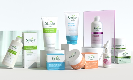
Design agency Sunhouse has revamped the packaging for skincare brand Simple.
The recent redesign of Simple’s packaging embodies a harmonious blend of geometric shapes inspired by the leaf motifs in the brand’s logo. This approach not only reflects Simple’s expertise in skincare but also emphasizes the inherent kindness that the brand represents. By leveraging a design language rooted in simplicity, the new packaging aims to resonate with consumers who increasingly seek effective products from trustworthy brands.
Sally Knapton, partner and executive director at Sunhouse, articulates the evolving expectations of today’s skincare consumers, who demand better results from brands they can rely on. The challenge, as Knapton notes, was to evolve Simple in a manner that honors its commitment to kindness while addressing these heightened expectations. This evolution involved unlocking the brand’s intrinsic simplicity as a strategic asset, allowing it to stand out in a crowded and often convoluted marketplace.
Creative director Chris Griffiths further emphasizes the objective of recalibrating the brand’s assets and messaging. The new design framework aims to reduce complexity while accentuating Simple’s optimistic and open personality. By capturing the essence of simplicity, the redesign not only enhances the brand’s premium credentials but also increases its visibility on the shelves. In a chaotic world, this thoughtful design serves as a testament to the beauty of simplicity, effectively elevating Simple’s presence in the skincare category.
Source:
https://www.packagingnews.co.uk/design/new-packs/sunhouse-refreshes-packaging-for-simple-skincare