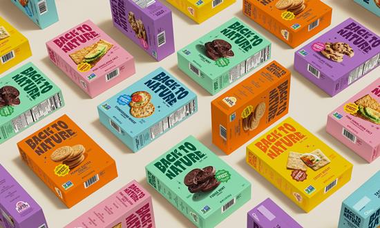
Manchester-based creative agency LOVE has unveiled a colourful new identity for US snack brand Back to Nature.
Back to Nature has recently unveiled an exciting redesign that captures the essence of its origins while appealing to contemporary consumers. The refreshed logo, inspired by the Californian sunrise, incorporates the brand’s iconic leaf, paying homage to its pioneering role in the natural food movement. This thoughtful design choice reflects a commitment to nature and quality.
The typography draws from vintage-style sign writing, reminiscent of classic screen prints, which adds a nostalgic charm to the packaging. Complementing this aesthetic is a vibrant colour palette and flavour-forward product photography that brings the packaging to life, emphasizing taste and quality in a way that resonates with today’s consumers.
In conjunction with the redesign, Back to Nature has introduced a new tagline: “Tasty Snacks Since Way Back.” This phrase, coupled with a confident and easy-going tone of voice, highlights the brand’s rich history while ensuring it remains approachable and relevant. The rebrand targets a new audience of “Snack Surfers”—real individuals browsing the aisles—capturing a ‘modern retro’ look that channels the laid-back spirit of 1960s California, the birthplace of Back to Nature.
Jennifer Jorgensen, Chief Executive of Back to Nature, expressed her enthusiasm for the rebrand, stating, “I’m so pleased to show this sunny new brand to the world! We set out with huge ambitions, and we’ve delivered.” She emphasized the remarkable on-shelf presence of the new packaging and the depth it brings to the brand. Jorgensen also extended her gratitude to LOVE, the agency behind the revitalization, for breathing new life into Back to Nature.
This rebranding effort not only enhances the visual appeal of Back to Nature’s products but also reinforces its commitment to quality and authenticity, ensuring that it continues to resonate with both loyal customers and new snack enthusiasts alike.
Source:


