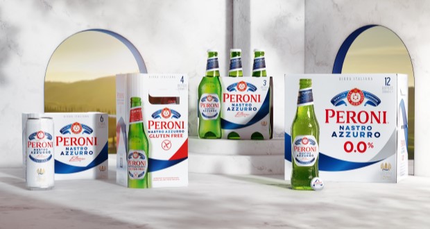
Bristol based strategic brand design agency, Outlaw, has redesigned Peroni Nastro Azzurro’s secondary packaging, the first global update to the brand’s core packaging since 2018.
Peroni Nastro Azzurro has set an ambitious goal to position itself among the top 10 beer brands globally by 2030, with packaging reform acting as a pivotal element in this growth trajectory. The brand’s last redesign, which occurred in 2018, reflected outdated premium codes and had gradually lost impact against bolder and more visually compelling rival products. Even Peroni’s own 0.0% and ‘Stile Capri’ variants began to eclipse its traditional packaging, further underscoring the need for innovative change.

With a presence in 70 markets worldwide, enhancing the core packaging design offered a significant opportunity for the brand to strengthen its market position. The objective was clear: to improve shelf visibility and desirability while enhancing the brand’s premium perception among consumers.
Extensive research revealed key visual assets that resonated most powerfully with consumers. Capitalizing on these insights, Outlaw explored early design concepts, which were subsequently tested across three strategic markets. The results indicated marked improvements in shelf impact, purchase intent, and premium perception.

Outlaw’s design solution prominently featured the blue ribbon—‘Nastro Azzurro’—transforming it into the focal point of the brand’s identity. This bold design element sweeps elegantly across each packaging format, symbolizing the sophistication and passion synonymous with Peroni. The innovative design creates an ‘endless ribbon’ effect, ensuring distinctiveness whether seen on shelves or highlighted in promotional displays.
The iconic logo, traditionally known as ‘the Amaretti,’ was subtly refreshed to enhance visibility while preserving its premium aesthetic. The redesigned packaging also showcases a bespoke green glass bottle, evoking the essence of Italian sunlight and enhancing product appeal, particularly in markets where Peroni is still establishing its presence.

Navigating the complexities of a global rollout, Outlaw extended the new design to 0.0% and Gluten Free variants, thereby creating a cohesive design system. Comprehensive packaging templates and guidelines facilitated a seamless implementation process across diverse market specifications.
The reimagined secondary packaging of Peroni Nastro Azzurro is currently being launched across various local markets, marking a new chapter in its journey.
As Alex Rexworthy, design director at Outlaw, eloquently stated, “It was an honour to unleash the ‘Nastro Azzurro’ and send it rippling around the world in this redesign.” Meanwhile, Mike O’Donoghue, global head of brand at Peroni Nastro Azzurro, expressed satisfaction with the results, noting the enthusiasm of local teams as they anticipate the new blue ribbon’s prominent presence on shelves.
This strategic redesign not only reinvigorates Peroni Nastro Azzurro’s visual identity but also aligns it with the brand’s ambitious aspirations for growth and global recognition.
Source:

