Categories
Uncategorized

“Tattooed” Fruits Grab Attention, Save Plastic with Laser Date Coding

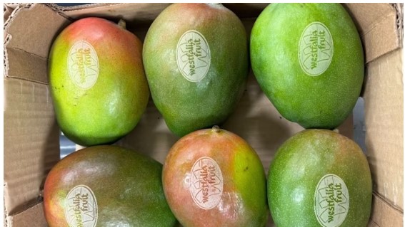
Laser etching directly onto suitably thick-skinned fruits like mangos and avocados lets Westfalia Fruit eschew plastic price look-up tags with date codes, while standing out on the shelf. Possibilities for unique designs, even 2D codes, abound.

In an era where sustainability is paramount, Westfalia Fruit has taken a significant step towards reducing plastic waste while enhancing the presentation of its products. The multinational supplier, renowned for its avocados and mangos, has launched a pioneering process of laser etching codes and branding directly onto the fruit. This initiative, spearheaded by operations in the Netherlands, effectively eliminates the need for plastic price look-up (PLU) stickers, a common yet environmentally taxing practice.

Mathijs Benard, head of operations for Central Europe at Westfalia, emphasizes the dual objectives of this project: reducing plastic usage and maintaining the quality of the fruit. “Since joining Westfalia, my focus has been on improving collaboration and efficiency,” he states. The introduction of laser etching, likened to a tattoo on the mango, not only enhances the visual appeal of the fruit but also has the potential to save up to 10 million plastic stickers annually.

The creative possibilities of laser etching extend beyond mere identification. Initially aimed at providing functional details such as product origin and reference, the project has evolved to include health-related messages and seasonal promotions, offering a unique opportunity to engage consumers directly at the point of sale.

The laser etching process itself is both innovative and efficient. Utilizing a Videojet laser positioned above a conveyor tunnel, the system ensures precise marking of the fruit while adhering to stringent safety measures. The tunnel’s design allows for the laser to activate only after confirming the correct positioning of the fruit, thereby preventing accidents and ensuring consistent quality.

Benard notes that the speed of the laser etching process is comparable to traditional PLU sticker application, with the efficiency varying based on the complexity of the printed message. The advantages of this method are clear: no need for label replacements, reduced susceptibility to environmental conditions, and a significant reduction in plastic waste.

As Westfalia Fruit continues to innovate, the integration of laser etching not only aligns with global sustainability efforts but also sets a new standard in the fresh produce industry, proving that creativity and environmental responsibility can go hand in hand.

Source:

https://www.packworld.com/coding-printing-labeling/coding-markin

Categories
Uncategorized

Douglas Laing introduces new addition to Old Particular Red Wine Cask Collection

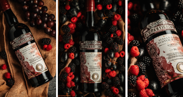
Douglas Laing & Co. has announced an exciting addition to their portfolio with the release of the Girvan 16-Year-Old Single Grain Scotch Whisky. This limited edition is finished in a single Merlot Red Wine Cask, marking its place as the fourth bottling in the distinguished Old Particular Red Wine Cask collection.

The Old Particular series is renowned for its meticulous selection of cask pairings, expertly chosen to enhance the inherent qualities of both Malt and Grain Scotch Whiskies. The aim is to elevate complexity and depth, offering consumers novel and enriching tasting experiences.

thumbnail_IMG_6390-683x1024.jpg

Bottled at a robust 48.4% alcohol strength, this exquisite whisky is distinguished further by its commitment to quality. Douglas Laing & Co. has ensured that this release is free from artificial colouring and chill filtration, preserving the whisky’s integrity. The bottle is elegantly presented with a premium red wax dip, a fitting tribute to the richness within.

As a limited release, the Girvan 16-Year-Old Single Grain Scotch Whisky stands as a testament to Douglas Laing’s dedication to craftsmanship and innovation in the world of whisky. Enthusiasts and collectors alike will undoubtedly appreciate this new entry into the Old Particular collection

thumbnail_IMG_6355-683x1024.jpg

Source:

https://www.packagingnews.co.uk/design/new-packs/douglas-laing-introduces-new-addition-to-old-particular-red-wine-cask-collection

Categories
Uncategorized

Bluemarlin unveils redesigned Cisk beer portfolio

Global brand design consultancy Bluemarlin has recently unveiled a comprehensive redesign of Cisk beer, one of Malta’s most cherished brands. This extensive project showcases a refreshed visual identity for the Cisk range, celebrating its rich heritage while appealing to a contemporary audience.

02_Cisk_Hero_Pilsner_Premium_Strong-1024x771.png

The redesign process commenced with the flagship Cisk Lager, renowned for its distinctive yellow branding, along with its low-calorie variant, Cisk Excel. Following the success of these initial endeavors, Bluemarlin extended the new visual system across the entire Cisk lineup, which now includes Cisk 0.0%, Cisk Pilsner, Cisk Premium, Cisk Strong, Cisk Extra Strong, and the innovative Cisk Chill range.

06_Cisk_Chill-1024x771.png

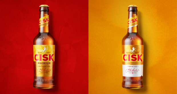
The challenge faced by Bluemarlin was to create a cohesive and modern look for Cisk’s diverse portfolio while preserving the brand’s iconic elements. The result is a unified range that prominently features the recognizable Maltese cross and sunray motifs across all products, from the classic yellow lager to the vibrant Chill range.

Charlie Spiers, account director at Bluemarlin, emphasized the importance of harmonizing Cisk’s rich traditions with the evolving market demands. “We had to consider the brand’s appeal across different consumer segments—from the loyal older generation, the ‘Patriots’, to the younger, more adventurous ‘Modernists’,” remarked Spiers.

Each variant is designed to reflect its unique character while contributing to an overall consistent brand experience. For instance, the newly designed Cisk Pilsner and Premium beers present a sleek gold and white palette, while the 0.0% variant employs a crisp white can to symbolize purity and lightness. In contrast, the Strong and Extra Strong beers showcase bold black and gold designs, encapsulating robustness and flavour depth.

08_Cisk_0.0-1024x563.png

Special attention was also given to the Cisk Chill range, which targets light, summer drinkers with its flavour variations of Lemon, Berry, and Ginger & Lime. Bluemarlin crafted a vibrant visual language for this line, incorporating lively greens and yellows that resonate with the core Cisk identity while accentuating its distinct fruity profiles.

In conclusion, the redesigned Cisk beer range embodies a strategic fusion of tradition and modernity, catering to a broad spectrum of consumers while preserving the essence of this legendary Maltese brand

04_Cisk_Premium-1024x771.png
03_Cisk_Pilsner-1024x771.png

Source:

https://www.packagingnews.co.uk/design/new-packs/bluemarlin-unveils-redesigned-cisk-beer-portfolio

Categories
Uncategorized

Bristol agency Outlaw creates new packaging for Peroni Nastro Azzurro

In an exciting development for one of the world’s leading beer brands, Bristol-based strategic brand design agency Outlaw has undertaken the first global redesign of Peroni Nastro Azzurro’s secondary packaging since 2018. This initiative aligns with Peroni’s ambition to ascend to the ranks of the top ten beer brands globally by 2030, recognizing that packaging is a critical element of brand growth and market presence.

Historically, Peroni Nastro Azzurro’s secondary packaging adhered to traditional codes of premium branding, rendering it less visible against more striking competitors. The previous design had faltered, overshadowed even by its own launches, such as the non-alcoholic Peroni 0.0% and the ‘Stile Capri’. The new design aims to rectify this, enhancing the brand’s shelf visibility and premium perception in over 70 international markets.

03-PNA_Flay-Lay-1024x576.jpg

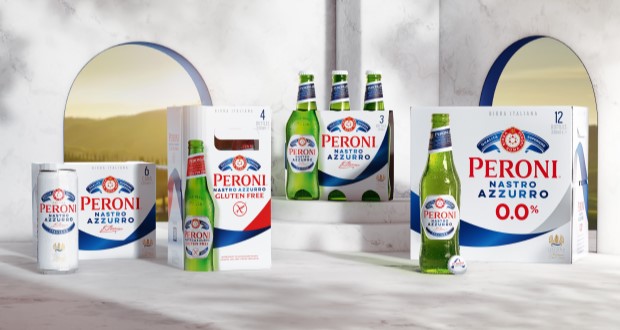
Outlaw’s approach involved extensive distinctive asset research to identify the most powerful visual elements of the brand. Their findings led to the bold decision to elevate the blue ribbon – or ‘Nastro Azzurro’ – as the central feature of the new design. This elegant element sweeps across the packaging, embodying the brand’s Italian flair and creating a striking presence that enhances findability and appeal. The updated logo, referred to as the ‘Amaretti’, has been rebalanced for improved visibility while maintaining its premium essence.

06-PNA_Box-stack-1024x576.jpg

This redesign not only enhances the aesthetic qualities of the product but also streamlines a global rollout process. Outlaw effectively extended the core design to include variants like Peroni 0.0% and Gluten Free, ensuring a cohesive branding strategy across diverse markets. The new packaging is anticipated to capture consumer attention and encourage trial, which is vital for Peroni’s growth objectives.

07-PNA_Before-and-After-1024x576.jpg

Alex Rexworthy, design director at Outlaw, succinctly captured the essence of the redesign, stating, “It was an honour to unleash the ‘Nastro Azzurro’ and send it rippling around the world.” Meanwhile, Mike O’Donoghue, global head of brand at Peroni Nastro Azzurro, expressed enthusiasm for the result, affirming its potential to resonate with consumers worldwide.

As the new secondary packaging begins to roll out across various markets, it symbolizes not just a fresh visual identity, but also a renewed commitment to standing out in a competitive landscape, inviting more consumers into the elegant world of Peroni Nastro Azzurro.

05-PNA_12x330ml-Macro-734x1024.jpg

Source:

https://www.packagingnews.co.uk/design/new-packs/bristol-agency-outlaw-creates-new-packaging-for-peroni-nastro-azzurro