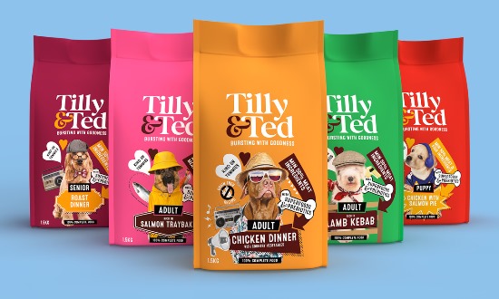
Slice Design has created branding for premium pet food brand Tilly & Ted.
The brief was to create a brand that is engaging, contemporary and can capture a millennial audience. It was key that the brand should be visually distinctive and playful with a straight talking down to earth tone of voice.
The packaging design for Tilly & Ted uses light hearted, quirky and unique photo montages that combine personality, flavour and benefits.
The packs are designed for a vibrant and playful feel, which gives stand out on shelf.
Alan Gilbody form Slice Design said: “It was key for us that the packaging design for Tilly & Ted captured that pets are an integral part of the family and their characters can be quite unique and eccentric just as we are. We used this insight to create a range of unique individual characters, capture the owners attention and provide an engaging way to talk about the flavours.”
Source:
https://www.packagingnews.co.uk/design/slice-design-creates-packaging-design-for-tilly-ted-pet-food


