Brand looked to a bolder scheme to reawaken interest for its sleep-supporting ice cream in a crowded freezer section.
There are few things better for your health than a good night’s sleep. Yet that natural act proves elusive for many whether caused by physical or mental conditions.
Supplements such as melatonin have provided relief to many, but a new option was introduced in 2019 when game-changing Nightfood debuted a market-first sleep-friendly food. Besides jumpstarting a new category, it earned product of the year honors in the ice cream category.
The emerging market quickly took off as major brands like Pepsi followed with sleep-friendly snacks and drinks.
There are few things better for your health than a good night’s sleep. Yet that natural act proves elusive for many whether caused by physical or mental conditions.
Supplements such as melatonin have provided relief to many, but a new option was introduced in 2019 when game-changing Nightfood debuted a market-first sleep-friendly food. Besides jumpstarting a new category, it earned product of the year honors in the ice cream category.https://4884b348b5af6c4e09b5031946cc6339.safeframe.googlesyndication.com/safeframe/1-0-37/html/container.html
The emerging market quickly took off as major brands like Pepsi followed with sleep-friendly snacks and drinks.Nightfood/Packaging Digest
“Better-for-you-snacking has been a powerful trend for years and now sleep is moving to the forefront as well,” Sean Folkson, Nightfood CEO, tells Packaging Digest. “Those two powerful trends are now combining, as consumers are starting to get the message from the media about the critical impact sleep quality has on overall health, performance, mood, energy levels…really every aspect of our lives is directly impacted by sleep quality.”
Brands also get it, too.
“We see Pepsi moving in with the new Driftwell sleep-supporting beverage,” Folkson says, “and we hear rumblings from other global food and beverage players like Nestlé and Mondelez. Because a large number of consumers snack regularly shortly before bed, the category of sleep-friendly snacking was inevitable.”
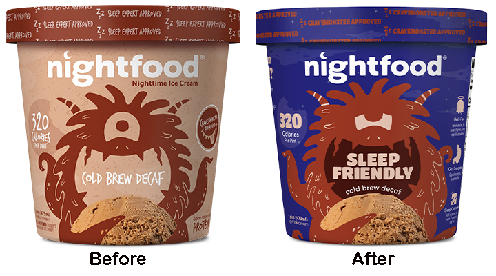
With more competition in a fast-changing landscape, Nightfood decided it was time to invigorate the packaging design that’s currently in a soft rollout introduction.Nightfood
It starts with a re-assessment of the unique product’s attributes.
“We’re the only company addressing nighttime snacking in this way,” says Folkson. “There are tons of companies making snacks that are generally healthier and ‘better for you’. Yet with a significant percentage of snacking taking place between dinner and bed, none of those other healthy snack companies has ever addressed sleep quality through nutrition.
“We enlisted a team of leading sleep and nutrition experts, leading sleep doctors and sleep researchers, that are involved in decisions regarding our recipes, formulations, and ingredients.”
It stacks up well as a healthy alternative to ice cream, with about 90% less fat, 70% less sugar, and 50% more protein.
Notably, Nightfood is high in fiber, typical ice cream has none. Fiber, Folkson points out, “helps with satiety, blood sugar levels, digestion, and with sleep.”Nightfood
Nightime decided on a two-prong approach to attract a wider swath of consumers.
“With the new design, we wanted to convey nighttime and sleep both directly and indirectly,” says Folkson. “The nighttime blue color should ‘block’ very powerfully on-shelf. That’s important because many brands have gone to the pastel look, with each flavor carrying a different hue. That was how our previous packaging was, and it would tend to get ‘washed out’ on shelf. Each illustrated monster now has more of a nighttime feel, with drowsy monster eyes and face. It’s a great look, bold, powerful, and clearly communicates our primary point of differentiation: Sleep-friendly.”
The targeted consumer is as hard to pin down as last night’s dream.
“People who love us don’t necessarily have a persona or demographics in common, but they have a behavior in common,” says Folkson. “They have a ‘why’ in common. Our target consumer is one who snacks at night with ice cream in their rotation. To get a bit more granular, they believe that what you eat matters and they would prefer better sleep…which is just about everybody these days.”
Further challenging things is that the ice cream section has colorfully proliferated.
“Many of the newer ice creams have been moving towards a color-by-the-flavor pint,” says Folkson. “We wanted to stand out by being big and bold, and the dark blue carton can dominate the shelf. Because we know most pint ice cream is consumed at night, it’s a natural fit to have sleep-friendly ice cream in the pint section.”
On top of what the main color brings to the brand, it also communicates the brand message and the usage occasion.
However, it’s the big, bold, and playful text that screams SLEEP FRIENDLY front and center on the packaging that’s by far the biggest element.
“It’s the one key thing we want the consumer to connect with in that first millisecond,” adds Folkson. “We think we’ve done enough to command their attention.”
He gives a great deal of credit to the OffWhite Co. design team, which redesigned Chobani yogurt packaging to help lift sales from $30 million to more than $1 billion and to the #1 category position in less than four years.
“They came up with this platform, and everything came together pretty smoothly,” says Folkson. “We wanted one key message on the front panel, and things flowed from there. Nailing down the font for the words Sleep Friendly was probably the toughest challenge, and I really like what we were able to land that through trial and discovery.”Nightfood
Nightfood lids make a favorable impression when the pints are held.
Another aspect that was improved were the lids, which Folkson describes as fun and cute. “They make an impression when a consumer holds a pint in their hands.”
Notably, the redesign is gaining attention as the product’s soft rollout progresses across the country.
“The feedback on the new packaging has been great from our category managers and consumers alike,” offers Folkson. “When the new design hits shelves in Walmart and major supermarket chains around the country, we expect it to be a big hit with consumers!”
Source

